Dataset Display
Sign InA combination of components that configure the main data management pattern of the system.
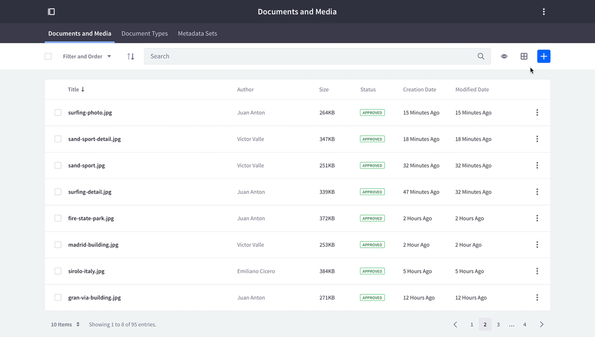
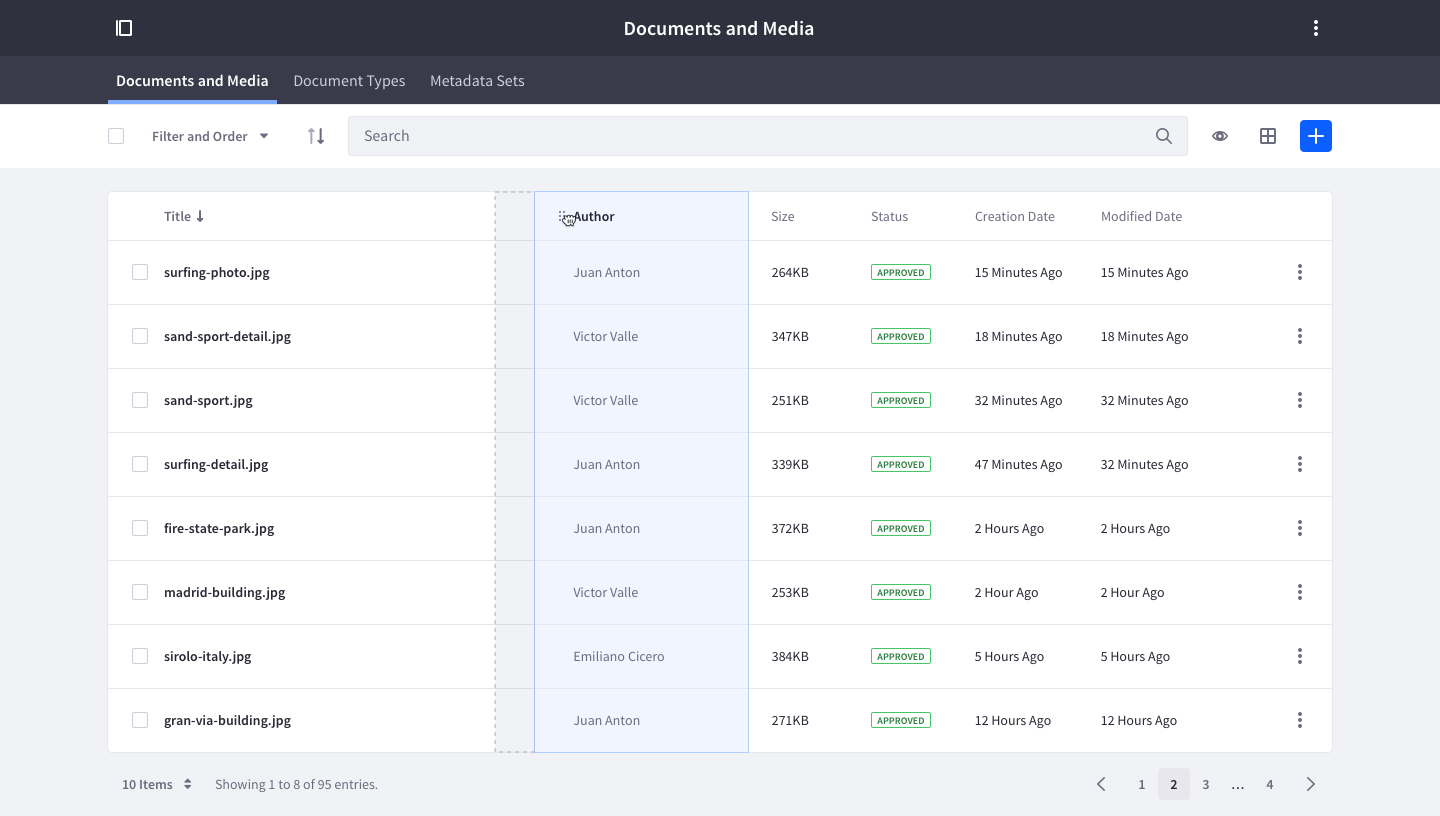
A dataset display is the combination of a management bar, with one or many data visualization types, and optionally a mechanism of pagination. The most common visualization types used are table, list, and card. You can see the dataset display pattern in action in the slides below:
Usage
This pattern is used when the visualization elements require collective management. The management bar offers the tools you need to work with the dataset.
- This pattern can only be used once on a page.
- Use it if you want several visualization options for a set of data.
- Use it if you want to perform actions on an individual piece of data or a set of data.
- Only use the visualization options that you require for your data. A visualization option may not be appropriate for your data.
Use a list view
- If you need to display homogeneous sets of basic data.
- If you need to sort, group, or filter simple data sets.
- If you don’t need to compare attributes of different items.
- If you need to display a single-level hierarchy.
- If you need to be able to quickly identify the content of a list item.
Use a table view
- If you need to manage complex data sets that need to be extensively sorted, grouped, filtered, or edited.
- If you need to compare attributes of different items.
- If you work with complex hierarchies.
Use a grid view
- If the primary content consists of images.
Use of other visualization methods
- So far the common use cases have been covered, but other visualization methods are possible, such as map view. Since they are not commonly used, you must implement them yourself.
Empty state
It's important to let the user know how and why an empty state is displayed, as well as what actions they can take to move out from the empty state. See the empty state page for more information.
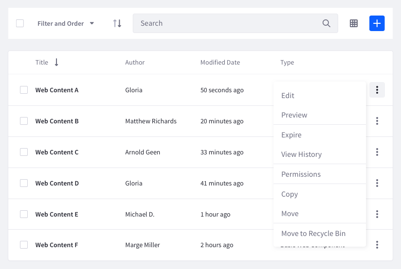
Individual actions
Individual actions are always available through an element's actions menu. Some of these actions are contextual and only appear in the management bar when one or more elements are selected from the dataset. These contextual actions are always represented by a button with an icon. They should only be the actions that are most relevant to the selected element(s).
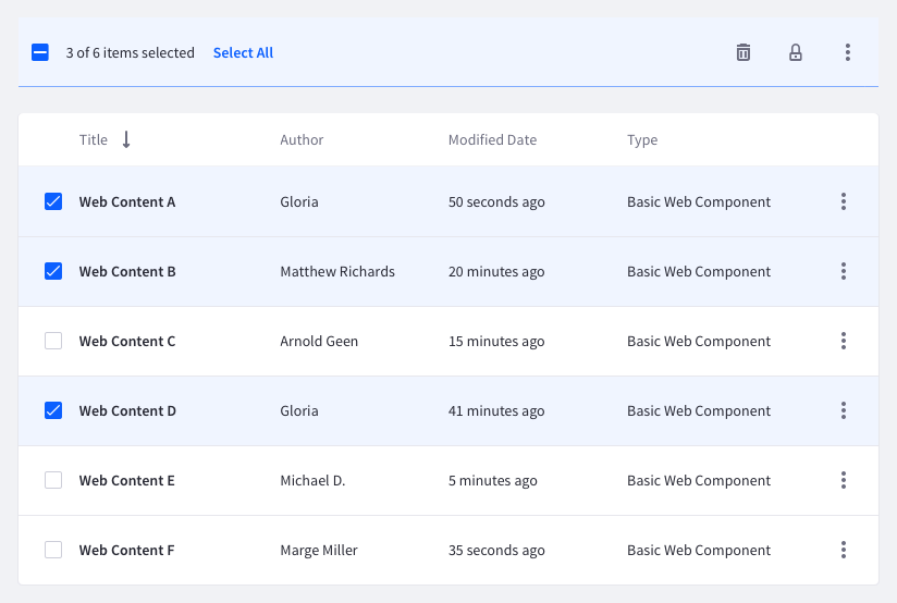
Collective actions
Collective actions are shown in the management bar when more than one element is selected in the dataset. If a collective action doesn't have an icon associated with it, it can be placed in a dropdown triggered from the actions button in the management bar.
Filtering
- Only use filters when you need them.
- When a filter is chosen from the management bar for a view type, the view type must update the displayed data to reflect the requested filter.
- Only elements that are displayed can be filtered. Hidden elements are not included in filtered results.
- When a filter returns an empty result, the user must be able to select another filter to keep the management bar from becoming locked. Always offer a descriptive message that clearly communicates that the dataset is empty or no results were found for the search.
Sorting
- When sorting is applied from the management bar for a view type, the view type must update the displayed data to reflect the requested sorting option.
- Only elements that are displayed can be filtered. Hidden elements are not included in filtered results.
- Tables can display the current sorting option in the column header. To provide this feature, make the following updates: When the user sorts by the column header, the value must be marked on the sort panel, and the arrow must indicate the “sort direction”. When the user sorts by the sort panel and button, the action must be reflected in the appropriate column header.
Selection
When an item is selected in any of the views, the management bar must change to its second state. This state is indicated by a different background color. The number of actions adapt to the number of items selected in the view:
- When one item is selected, the available actions are the same as in the row.
- When multiple items are selected, the available group actions are displayed.
The checkbox in the management bar selects/unselects all elements in the view.
Drag and drop example
Change view
Only provide multiple view options if more than one visualization method is available for a data set. visualization methods that are not available for a data set must not be available as a view option.