Asset Toolbar
Sign InA multi-purpose toolbar that can be located in different types of asset visualizations.
Layout
The asset toolbar's layout is flexible and adapts to different viewport sizes, as shown in the examples below:
8 columns
Asset publisher asset

Knowledge base article
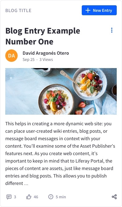
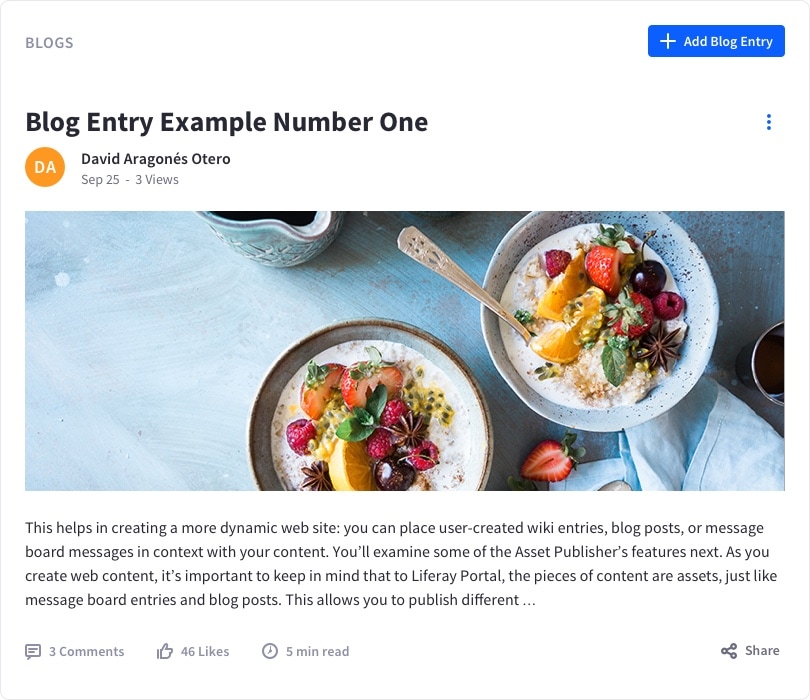
Blog entry

Blog list item
Comments

Mobile displays less than 577px in width
The examples below show the asset toolbar's behavior on mobile viewports:
Asset publisher asset

Knowledge base article

Blog entry

Blog list item

Comments

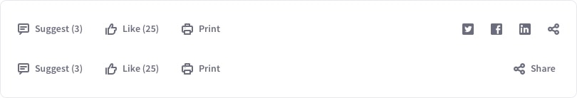
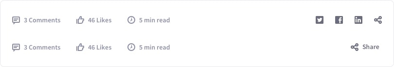
The asset toolbar can contain tools, links, or informative elements.
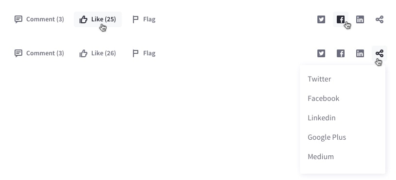
The toolbar is organized into two different groups of tools or informative elements. Most of the tools and content are grouped on the left, and the social tools are grouped on the right.
The “Share” button displays a dropdown menu containing a list of places/networks where the user can share. This list contains the social networks represented as icon buttons outside the list, as well as any additional social networks that are available.
Examples of use
The example below shows the asset toolbar for the blogs application on desktop in an 8-column container:
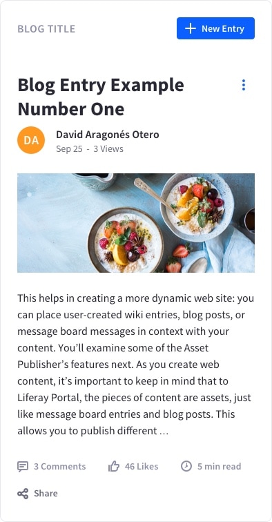
The same component in a 4-column container narrows to adapt to the available space:
On mobile displays, the component transforms its toolbar: