Common Actions
Sign InVocabulary set of frequent actions in our products base.
In this page we refer to entities and records. A simple definition of an entity is a collection of data fields (schema) that comprise an object. A record refers to a specific entry within an entity. In some instances entities can also be records.
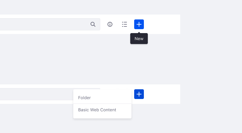
New
Use when an interaction initiates the sequence to start creating a new entity or record.
Usage
- When there is a single entity creation option, button or tooltip must read “New [Entity name]”.
- When there are multiple create possibilities, button or tooltip must read “New”.
- When expressed as an icon button, use plus icon and set a tooltip for the action.
- This action might also appear in a dropdown menu, the action should read “New [Entity name]”.
Associated Icon

Similar actions: Edit, Add
Opposite action: Delete
Examples
Example 1: only one action is possible

Example 2: multiple actions are possible
Create
Use when an interaction completes the sequence of creating a new entity/record.
Usage
- Always use a text button.
- Always include the entity/record that is being created: “Create [entity]”.
- Create is only used when an entity/record is first being configured, any subsequent edits will use the verb "Save" as the primary action.
- Inform the user after with the outcome with an alert or a different UI feedback.
Similar actions: Save, Add
Opposite action: Delete
Example

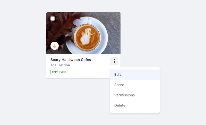
Edit
Use when an interaction initiates the sequence to modify an existing entity/record. Common edits change the title or description field of the entity.
Usage
- Usually listed in a dropdown menu as a fundamental for most entities/records.
Associated Icon

Similar actions: Configure, New
Example
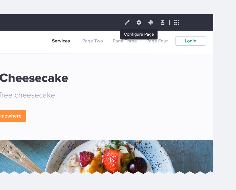
Configure
Initiates the sequence to modify an existing entity/record's meta properties and settings. A Configure interaction usually takes the user to a different screen than the more fundamental Edit interaction.
Usage
- Use Configure for interactions that modify the meta information of an entity/record. By contrast, "edit" is used to modify the entity/record itself.
- The initial configuration will either be set by default or during the creation process.
- Use Configure when editing and configuring are separate steps. However, in the case that they are combined, use Edit
Associated Icon

Similar actions: Edit, New
Example
Save
Completes the sequence to save changes to the entity/record or its settings. Used to complete either the sequence started by a Configure or Edit interaction.
Usage
- Always use a primary text button, with a few exceptions.
- "Save as Draft" typically displayed with a secondary button.
- In the balloon toolbars of the page builder, a disk icon is used.
- Do not use “Save” when making changes in a secondary state (i.e. modal), during an unsaved sequence, such as a form. In these situations, use “Done.”
- Do not use “Save” to submit filters. In this case, use “Apply”.
- After the Save is submitted, inform the user with the outcome.
Similar action: Create
Opposite action: Cancel
Example

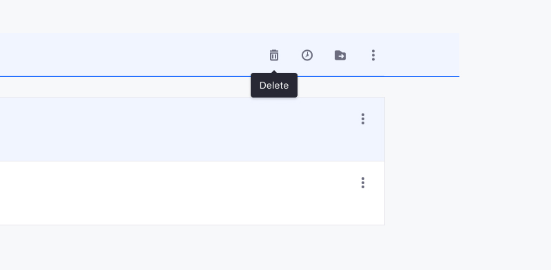
Delete
Deletes an entity/record that has been created. An entity must only be deleted in the area of the product where it is created.
Usage
- Usually listed as the last action in a dropdown that lists the actions of the entity.
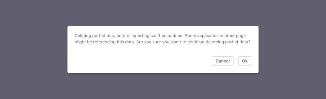
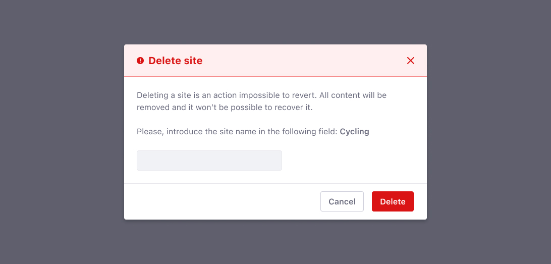
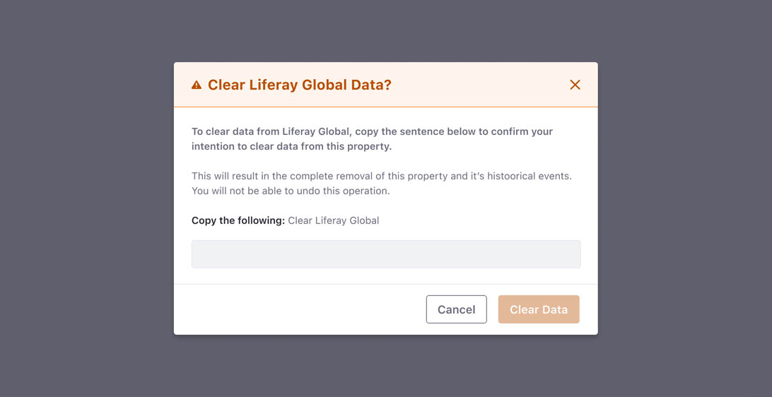
- Deleting is a destructive action and therefore requires warning the user. Three levels of severity have been identified :
- Low Risk: because the record/entity can be restored from the recycle bin, a post-deletion toast alert should be used.
- Mid Risk: because the record/entity cannot be restored but the consequences are low (such as having to recreate the entity). A confirmation message must be presented to the user with the proper message to understand this situation before the action is processed.
- High Risk: because the record/entity cannot be restored and the consequences are high (such as deleting an entire site). A danger modal with a reading proof mechanism would be appropriate before the action is processed.
Associated Icon

Similar action: Remove
Opposite action: New, Create
Example
Mid risk security message
High risk security message
Cancel
Discards work in progress and closes the interaction
Usage
- Use secondary text button
- If an entity/record has been cancelled without saving/creating/publishing, trigger a confirmation message to confirm the user's intent.
- In autosave scenarios, “Cancel” will restore values to the moment the entity was opened for the last time.
Similar action: Close, Exit
Opposite action: Save
Example
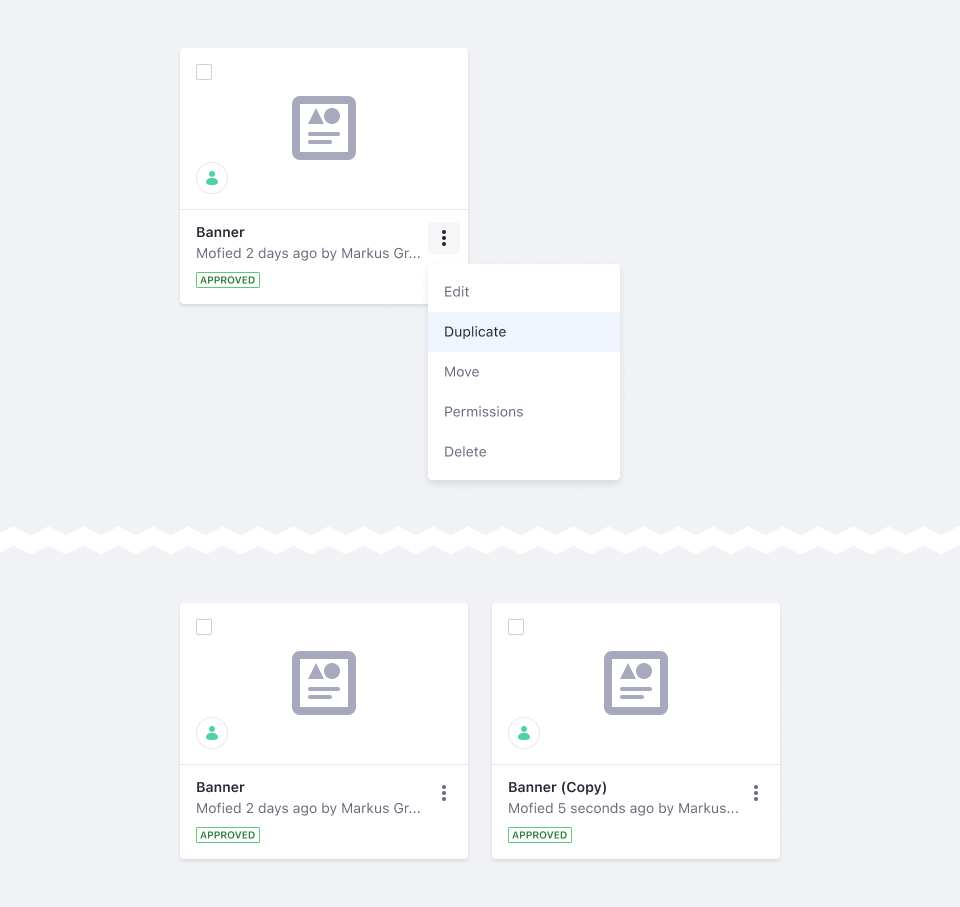
Duplicate
Makes an exact copy of an entity.
Usage
- Duplicated entity/records must read: “Filename (Copy)”
- For duplication to another location, use “Duplicate To”
Similar action: Duplicate to
Example
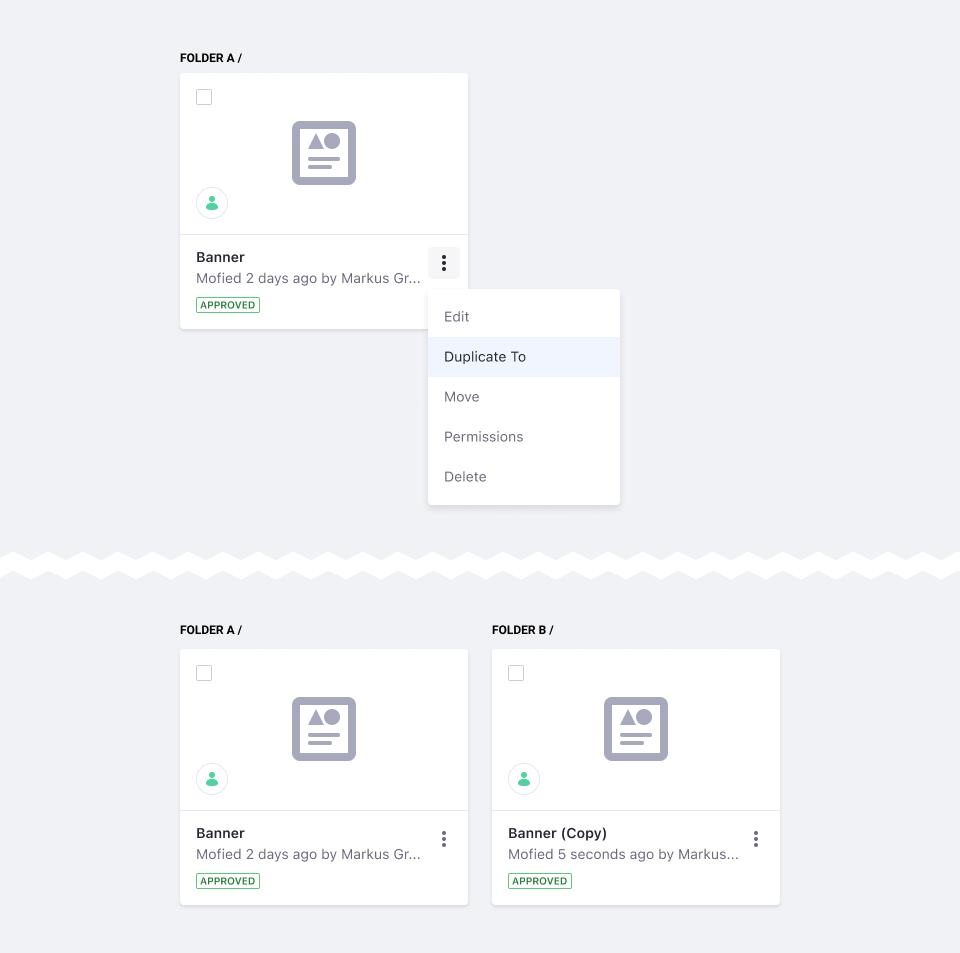
Duplicate To
Makes an exact copy of an entity in another location.
Usage
- Copied entity/records must be named following: Filename (Copy)
- For duplication without move necessity please use “Duplicate”
Similar action: Duplicate
Example
Copy To
Copies an entity's records to another entity. Both entities must already exist for the records to be copied.
Usage
- After the records are copied, inform the user with the outcome.
Associated Icon

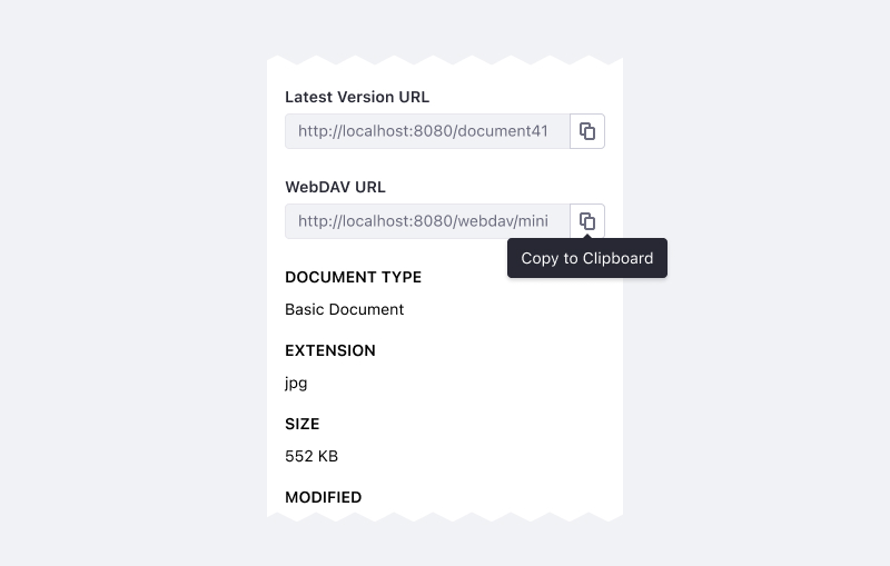
Copy To Clipboard
Copies a string to the clipboard.
Usage
- Use “Copy to clipboard” instead of: Copy, Duplicate
- Clicking button results in a tooltip confirming the copy to clipboard action has been completed.
Associated Icon
Example
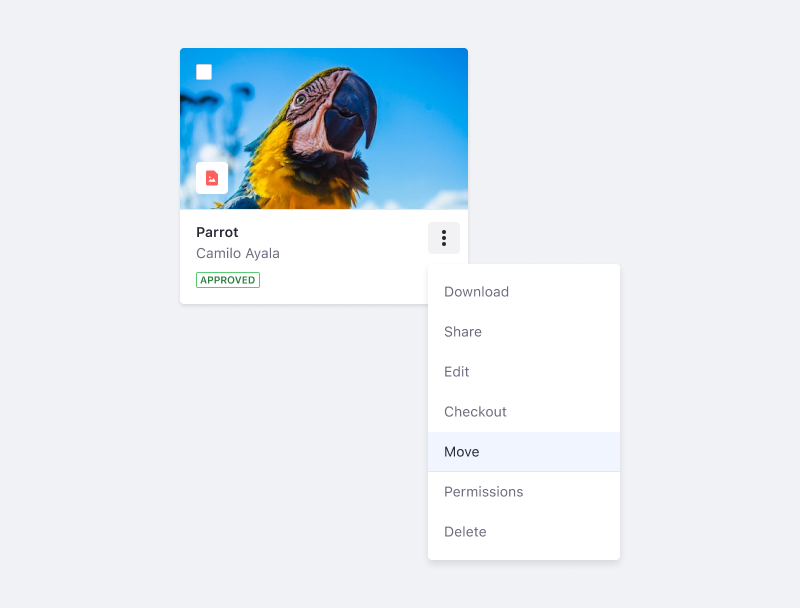
Move
Moves an entity/record from one place to another (for example, from one folder to another folder). The entity is removed from the original location.
Usage
- Copied entity/records must be named following: Filename (Copy)
- For duplication without move necessity please use “Duplicate”
Associated Icon

Similar action: Duplicate to
Example
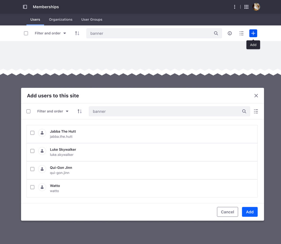
Add
Adds an existing entity/record to the current context. For example, add a user to a segment.
Usage
- If the add action requires a modal, the modal title must read “Add [entity/record]” and the primary action must read “Add”.
Associated Icon
Similar actions: New, Assign
Opposite action: Remove
Example
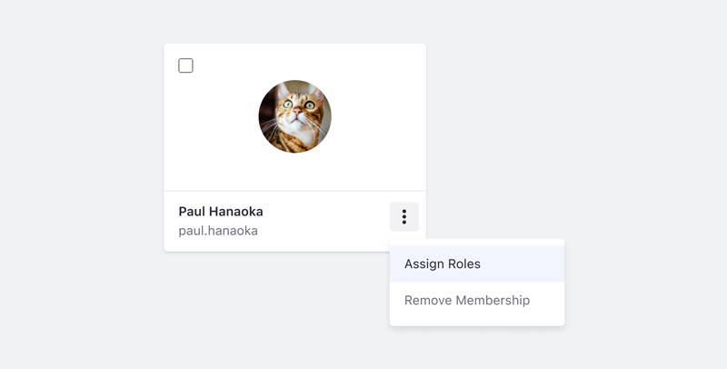
Assign
A variation of "add." It associates an existing user record to a particular job or piece of work, to establish a connection between the user and the job.
Usage
- When the add action triggers a modal, the modal title must read “Assign [entity/record]”. Ex: Assign Roles to Paul Hanaoka
- If there is an associated modal, the primary text button should read “Assign.”
Associated Icon
Similar actions: New, Add
Opposite actions: Unassign, Remove
Example
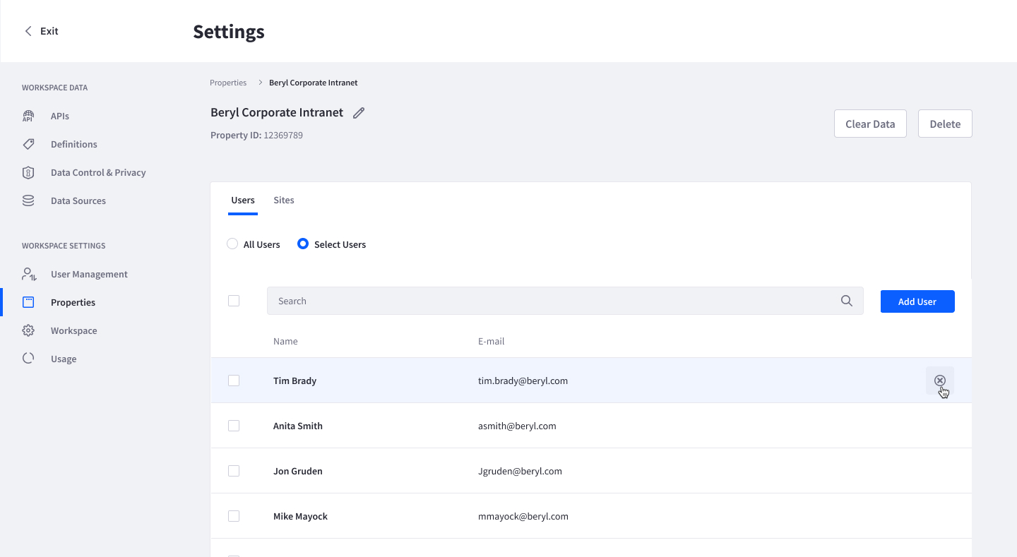
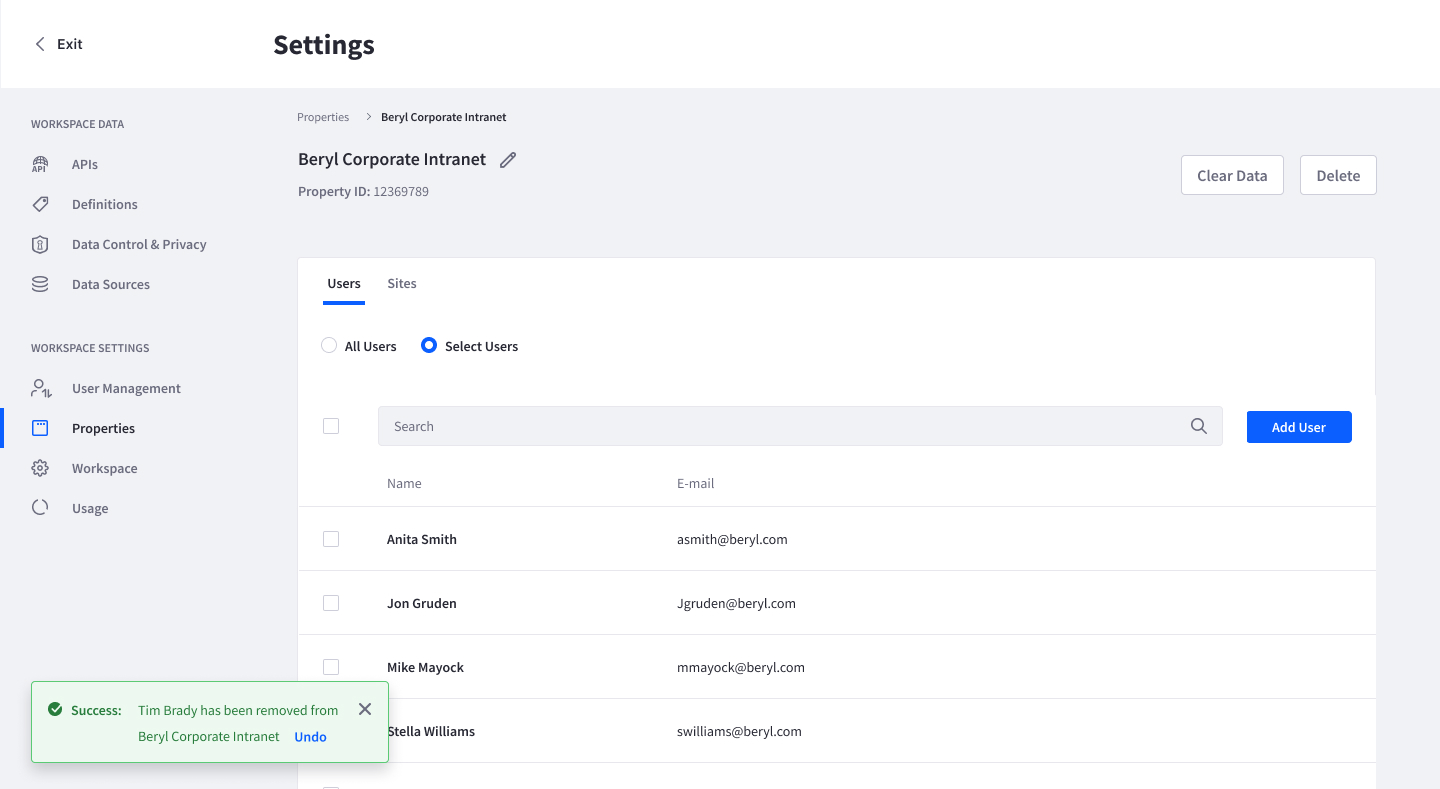
Remove
Non-destructive removal of an entity/record/element that has been added or assigned. Because the element was created and saved elsewhere, the element remains available for use in other contexts, or to be re-added to the same context.
Usage
- If the action to remove is on a sensitive or work intensive screen, provide an alert to acknowledge an action has taken place. Alert can contain an undo button.
Associated Icons

Similar actions: New, Add
Opposite actions: Unassign, Remove
Examples
Example 1: Results bar below the management toolbar where applied fiters appear

Example 2: Removing a user from a list
Close
Closes a modal or a secondary state to return back to its original state. Close dismisses an interface element such as an alert, modal, sidebar or menu.
Usage
- Always placed to the top right corner of the component to be closed.
- Always a secondary action
- May be the only allowable option if there aren’t other actionable options.
- In a modal: If the secondary state has changed without saving, then prompt a confirmation message to confirm the user's intent (similar to cancel, where save actions are available).
Associated Icon

Similar action: Cancel
Example

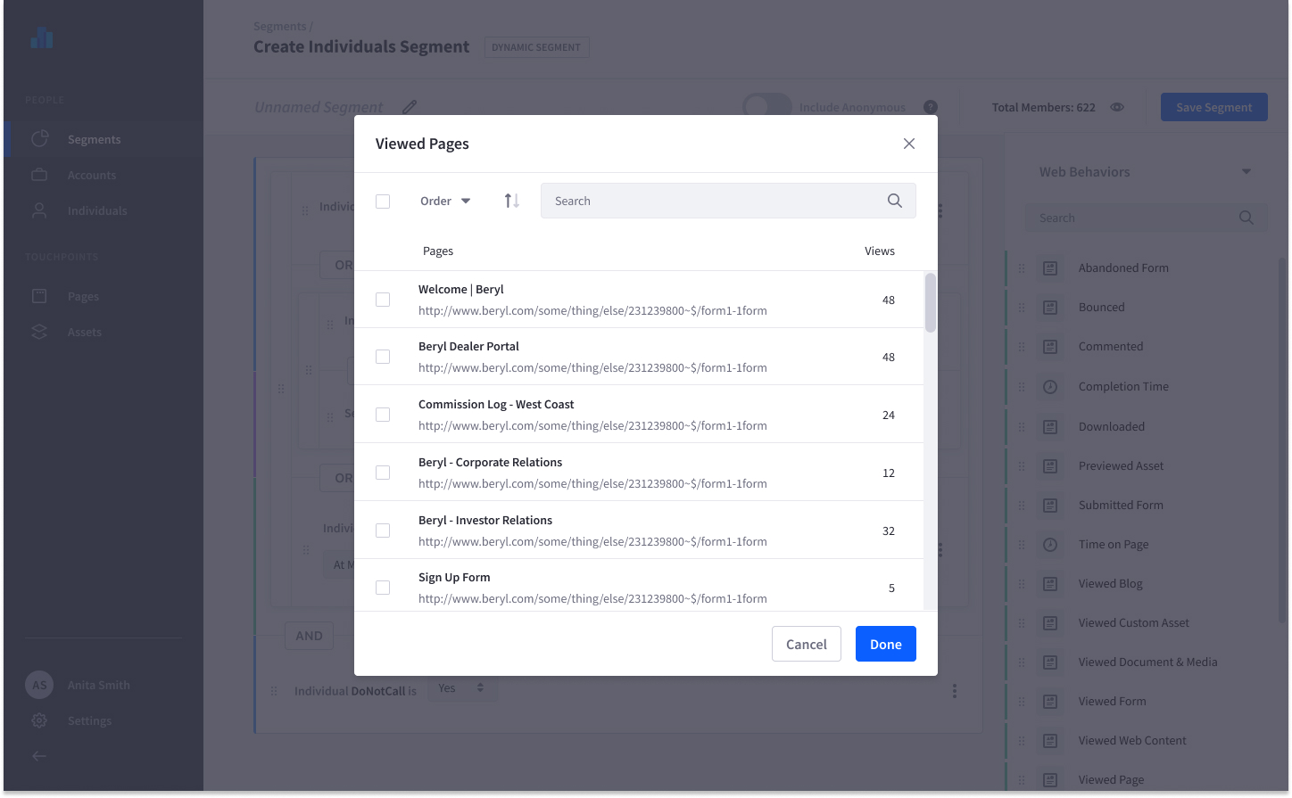
Done
Confirms a completed secondary action during an unsaved sequence.
Usage
- Use when making changes in a secondary state (i.e. modal), during an unsaved sequence, such as a form or wizard.
Similar action: Apply
Opposite actions: Open, Cancel
Example
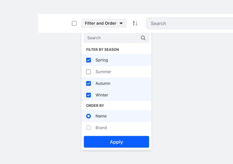
Apply
Confirms a temporary selection such as filtering.
Usage
- Closes a modal or secondary state and temporarily registers user changes on the screen.
- Use apply when selections change the results on the screen. Selecting apply will close the secondary state (modal or dropdown).
Similar actions: Save, Done
Opposite action: Clear
Example
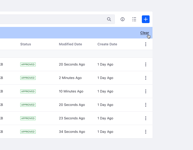
Clear
Clears temporary filters/entities/records ( ie: queries, notifications, suggested content, system generated logs, unsaved selections, filter labels). Usually applies to a view mode, rarely affects persisted data.
Associated Icons
Opposite action: Apply
Example
Select
Choose one or multiple entities/records/settings to apply to a specific interaction. The user usually has a choice of pre-existing selections when the term Select is appropriately used.
Usage
- Do not use the word "Choose" for selection interactions.
Example
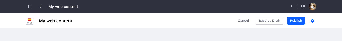
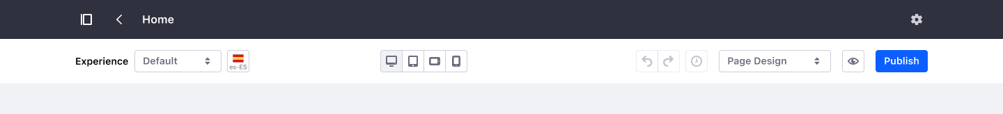
Publish
Saves an entity/record and makes it available for public consumption.
Usage
- Always use a primary text button.
- Use always with another save action as “Save”, “Save as draft”, or auto-save.
- Alert to acknowledge a successful publication has occurred.
Opposite action: Unpublish
Associated Icon

Example
Save as Draft
Completes the sequence to save changes to an entity/record when the primary action, “Publish,” has not been completed.
Usage
- Always use a secondary text button.
- Use as an alternative save option to Publish. This action can be replaced with “Save” or with an auto-save functionality.
Similar action: Save
Opposite action: Cancel
Example