Stickers
Sign InStickers are a visual way to quickly identify content in a different way than badges and labels.

Usage
Use stickers to visually identify elements in a dataset that are part of the same group. Stickers can be any color.
Sizes
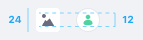
24px

Use the 24px size sticker in smaller context when you only require visual identification for the element and don't need the user to interact with it.
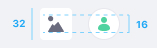
32px
Use the 32px size sticker in image cards, so you can see more parts of the image.
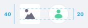
40px

Use the 40px size sticker to identify the user in a comment in the comments portlet in sites. This size is only rounded.
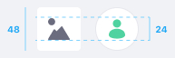
48px

Use the 48px size sticker to identify the user in a blog entry or article in sites. This size is only rounded.
Colors
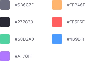
Stickers can be any color, and the default color for stickers is #6B6C7E, which corresponds to Main Lighten 28% desat 5%.
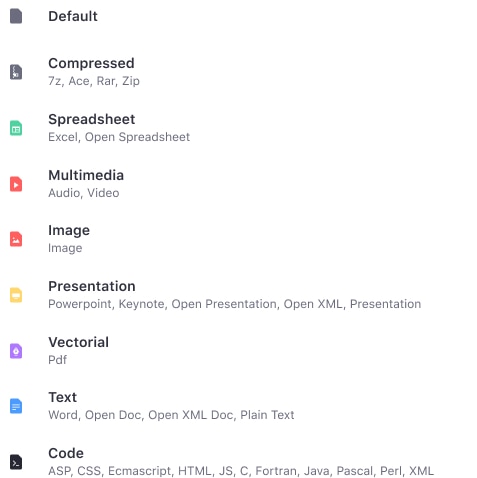
For Documents and Media please follow the following specification of colors and icons.
Variations
Square
Use a square sticker to identify files and folders. You can place up to three characters or an icon inside it. Always use uppercase letters.

Round
Only use the circle sticker to identify people. You can places up to two characters or an image inside it. Always use uppercase letters.

Position
You can place a sticker of any type in an Card. Its position is always bottom left, as shown in the example below: