Modal
Sign InA modal is a secondary window that communicates or provides an action inside the same process.
Usage
Modal display a temporal task initiated by users in a secondary window and request information that users need to complete or read in order to continue with the task. Use modal to display short or unusual tasks. There can be different uses of modal to confirm messages, to show additional information, to request users to add information, etc.
Use modal sparingly, keeping primary interactions in the primary window. Modal should not be confused with alerts. Modal block users' workflow for a limited period of time, while alerts don’t interrupt the workflow and coexist with the main page. In other words, alerts are a way to capture user attention in an obtrusive way as users are not required to perform any action.
Do
- Use it to draw the user's attention to something that is more important.
- Use it for simple content cases.
- Use it if you need to interrupt the user flow to display concrete information or capture data from the user.
Don't
- Do not use it for complex cases that require you to display a lot of information or to complete a long form. In these cases, use a new page instead.
- Try not to trigger a modal window from another modal window. Modal windows are subordinate to pages.
- Never completely cover the page's information with the modal window.
Description
Parts
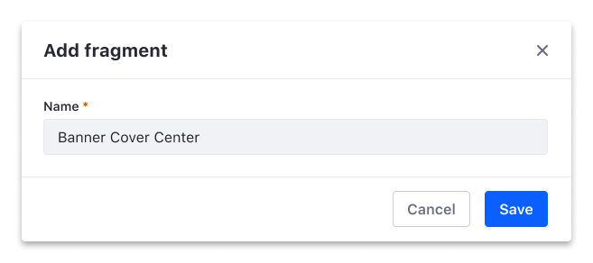
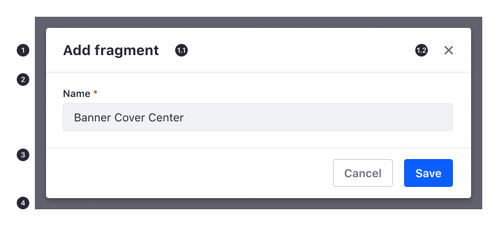
A modal consists of four main parts: header, body, footer and overlay.
Header (optional): The header contains a title and a close button. Titles in a modal should be clear and concise to help readers understand the purpose of the modal.
Title
Close button
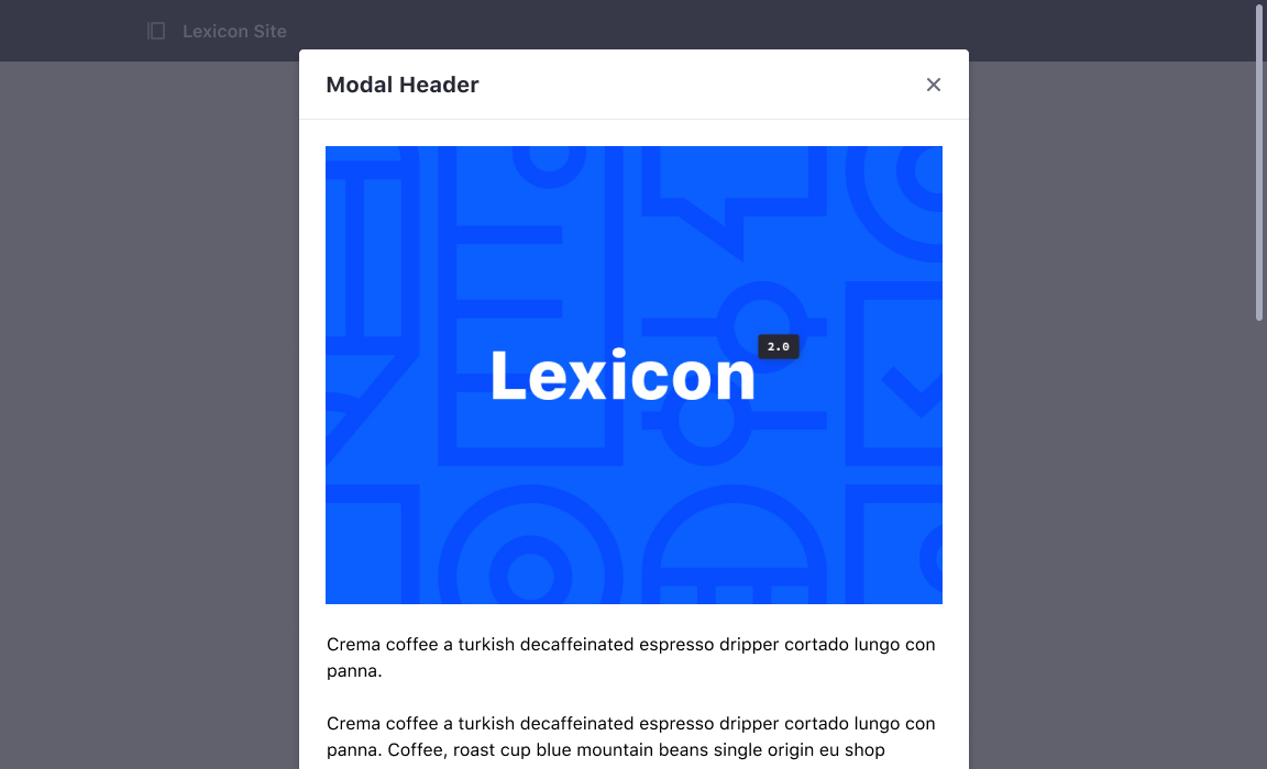
Body: The body displays the information necessary to help users complete their tasks. This content can be text, a form, an image, etc.
Footer (optional): The footer contains the actions that can be taken.
Overlay (optional): The overlay draws attention to the modal and lets users know that they cannot interact with the main page.
Configuration
Lexicon allows your modal window to have different configurations according to your needs. These needs vary from case to case and that is why not every modal in the system needs to be equal but needs to follow certain rules.
Header,body and footer
This is the classic composition of a modal window with its three main parts: header, body and footer.
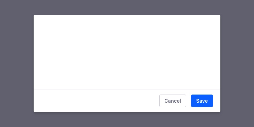
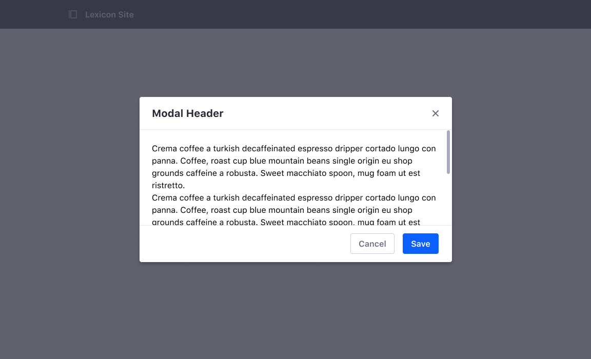
When a modal has a footer, buttons are normally aligned to the right. There is an order of importance and the sequence is (from left to right): borderless button, secondary button and primary button. However, there can be other cases where the footer may need special configuration and host buttons in the right side. In this case, these actions can be represented by a secondary button, a borderless button, or a button link.
The main footer actions as Save, Cancel must be always placed on the right side.
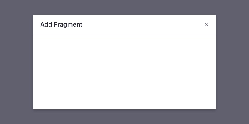
Header and body
This option is used when there is no need to place action buttons in the modal. When using this configuration, we must ensure that the modal provides a cancel button so that users can dismiss the modal.
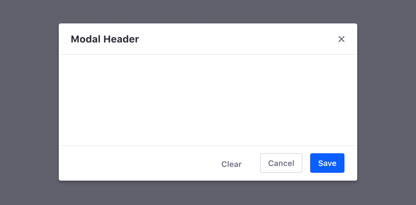
Body and Footer
Use this option when you just need to show text and buttons to agree or cancel.
Content
Modals need to be helpful, polite and need to exhibit a strong visual hierarchy to help users understand and scan the message.
Title
The title in a modal should be concise and clearly display the main purpose. If users need to complete a task, we recommend using the main action as a verb in the title. On the other hand, if the modal is used as a descriptive modal to show properties such as a configuration panel, our recommendation is to use the object’s name or short description.
Description
Modal should speak the user language avoiding computer terms. Explain the goal of the modal using clear questions and descriptions. When describing the modal, provide relevant information that might be useful for the user, such as the name of the item that is going to be deleted.
Actions
Avoid giving unclear options. Users must be able to understand the choices reading the title and the options.
Do

Don't
Size
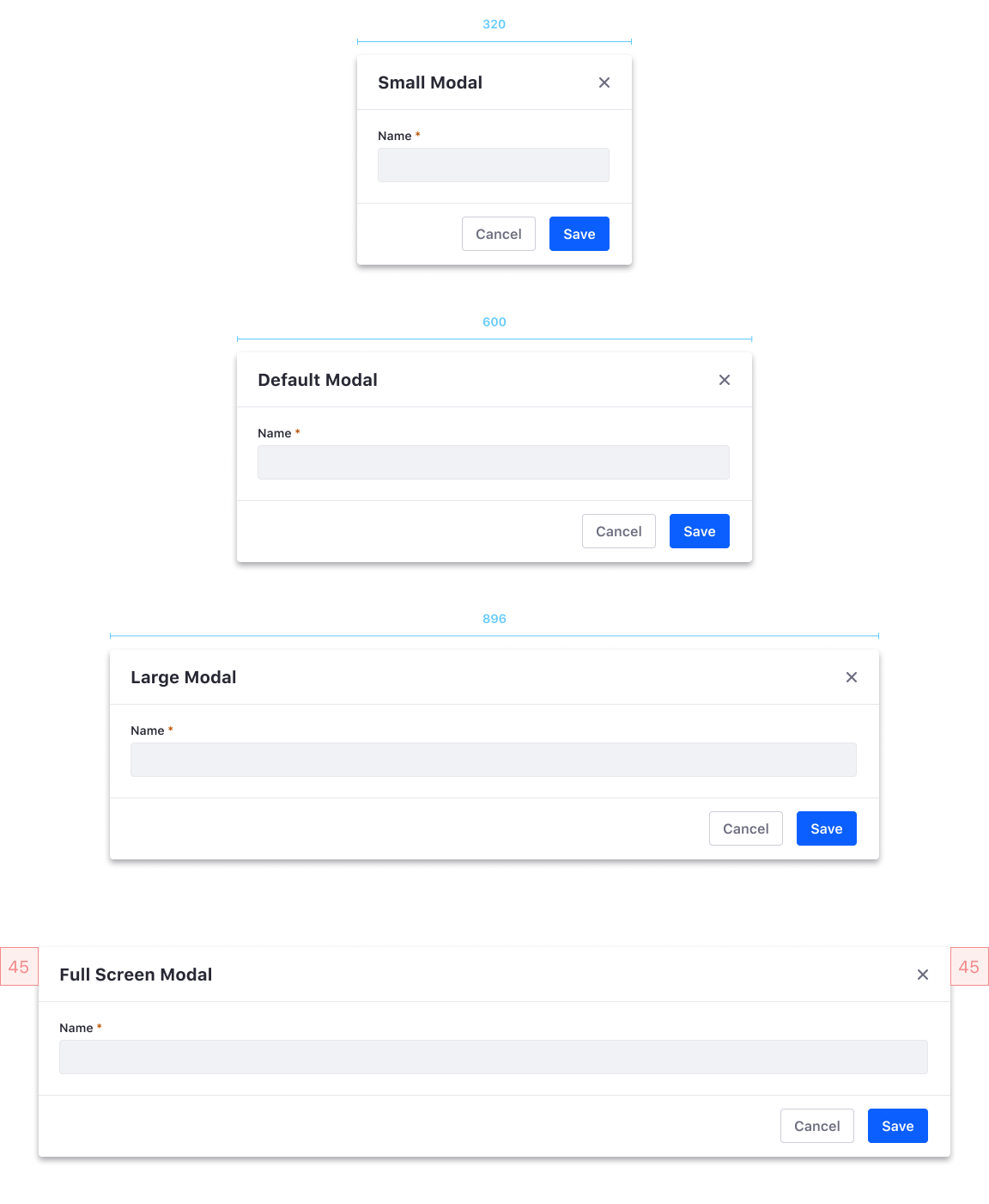
Modals can be built with different sizes to best fit the amount of content you have. Modals can be configured with the sizes shown in the table below:
| Size | Description |
|---|---|
| Small | 320px |
| Default | 600px |
| Large | 896px wide modal on screen sizes greater than 992px. 600px wide modal on screen sizes between 768px and 992px. |
| Full Screen | A modal that stretches to fit the browser window, with 45px padding on every side. We recommend not using the full-screen size, as it looks like a completely new page. If you require this size, we recommend that you consider creating a new page instead of a modal. |
Responsive behaviour
All size modals adapt its width from its initial width to lower values. Once the viewport gets to a mobile size, all modal windows can be adapted into a small modal or to a unique full-screen modal window design stretching the modal to fit the browser window.
Regarding the full-screen size, it will adapt to this design at screen widths 767px and below.
Alingment
Modals should be able to be positioned as desired in the screen. However, if a modal grows and adapts as the same time users input some content, we recommend aligning the modal vertically to the top of the screen.
If the modal is fixed and doesn’t grow while it is being used, we recommend placing the modal vertically and horizontally centered to call users attention. This placement of the modal feels more intuitive and lets users know that they must complete an action before continuing with the task.
Scroll
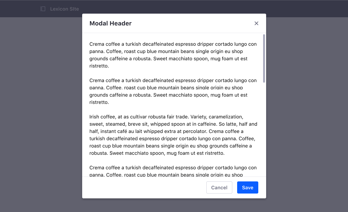
When the content in the body of a modal goes over the limit of the screen, a scrollbar is used in the body to make the overflowed content visible to the user. Actions in a modal with a footer must be always visible within the viewport area.
Dynamic size modal
The modal height must be adapted dynamically to the content height. If the content is bigger than the available space on the screen, a scroll bar must appear in the modal body to scroll the content.
However, a dynamic size modal without footer can grow below the fold indicating there is more content to see. In this case, the content will be revealed as we scroll the main page instead of the body and the background page will remain static.
Fixed-size modal
A specific height can be passed through a parameter to make the height of a modal to a determined size. In case the content is bigger than that parameter, the modal won’t grow in height but will allow scrolling the content in the body.
Types
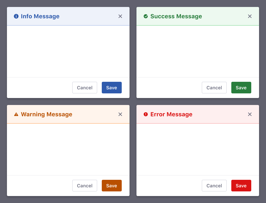
There are 5 different types of modals: default, information, success, warning and error. These last 4 types are called modals for status messages.
Default Modal
The default modal is a classic composition of a modal window with a header, a body, and a footer or a combination of two parts.
Modals for status Messages
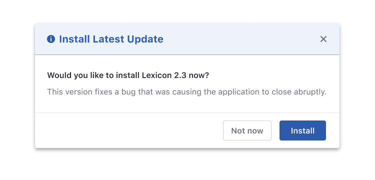
Modal headers can be configured to use modals as status messages. This solution is proposed to give more emphasis on blocking actions that the user must read and pay careful attention.
Never remove the icon in the title, as it provides the modal with a better user experience for accessibility and always uses direct and concrete titles.
Use cases
Status Messages
In a status message modal, action-based color buttons can be used to draw attention and emphasize the meaning of a message.
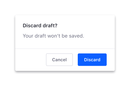
However, if a modal is used as a confirmation message to prevent the user from a critical situation that can’t be easily undone such as deleting a site, Lexicon does not style them, as confirmation messages are browser native.
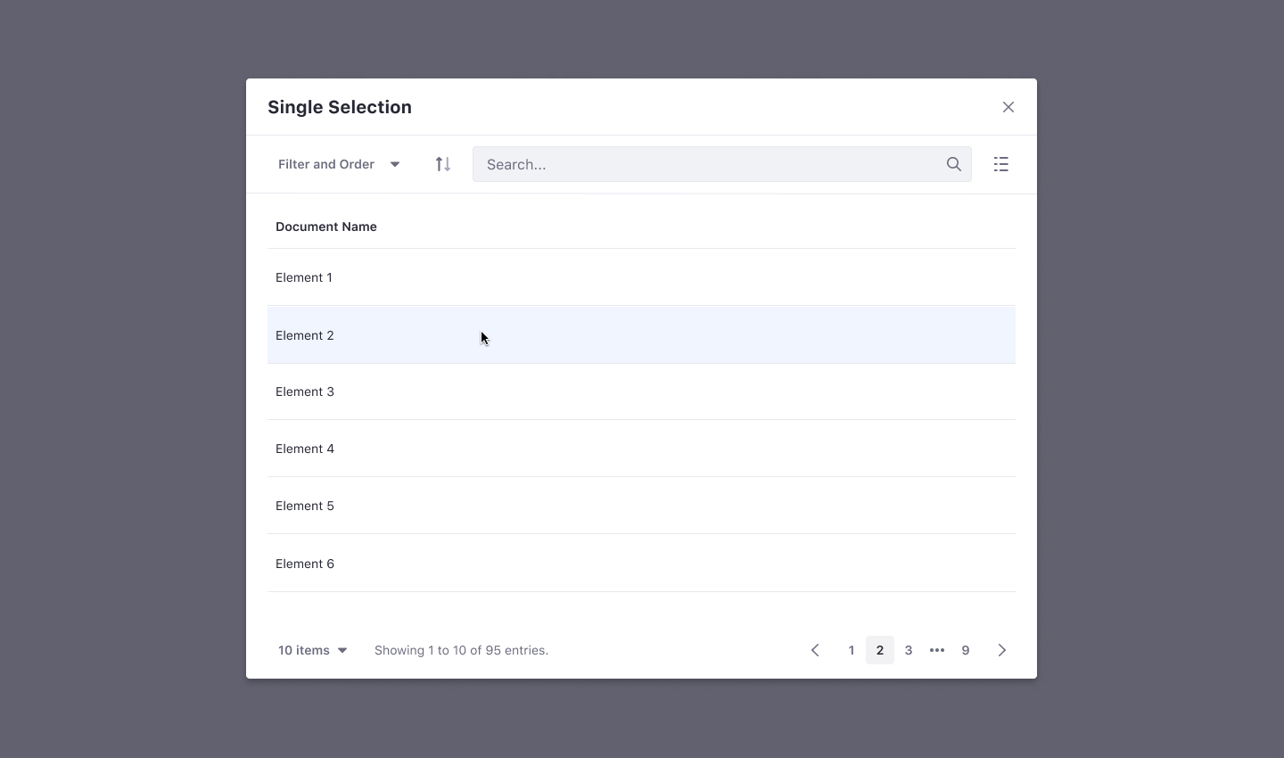
Single selection modal
A single selection must be done by clicking directly on the desired element. In this case, the element must not have a Choose or Select button. The modal doesn't have a footer as there is no need.
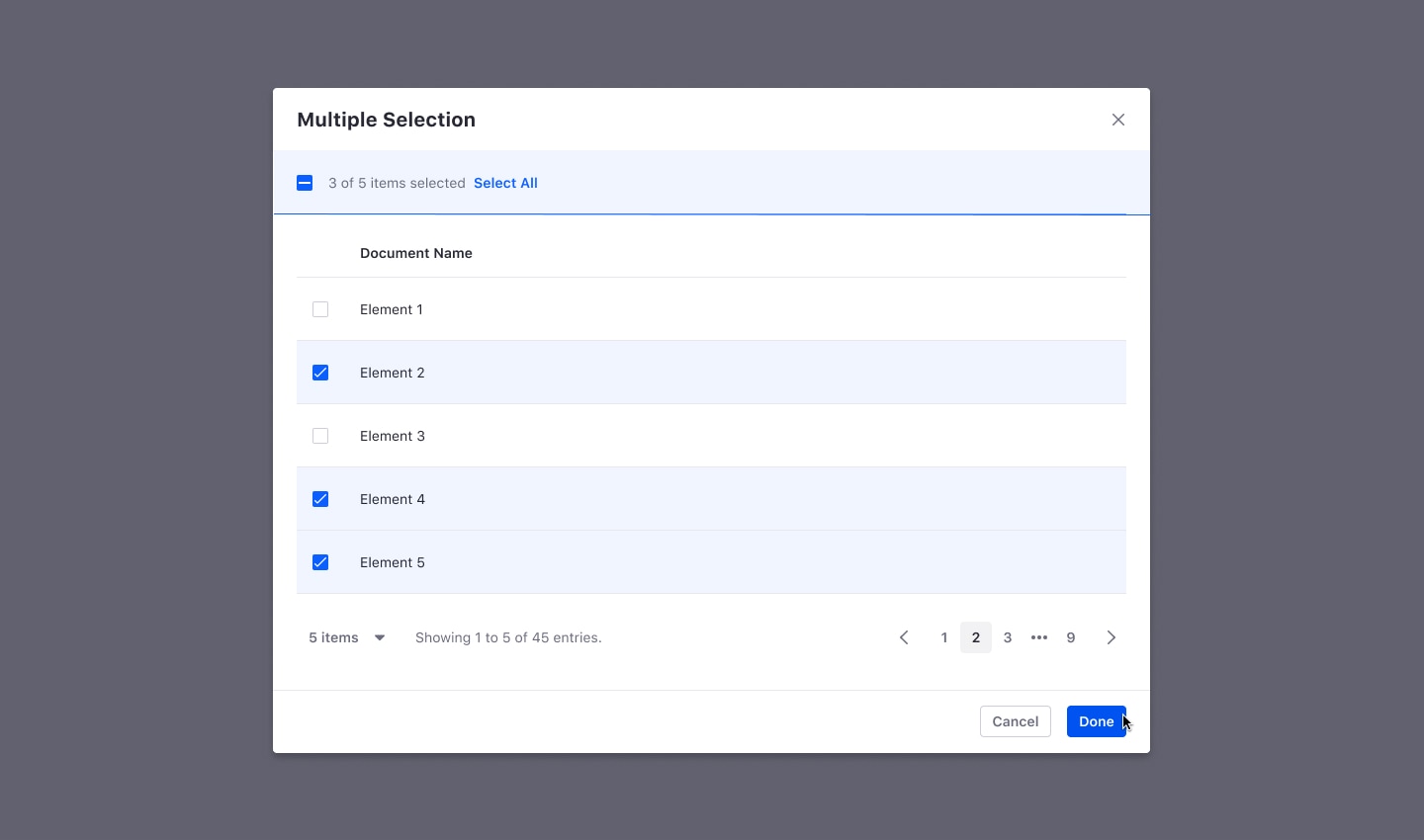
Multiple selection inside a modal
Selecting multiple items in a modal must be done by selecting each desired element through a checkbox. The selection will be finished by clicking in the Done button at the modal footer.
Iframe in the body
You can add an iframe to a modal body. See the iframe modal body in Clay for more information. As default, Iframe modals are full-screen. A loading indicator inside the body of the modal will be provided to load the content.
Loading content
Modals could need time to load the content in the body. This situation is solved by placing the loading indicator (medium size) to the middle of the body both horizontally and vertically.
As the modal background is white, the loading indicator used is the one with different shades of gray.
Modal over modal
Modal over modal is a not desired situation. Please, try to solve this situation in another way, like using a full page or driving the process to the correct place. In case this happens, make sure to provide a good experience preventing first modal closing by accidental interaction (as an example).
Interaction
Mouse
Clicking an element on the page will trigger the modal window.
We must ensure that the modal provides a cancel button or a close button so that users can dismiss the modal.
Users could also close a modal by clicking the overlay area. Avoid this behavior in those modals that require users to take a deliberate action or to complete some information.
Keyboard
It must be possible to trigger the modal window using the keyboard.
Once the modal is on screen, the focus should be captured within the modal until it is closed.
It must be possible to close the modal by using the ESC key in the keyboard, by clicking outside the modal in the shaded area or by easily accessing the close button.
The focus must be restored to the page into the item that triggered the modal when the modal window gets closed.
TAB key at the bottom of a modal cycle the focus back to the first focusable element at the top of the modal.
Shift + TAB moves the focus back to the previous focusable component. If the focus is at the top of a modal, it moves the focus back to the last focusable element at the bottom.
ENTER key submits the modal, if applicable.