Colors
Sign InA specific color palette with the aim to provide the best charts user experience.
Colors must be the last choice you make to differentiate chart elements. Lexicon provides a specific color order and combinations and rules to follow when you create a new chart component, including patterns, dash lines, and shapes.
Flat Colors
Blue
Orange
Red
Teal
Pink
Green
Purple
Yellow
Cyan
Indigo
Gradient Colors
Use gradient colors when you don’t need a chart with embedded texts, but instead you need visual variation between shapes (an example could be a Heat Map).
Blue
Blue
Blue
Blue
Blue
Blue
Blue
Blue
Blue
Use of Gradient Colors
An example use case for gradient colors could be a low/high level Map with different data for every country, with a maximum of nine levels of differentiation.
Rules for Gradient Colors
You can get the same percentages we applied to the blue for each one of the Flat Colors by using a sass color generator. Paste the Flat Color HEX, and you’ll get the percentages. This provides you with a set of colors that you can use as gradient colors.
Reading colors
Colors help identify data and improve readability, but they must be chosen carefully. Choosing the wrong colors can produce the opposite effect. Below are some guidelines for choosing colors are shown below.
Shape & order
Using the proper shape and color order helps avoid color vibration and lets users, including color blind users, easily identify chart sections. A pie chart example is shown below:
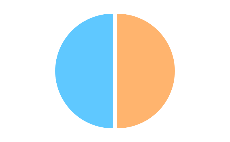
Do
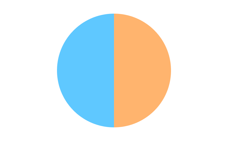
Don't
Lines Charts
Only use borders, 2px thickness, to identify line charts. Differentiate them using dash types, shape types, and colors. Don’t use background/area colors with line charts, as they will only confuse the user.
Area Charts
Background colors may be necessary to identify Area Charts. We recommend that you use 10% opacity for each Area Chart's background color. This lets area colors overlap, without completely obscuring each other. Use the same elements as Line Charts for borders and shapes.
Colors on chart interaction
For clarity and to provide a good user experience, you should let the user interact and focus on single chart elements. The example below resizes the selected element (from the pie or the legend) and highlights it by decreasing the opacity of the other elements to 40%:
The example below styles a Line chart to improve readability. The selected element maintains the 2px border, while the other elements are decreased to a 1px border and 40% opacity:
Text embedded in area
Although, you can include text inside the Flat Colors by default, we don't recommend it. Instead, we recommend that you use organization and interaction to improve text readability. The best place for this is the legend.
Accessibility
Lexicon provides a set of elements that you can use to improve accessibility in your charts. These are covered in more detail below.
Lines and Shapes
Lines and shapes can help you create easily recognizable patterns in line charts.
You can see both elements in action in the example below:
Area patterns
You can use patterns in areas to help identify each section. Lexicon provides nine patterns you can use to differentiate areas:
These patterns should be used in areas that don't overlap, such as the slices in a Pie Chart.