Forms Rules
Sign InA set of rules and recommendations for using form patterns in portal.
Fields’ order
Laying out the fields of your form we recommend you to follow an order of importance. Try to place first as many mandatory fields when possible to make the user task short. Non mandatory fields should go in a second place as they are not so important and the user could like to skip them. In case non mandatory fields are in between mandatory fields the user would expend more time scanning the form.
Fields’ length
Fields must occupy the space you expect your user needs to fill it. The only requirement for fields is to adapt their width to the grid so they behave properly on window resize. Sharp shape forms do not go against Lexicon but we prefer rectangular shape form as they look more clear. In mobile view ports field lengths should be half of the screen or full length.
Mandatory fields
Fields can be mandatory/required to fill in a form. The way to mark a field as mandatory is:

Try to place first as many mandatory fields when possible to make the user task short. Non mandatory fields should go in a second place as they are not so important and the user may like to skip them. In case non mandatory fields are in between mandatory fields the user would expend more time scanning the form.
Repeatable fields
Single repeatable field
A single repeatable field is useful when the user must provide several pieces of information that require the same input type, and the number of fields and field order are not important.
Set of repeatable fields
This lets the user add blocks of the same type of content to a form. Sets of repeatable fields are usually combined with other form pieces. Additional sets can be added and existing sets can be removed.
Actions
General form actions
General form actions are always placed at the end of the form on the left side in the same order: Primary, Secondary, and Link. Form actions should always use the default button size.
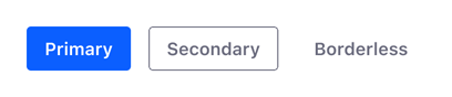
Note: This order is reversed in modals in which buttons in the footer are right-aligned: Link, Secondary, Primary.
Interior form actions
Interior form actions are not as widely used as general actions. Therefore, use the secondary button for interior form actions.

Dos and Don'ts
- Never use two primary buttons together. There must only be one primary button that represents the most important action.

Do

Don't
- Always use concrete words, rather than general words such as "Ok".

Do

Don't
Boolean situations
Boolean situations are those yes/no situations usually solved with checkboxes.
- Try to always be as explicit as possible to let the user know what is the outcome of the decision.
- Do not hide helpful information to the user in popovers, alerts, or secondary text.