Date & Time Pickers
Sign InDate and Time pickers let users select a date and time for a form.
Note: These components are meant to cover desktop browser needs. The OS native component must be used on mobile devices.
This page describes the date and time patterns separately and then describes a pattern that combines the two functionalities:
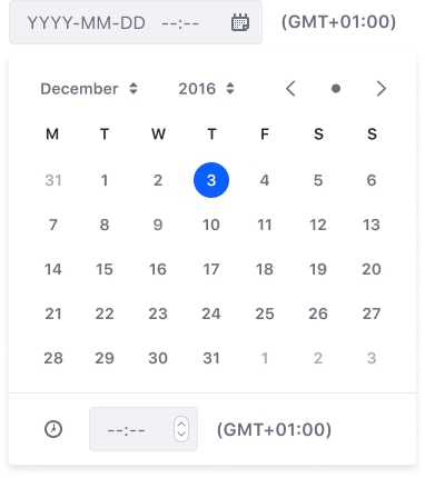
Date Picker
Usage
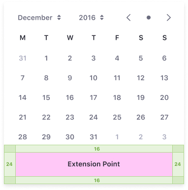
- Month selector: provides the twelve months of the year
- Year selector: provides the available years. This needs to be open so users can select past, present, future, or all dates.
- Back arrow button: selects the previous month on the calendar
- When displaying the first month of the year (eg: January 2019), this selects the last month of the previous year (eg: December 2018)
- Dot button: selects current date
- Next arrow button: selects the next month on the calendar
- When displaying the last month of the year (eg: December 2019), this selects the first month of the next year (eg: January 2020)
- Days panel
- Note that the abbreviated week day labels are not interactive
- The day number must be interactive so the user can select the date
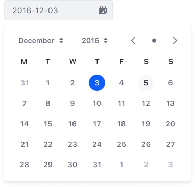
Calendar day states
Default state
The default state displays the day's number, indicating that the user can select it.

Hover state
When the user hovers an enabled day, a light grey circle is displayed behind it.

Active state
A selected day is highlighted by a blue circle.

Disable state
A disabled day is greyed out, indicating that the user can not select it.

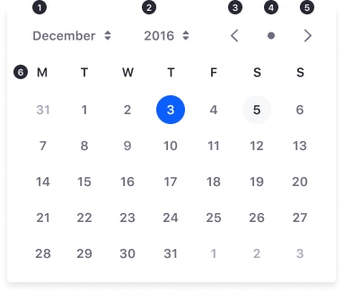
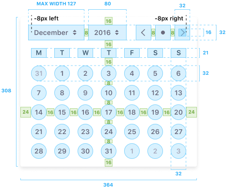
Attributes
Date picker layout and dimensions:
Extension Points
Lexicon provides a recommended area for extension points that is placed right at the end of the calendar panel. If, however, you would like to provide a double calendar, we recommend that you place the calendars side by side, rather than stack them vertically.
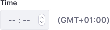
Time Picker
The time picker lets a user select a time from a range of hours and minutes.
The first option to show a time picker will be the native one, this control will be responsible for showing the user the 12 (AM/PM) or 24 hour time selector, based on the OS time format configuration.
If we are in a secure environment where the time format is not determining, we can use a range of hours and minutes:

Usage
You can specify the time zone in the text label on the right side of the time picker.
Date and Time Picker
The time picker is a common extension point when building a date picker, as it combines two related functionalities in the same component.