Typography
Sign InA basic reference for the definition of the visual identity and the organization of the content.
Font Stacks
Lexicon uses two text styles exclusively: A sans serif one, which is the main style, and a monospaced one used to render code.
Lexicon takes an agnostic approach to typography, due to the customizable, multi-language, and multi-platform nature of Liferay's products. Therefore, Lexicon doesn't include any specific font family as part of its framework. Instead, it relies on the native font family of the user's operating system. This way we avoid web-font delivery services or font files stored on the server.
Lexicon and Clay embrace the standard known as "Native Font Stack" as the basis for its typographic source. The tables in the sections below list the font families available for each operating system's native font stack.
Sans Serif
For sans serif style, using Bootstrap's native font stack as inspiration, we also include families for Ubuntu, Oxygen, and Gnome operating systems:
| OS | Font Family |
|---|---|
| Windows | Segoe UI |
| MacOS & iOS | San Francisco |
| Chrome OS & Android | Roboto |
| Ubuntu | Ubuntu |
| OxygenOS | Oxygen |
| Cantarell | Gnome |
| Basic web fallbacks | Arial, Helvetica Neue, sans-serif |
| Emoji Fonts | Apple Color Emoji, Segoe UI Emoji, Segoe UI Symbol |
Monospaced
For monospaced style, we also follow the same approach as Bootstrap:
| OS | Font Family |
|---|---|
| Windows | Segoe UI |
| MacOS & iOS | San Francisco |
| Chrome OS & Android | Roboto |
| Basic web fallback | Courier New, monospaced |
Since Mac OS is the most widely used operating system for design tasks in Liferay and in general, we have decided to use the San Francisco font family for the visual examples in both the technical documentation and in the Lexicon Site.
Type Scale
As we approached the foundational elements with simplification and standardization in mind, so too have we approached type scale. Lexicon's type scale is based on Bootstrap and follows one of the most widely used type scales in web products today.
Lexicon's type scale is based on an initial increase of 2px that grows to 4px in larger font sizes to favor contrast and improve readability. It follows a non-linear arithmetic progression that's understandable and easy to use in both simple and complex applications.
| px | rem | example |
|---|---|---|
| 10px | 0.625rem | Design matters |
| 12px | 0.75rem | Design matters |
| 14px | 0.875rem | Design matters |
| 16px | 1rem | Design matters |
| 18px | 1.125rem | Design matters |
| 20px | 1.25rem | Design matters |
| 24px | 1.5rem | Design matters |
| 28px | 1.75rem | Design matters |
| 32px | 2rem | Design matters |
| 36px | 2.25rem | Design matters |
| 40px | 2.5rem | Design matters |
Basic Formatting
Line Height
Lexicon uses two reference line heights for its typography: A standard line height with a 1:1.5 ratio and another one used for headings with a 1:1.25 ratio.
1:1.5 is one of the most common line height ratios used in web development right now. A body font of 16px (1rem) returns a value of 24px (1.5rem), which is the main reference measurement for the vertical organization of content in Lexicon.
Using a minimum value of 1.5 for the line-height for main paragraph content also improves accessibility for people with low vision or cognitive concerns such as Dyslexia.
We perceive the space between large font sizes a bit differently. The white space between lines appears more prominent. Therefore, it is considered best practice to reduce the line height in font sizes that are 20 pixels or larger. The same is true for uppercase texts. Therefore uppercase headings in Lexicon, despite only being 12px and 14px, also use a ratio of 1:1.25.
| Line Height | ratio |
|---|---|
| Standard | 1:1.5 |
| Secondary | 1:1.25 |
Lexicon's Line height only applies to texts elements that run more than one line, such as paragraphs, headlines, and list group items. For the remainder of the UI elements that contain text, such as buttons, single line input fields, stickers, badges, or labels, this value is defined by the implementation.
Font Weight
For efficiency and simplicity, Lexicon only incorporates three font weights for content:
| Font Weight | Reference |
|---|---|
| Regular | 400 |
| Semibold | 600 |
| Bold | 700 |
The use cases for each font weight are covered in the "Type Styles" section.
Letter Case
Lexicon uses lowercase as a basis, regardless of the specific capitalization rules. Uppercase is only used as a hierarchy resource in the section divider pattern used in dataset display views and forms.
The use cases for each letter case are covered in the "Type Styles" section.
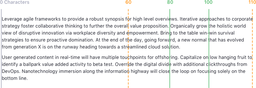
Line Length
To provide optimal reading conditions, we recommend that you use a line width within a range between 60 and 100 characters, including spacing, for medium and long text blocks. This gives a good flow to the reading and reduces the potential for straining the reader's eyes.
Type styles
The tables in this section show the format combinations that are available in Lexicon, along with reference examples.
Headings
| Font Size | Line Height | Font Weight | Letter Case | Use Example |
|---|---|---|---|---|
| 12px / 0.75rem | 1.25 | 600 (semibold) | Uppercase | Dataset section divider |
| 14px / 0.875rem | 1.25 | 600 (semibold) | Uppercase | Form section divider |
| 16px / 1rem | 1.25 | 700 (bold) | Lowercase | Application and Page titles |
| 20px / 1.25rem | 1.25 | 700 (bold) | Lowercase | Form title |
| 24px / 1.5rem | 1.25 | 700 (bold) | Lowercase | Asset title in asset display widgets |
| 28px / 1.75rem | 1.25 | 700 (bold) | Lowercase | Blog Entry title in blogs widget |
| 36px / 2.25rem | 1.25 | 700 (bold) | Lowercase | Blog Entry Detail title |
Paragraph
| Font Size | Line Height | Font Weight | Letter Case | Use Example |
|---|---|---|---|---|
| 16px / 1rem | 1.5 | 400 (regular) | Lowercase | Mid-long read text |
The paragraph element incorporates a bottom margin of 0.75rem (12px) to define the separation between text blocks.
General UI Elements
The Lexicon UI elements are styled using a combination of the format values described on this page. You can check the font attributes of each element on its specific page.
Content Alingment
Content aligment is relevant for readability. Respecting some basic rules, 1rem spacing, make your text easier to consume. Please follow the advices in the images:
| Do |
|---|
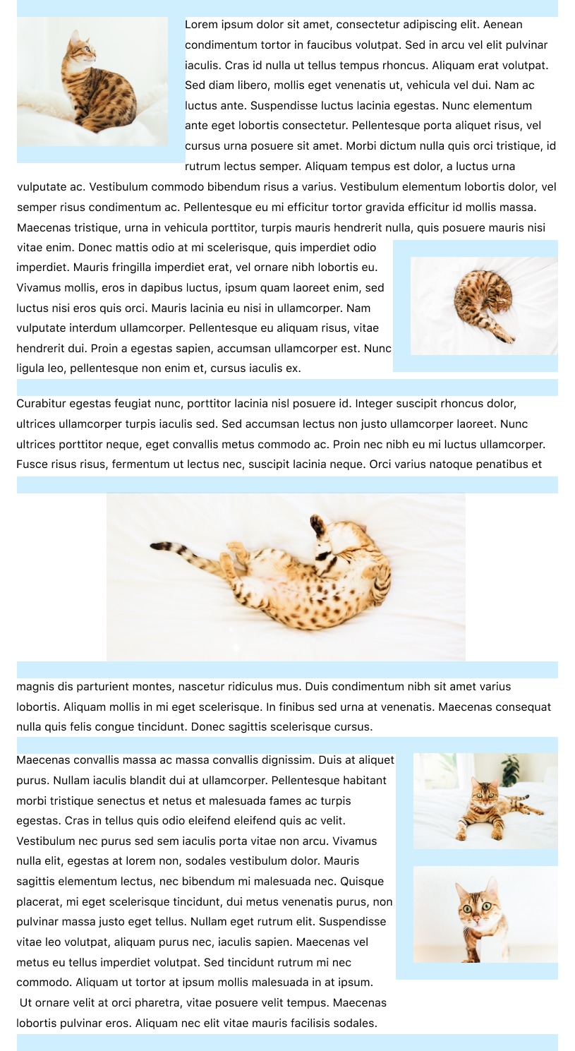 |
| Don't |
|---|
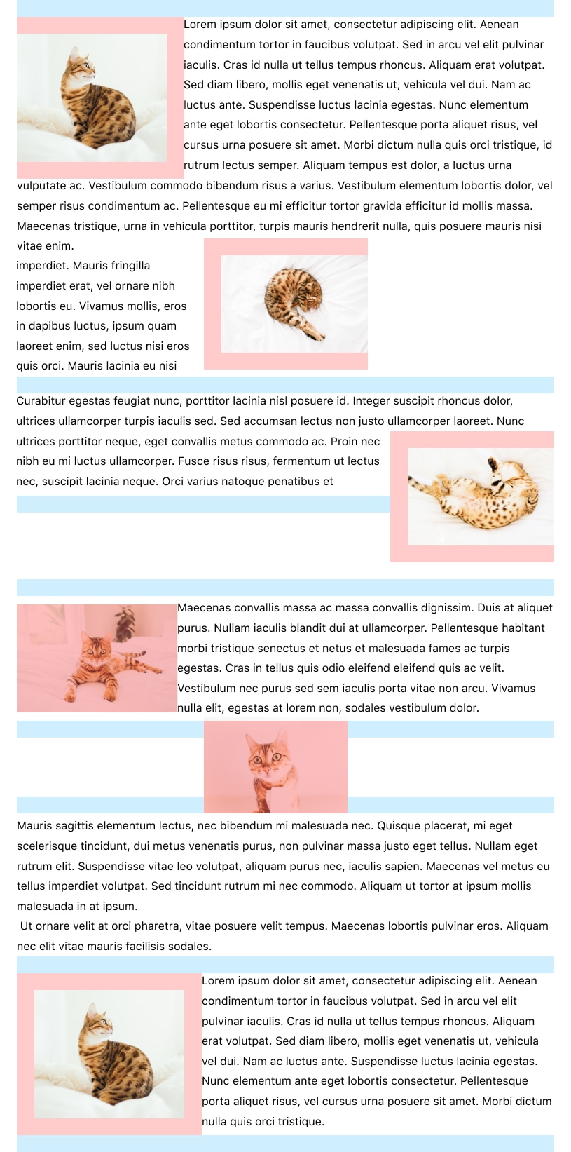 |