Drag and Drop
Sign InA pattern that lets users drag and drop elements in the interface. This can optionally perform an action, depending on the target the element is dropped onto.
Events
Drag and drop interaction is composed of a series of six events:
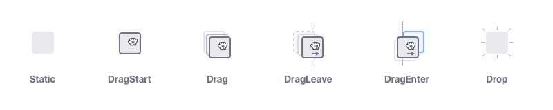
- DragStart: An element starts to drag when it is clicked or Tapped on while holding and Moving the pointer.
- Drag: The element is being dragged.
- DragLeave: The element leaves its original position or a valid target.
- DragEnter: The element enters a valid drop target.
- Drop: The element is released.
- DragEnd: The element has completed the drag and drop interaction. It is successful if it matches the conditions for a drop target.
Actors
The drag and drop interaction involves the following actors:
Pointer
Although a standard element, you must consider the type of mouse pointer you use during dragging and dropping. Please follow these guidelines:
| Type | Usage |
|---|---|
 | Default: the standard mouse cursor. |
 | Open hand: used during the hover state of an element when it is possible to move it around, but selection is not allowed (e.g. a map or a zoomed image) |
 | Dragging: always required as feedback for the dragging action when using a mouse |
Handler
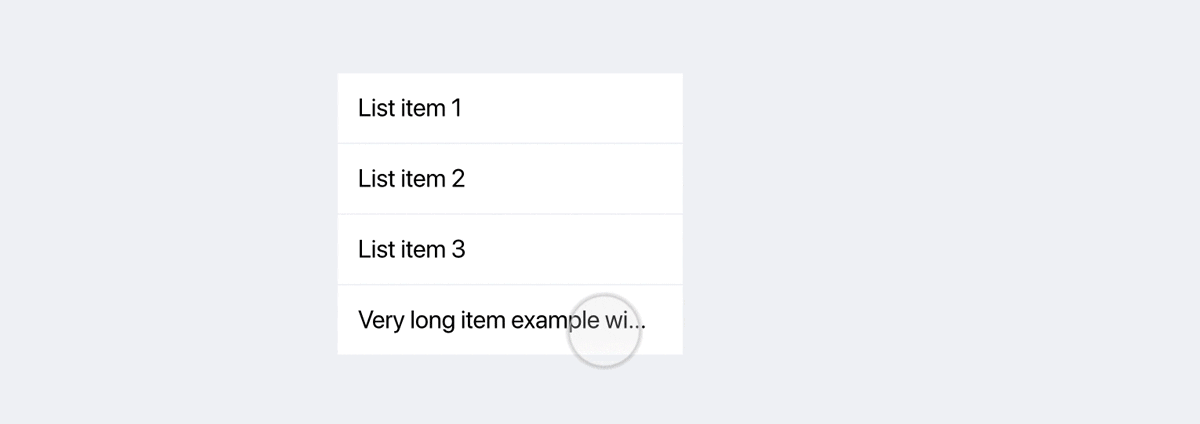
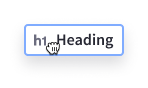
It can be hard to distinguish a draggable element from a standard element in the interface. To properly communicate that an element is draggable to the user, we recommend that you use the drag-dots icon in the element on hover.

A good example is a list of draggable items:

Drag Element & Drag Feedback
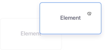
Elements that are draggable must also offer feedback when they are being dragged. There are a couple scenarios to consider:
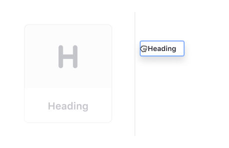
Scale down the item while dragging a single element
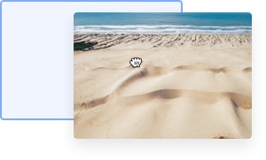
When dragging a single element, the element must be scaled down to 70% and accompany the cursor as shown in the image below:
Using a Representation while Dragging a Single Element
In contrast, an alternative option for dragging a single element is to show a new element with the most relevant information.
Optionally an icon or a thumbnail can be shown accompanying the key field.
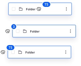
Multiple elements dragging
When dragging multiple elements, you may need to indicate how many elements are being dragged. For that we offer a badge to reflect this amount. Please remember the following while dragging multiple elements:
- The badge must always be placed at the top-right from the cursor.
- Multiple selections are previewed together while grabbing the elements and moving them.
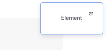
Drag Source
The drag source indicates the original position of the dragged element. It is only visible when the element is being dragged away from its original position (event: DragLeave).
There are two variants for showing feedback in the dragged element's source:
Default: setting its opacity to 40%, as shown in the image below.
Simplified placeholder: For cases that require a simpler approach, you can use a placeholder that is the same size as the element. Transform the element's background color to #272833 with a 4% opacity. This may require modification depending on the use case.
Valid Target
A valid target is the possible drop area of a dragged element. An element can have multiple valid targets on the same page. A valid target changes appearance, depending on the event:
Default: No interaction
A valid target is initially indicated with a grey background and a grey dashed border.
- This can be used in scenarios where files need to be dragged.
- Please use text inside to valid target to improve readability.

DragEnter: Dragging Interaction
Dragging an element into a valid target area activates the target area. When a target is activated, the border line style must remain the same and it must be turned blue, as shown in the image below:
Drop and DropEnd: Dropping Result
After dropping an element inside a valid target, the Drop and DropEnd event is triggered.
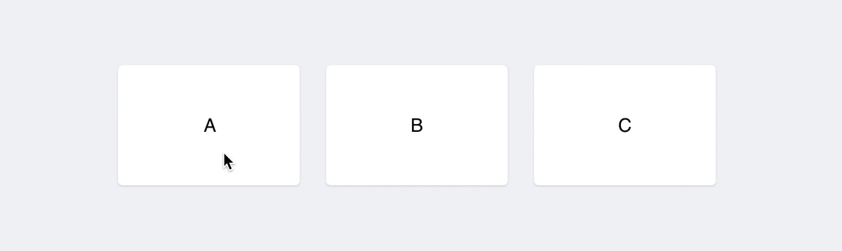
Cards sorting example
You can use the Drop/DragEnd event to magnetize the dragged element to the target. This improves the accuracy of the drag and drop action when the element changes position in the same page.
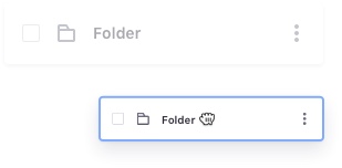
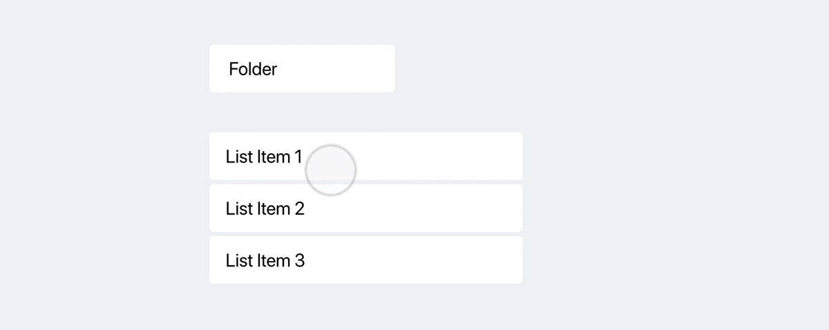
Moving elements to a folder example
Moving an element into another element to change its location (like a folder) will trigger an animation with a border that expands and hides. This indicates that the dropped element was moved. We also recommend that you show a success alert after the action is done. This will communicate that the elements were moved correctly and also give the user the possibility to undo the action, via a link.
Sorting list items example
Another way to define a valid target is to use a blue line of 4px between the elements. We recommend that you use fluid animations to provide a more natural feedback of moving elements.