Info Panel
Sign InAn information container that displays additional data for the content displayed in the main visual area.
This sidebar always enters the screen from the right side of the viewport. It pushes the container in large viewports and slides over the container in small viewports. It usually shows detailed information for an element, without requiring the user to navigate deeper. See responsive behavior for more details.
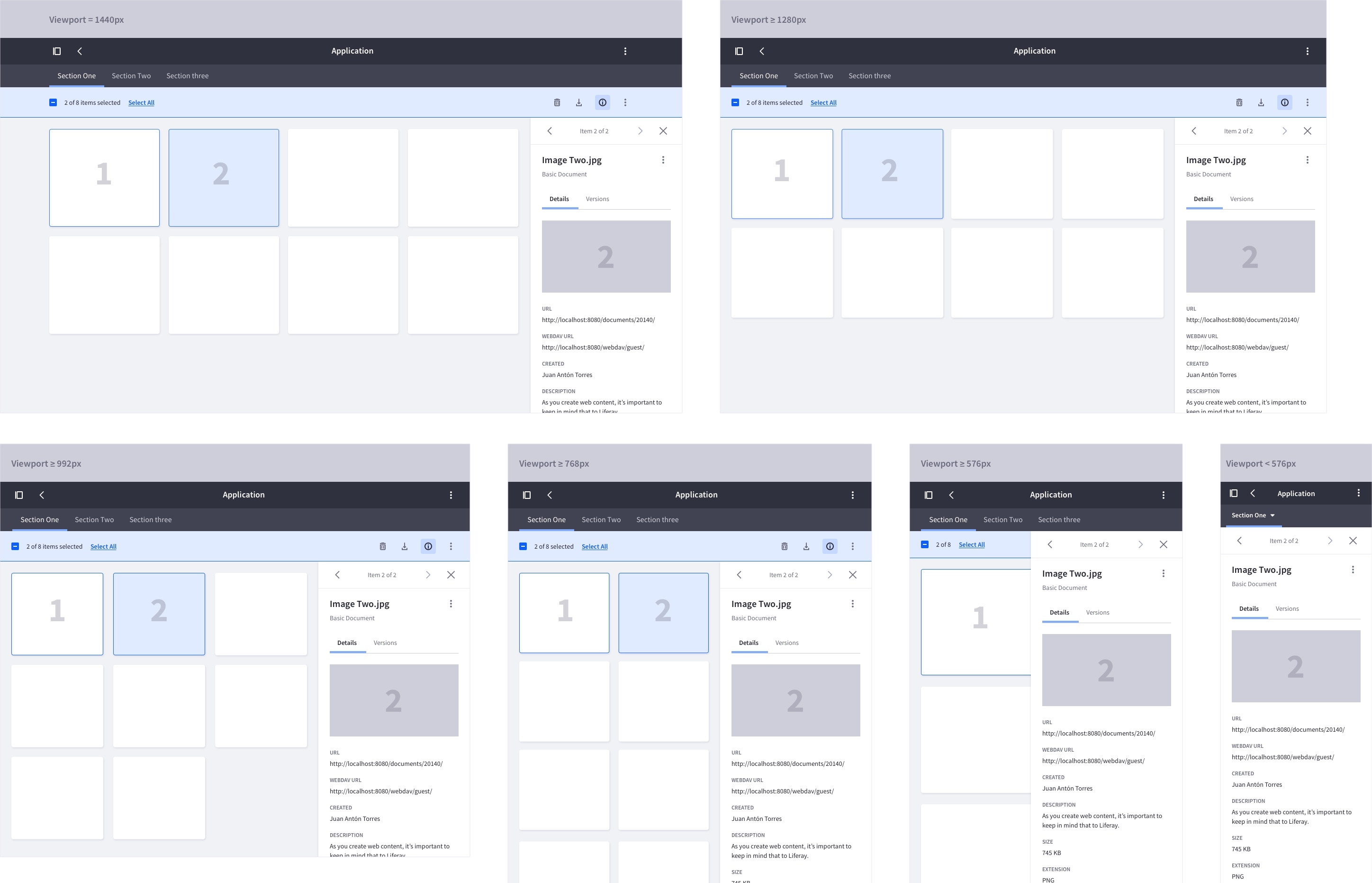
Below are two examples for the "Documents and Media" application:
Components
The components used in the “Info Panel” can vary depending on the application. Following the same example used above, these images show the components used in the “Documents and Media” application:
- Items carousel
- File title and file type
- Content divided by tabs. Information examples:
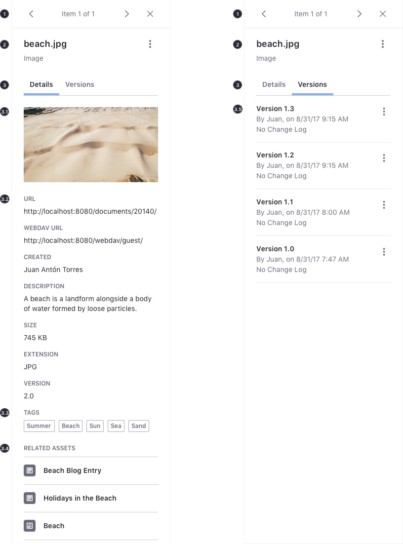
- Details tab:
- Image
- Meta information
- Tags
- Related assets
- Versions tab: 5. Versions list
- Details tab:
Semantics
The tag hierarchy is important in combination with a good content structure of headings, paragraphs and lists.
| File | Tag |
|---|---|
| Title | H1 |
| Type | H2 |
Sidebar Height
The sidebar adjusts to the maximum height of the viewport:
Item Selection and Navigation
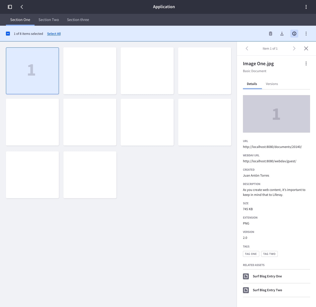
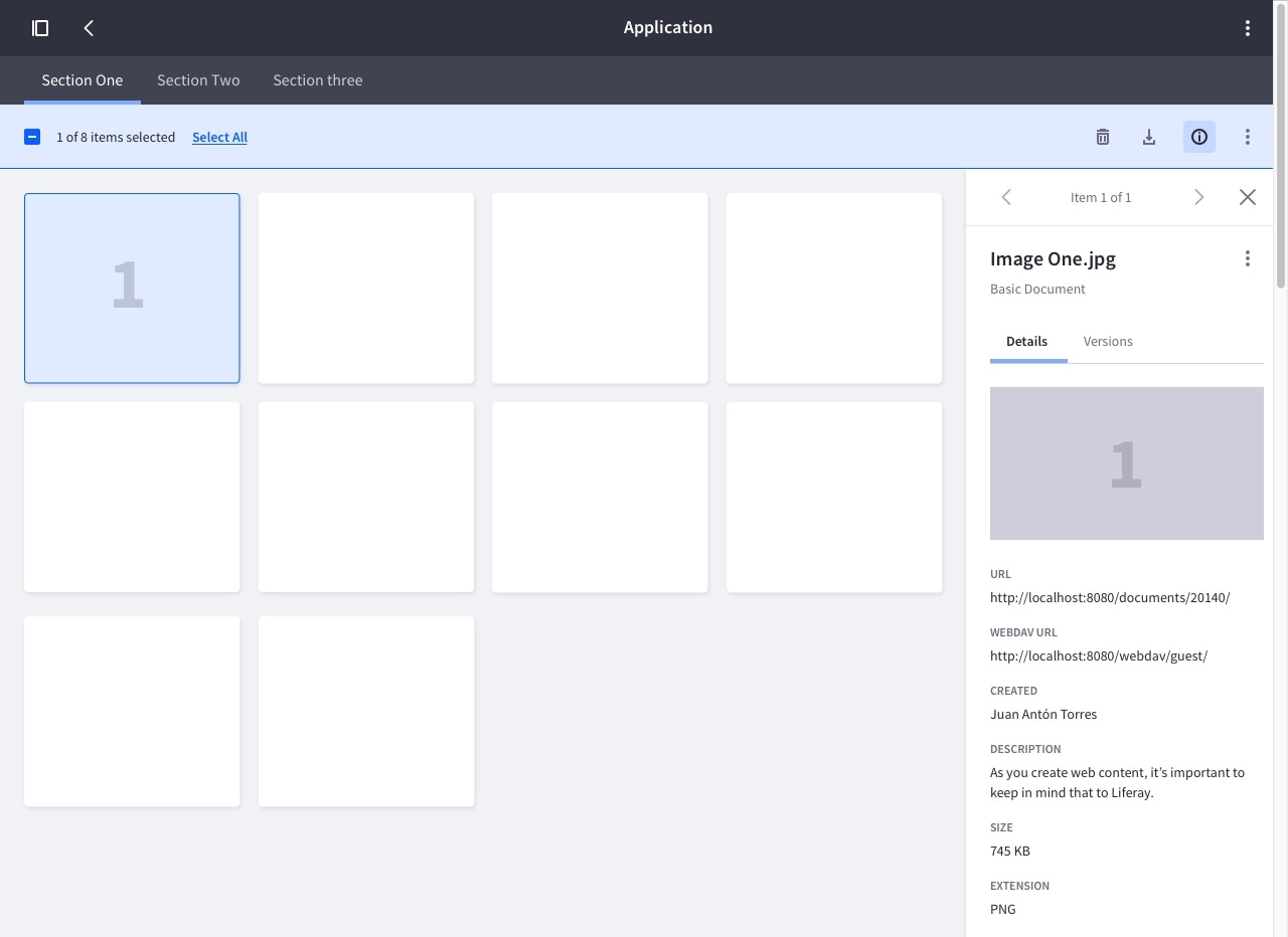
Single item selection
When a single item is selected, the item's information is displayed in the sidebar:
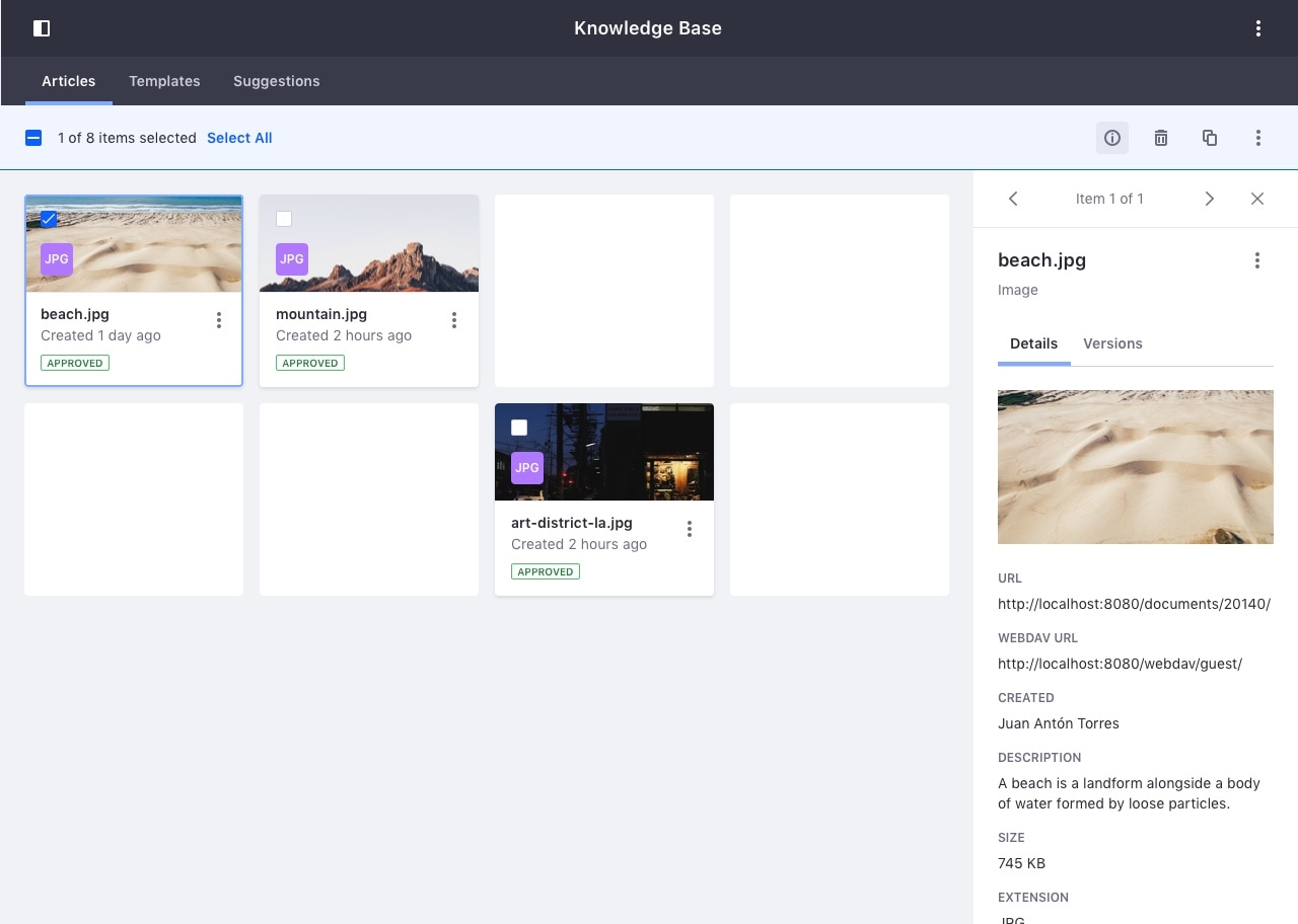
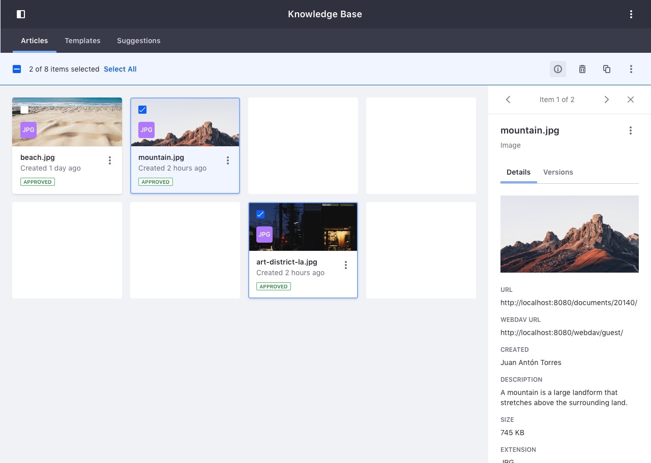
Multiple item selection
When multiple items are selected, the information of the item selected last is displayed in the sidebar:
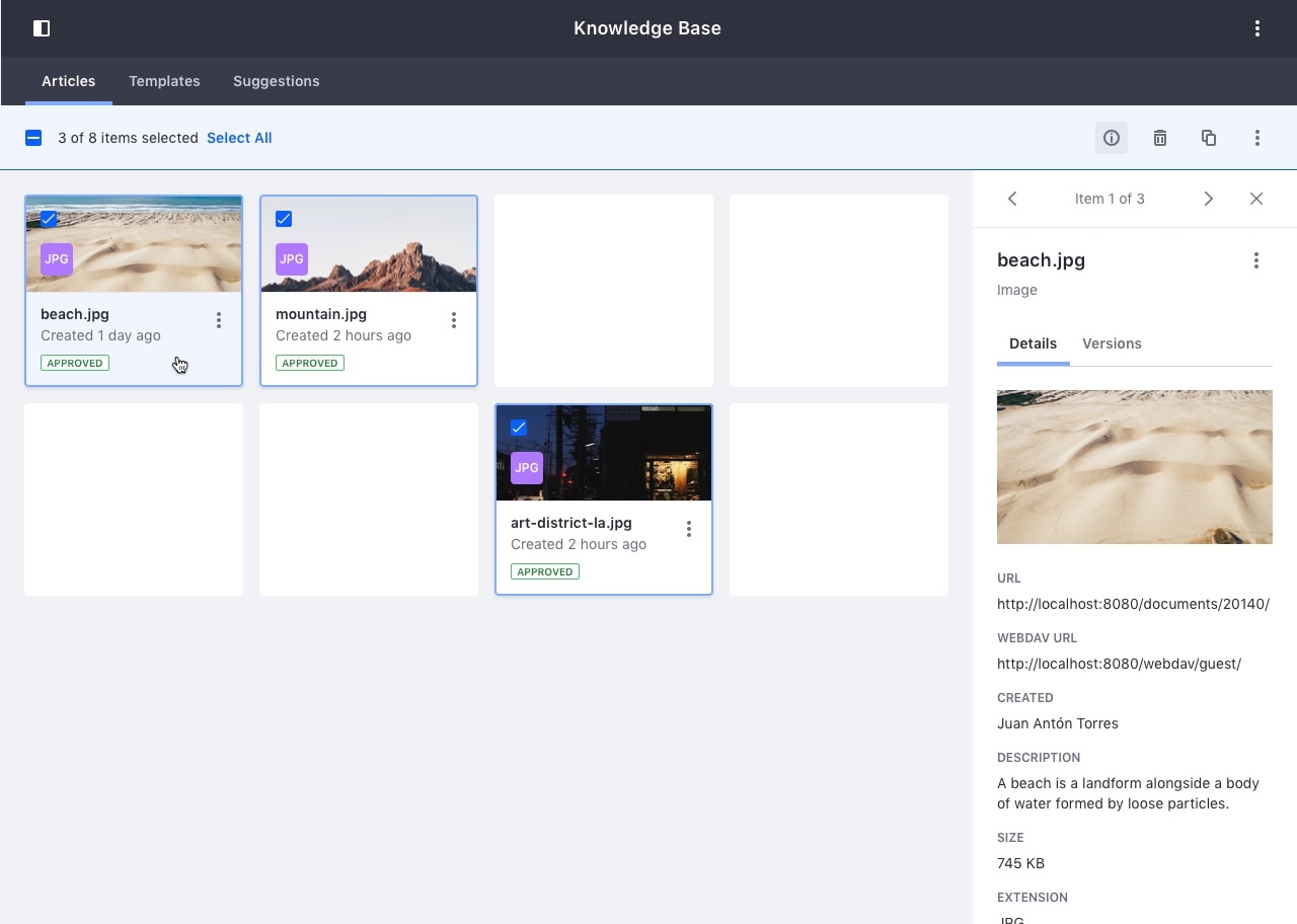
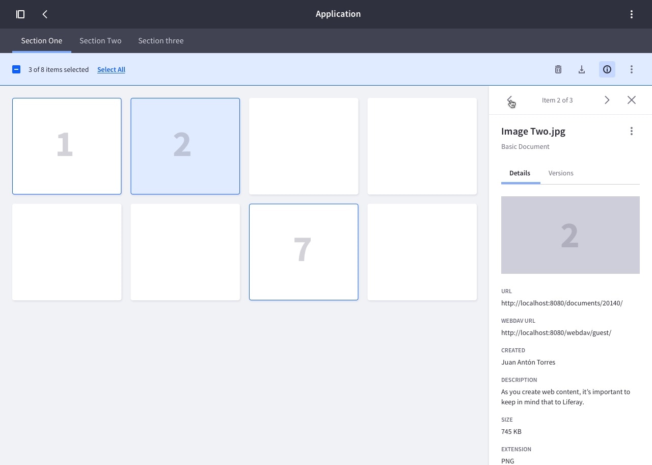
If you deselect one item, the info of the next selected item in the list will be shown in the sidebar:
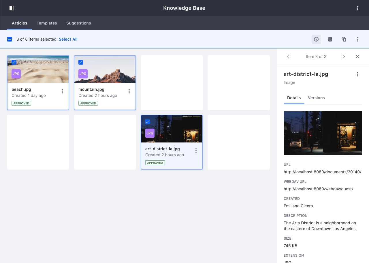
Item Carousel
When there is more than one item selected, you can switch between each item's information using the previous and next carousel buttons at the top of the panel.
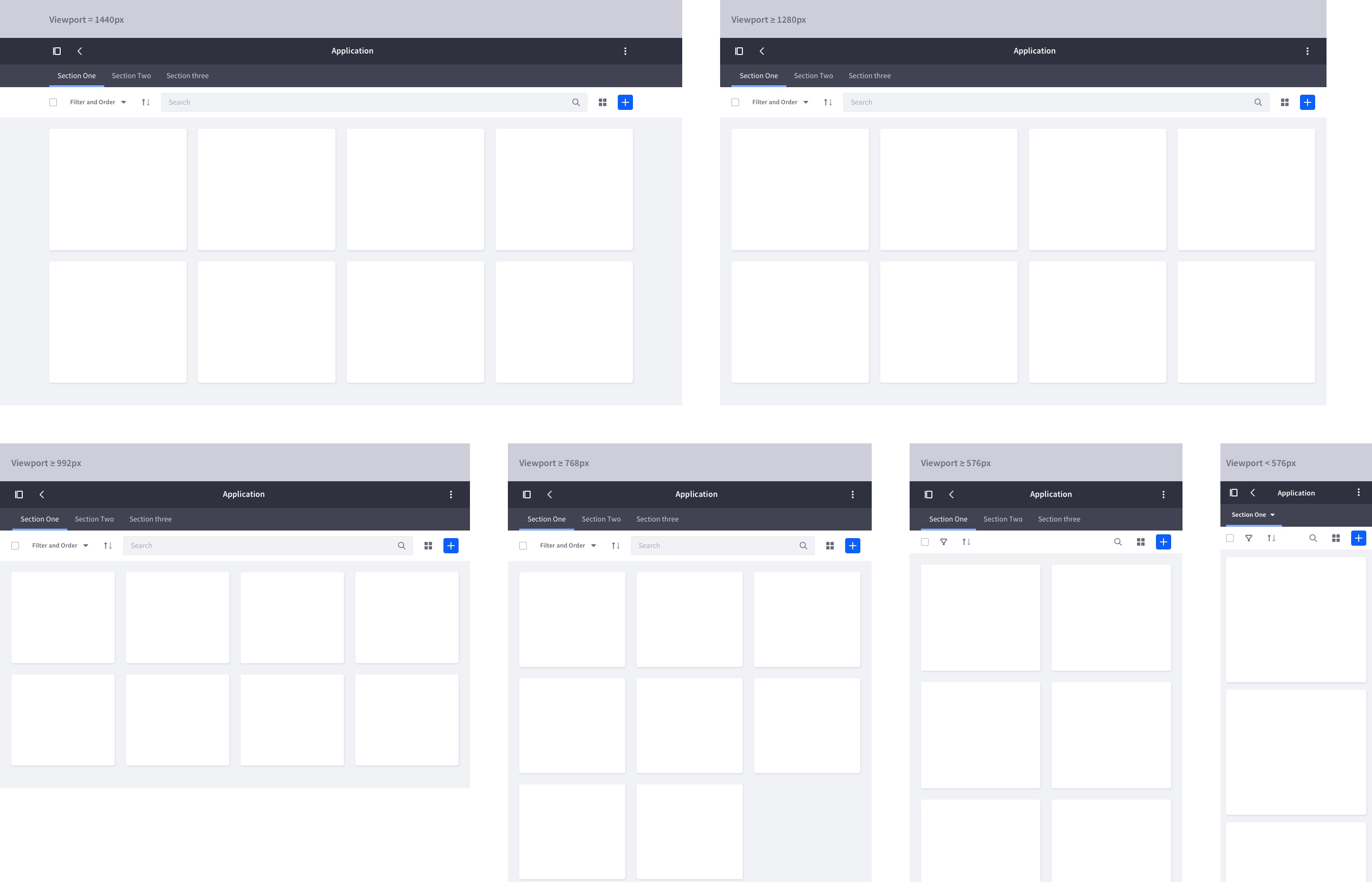
Responsive Behavior
The examples below show the behavior of the “Info Panel” on different viewport sizes, based on the established breakpoints.
They also illustrate the grid of card's behavior on each viewport size, as well as the sidebar's behavior when it is visible at the same time as the “Product Menu”.
No Sidebar Opened
Info Panel opened
On viewport sizes less than 768px in width, the “Info Panel” slides over the container, instead of pushing it.