Management Toolbar
Sign InManagement toolbar is an extension of Toolbar. It is a combination of different components, including filters, orders, search, visualization select, and other actions that let users manage a dataset.


Note: The management toolbar doesn't have gray borders. They are just used in the examples on this page to show its height.
Usage
The Management Toolbar is always part of a bigger structure that works along with other data management patterns such as tables, lists, or card. Its functionality is directly related to them.
The Management Toolbar has two main states:
State 1
It is the default state.
It displays tools focused on filtering, sorting, and data visualization.
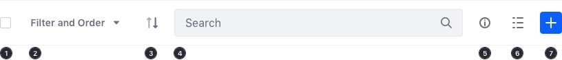
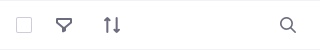
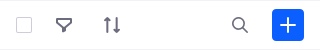
- Checkbox: selects all elements on the current page
- Filter and Order: dropdown with dropdown menu associated. See dropdown with groups for more information.
- Sort toggle button: The arrow identifies the sorting order, depending on the selected option inside the Filter and Order dropdown. The main attribute, usually the name, states the default sort parameter.
- Search bar to filter out the current dataset
- Info toggle button: displays/hides the info panel.
- Visualization button to select the desired visualization
- Plus button to add content and folders into the dataset
State 2
It displays contextual tools when one or more items are selected. Only the specific actions that the selected dataset allows are displayed.
The background color changes to reflect the change of state.
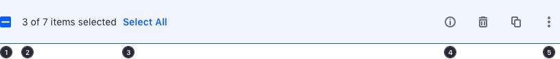
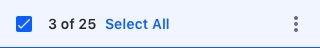
- Checkbox: To select all elements in the current page
- Counter: Selected elements counter
- Select all: To select all elements in the dataset
- Quick actions: set of quick actions with a visual representation
- Actions menu: on interaction, displays a dropdown menu with all the actions that can be applied over the selected dataset.
Requirements
- The Management Toolbar has to be fixed to the page header so it can always be visible during the vertical scroll.
- In the default state of the toolbar, filter and order tools always have to be on the left side, and visualization and information tools have to be on the right side.
- In the second state, the tools for selected items always appear on the right side of the toolbar and vary according to the items selected.
- The Management Toolbar only displays the tools that the type of data displayed requires for a specific context.
- A user can only sort and filter by the elements that are visible in the current visualization.
Examples
Selection
The Management Toolbar follows these rules for selection:
- State 1: A click on the checkbox, off state, selects all the elements on the current page.
- State 1 and 2: The checkbox is marked with a dash when only some of the items are selected in the whole dataset.
- State 2: Even if only some of the items are selected, clicking the checkbox selects all elements on the page.
- State 2: There is a "Select all" that selects all elements in the dataset.
- State 2: Unselecting the checkbox deselects all selected items in the dataset.
Filter and order
A dropdown button triggers the dropdown menu with groups. This configuration keeps the Management Toolbar organized by collapsing options into collapsible menus.
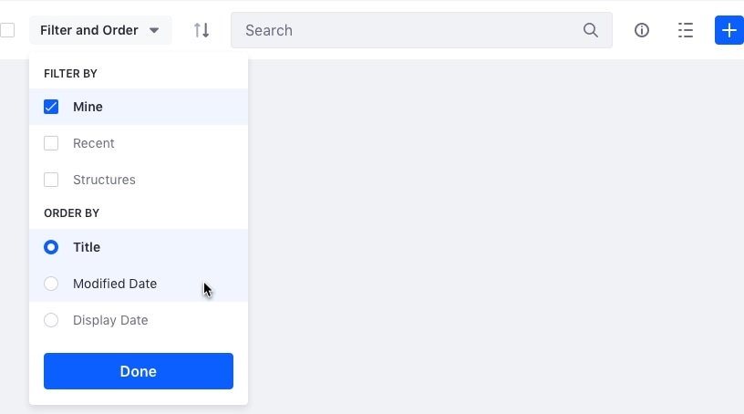
Filter by: used to filter elements from the dataset.
Order by: used to order the dataset by one of the available attributes. If there is no possible order or only one order available, this section must not appear.
Group by: used to group the dataset in different ways. A title and a data provider with the different classification terms per each criteria must be provided. If there is no criteria to group by or there is only one criteria, this section must not appear.
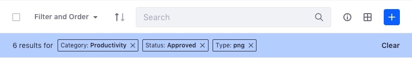
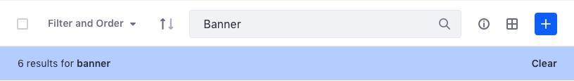
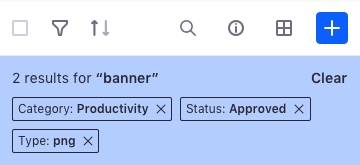
Filters are reflected in the results bar. This bar includes a label for each filter that is applied.
Changing Views
The icon button lets the user change visualization between tables, lists, and cards.
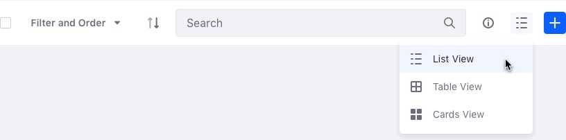
This button must not appear if there is only one possible visualization.
Search
When a management Toolbar contains a search field, and it is used to filter elements, a thing stripe is displayed, informing the user of the total results. This can be combined with filters.
Layout Variations
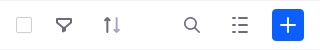
The functionalities that are not required disappear. The Search field expands to fill the remaining space, as shown below.
This example displays all the features:
There may be cases where selection or filters are not required. In these cases, you can remove the elements from the Management Toolbar that you don't need. In this example, we only need the search field, a button to change visualizations, and the plus button to add elements into the dataset.

You may not require the visualizations and the plus buttons. In this case, you can remove these options, as shown in the layout below:

Having the management toolbar only configured with the search field is the minimum possible configuration.

Last but not least, a very common case, and aforementioned in the View Case section, is to go without the visualizations button:

Mobile
State 1
On mobile devices, all actions are transformed into icons to conserve space and condense the toolbar to only one line. This provides more space for content, rather than tools.
State 2
In contrast to the desktop version, no actions are available outside of the actions menu.
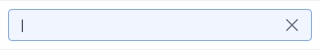
Search
The magnifying glass icon triggers the Management Toolbar to switch to the search state. The search field expands to the width of the whole bar to provide the best user experience.
Search results
Tap the entry in the search field to view the results. The Management Toolbar returns to state 1 with a summary of the results found.
Mobile Layout Variations
The search field grows to fill the remaining space leftover from features that were removed from the Management Toolbar.
The example below displays all the features:
This example only includes the options to change the view mode and add new elements:

This example includes the options for selection, filter, and order:
The dataset display in this case, only allows users to Search.

The most common configuration includes all options, except the ability to change the view.
Note: The management toolbar doesn't have gray borders. They are just used in the examples on this page to show its height.