Forms Validation
Sign InA description of how validation patterns must be displayed within form structures.
Error Messages
Sometimes errors are unavoidable even though they are not expected. When an error happens messages are used to describe the problem, including information on how to fix and prevent said error. To keep these messages user-friendly, validation messages in forms should:
Describe the nature of the problem
Using an honest and clear language.
Supply enough information to minimize mistakes
Providing examples with hints or explicit help to eliminate the possibility of errors.
Be given in real time
Solutions appear as the user is typing.
Inform about valid format rules
Prevent reiteration
Describing how to fix the error committed.
Partial validation
This type of validation occurs on the fly, while the user fills in the form. It doesn't require the user to fill in the entire form or the form to be submitted to see it.
INLINE
Forms can have inline validation. All form fields that can be checked against a set of rules while filling them in must show success or error state to the user.
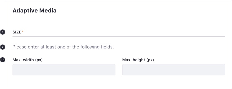
AT LEAST ONE FIELD REQUIRED
There may be a case when only one indeterminate field is required in a form or fieldset. In this case, follow these guidelines:
Set a mandatory mark in the fieldset title.
It is recommended to include a short help text below the title. Ex: "Please enter at least one of the following fields."
All fields must be marked with the corresponding validation color.
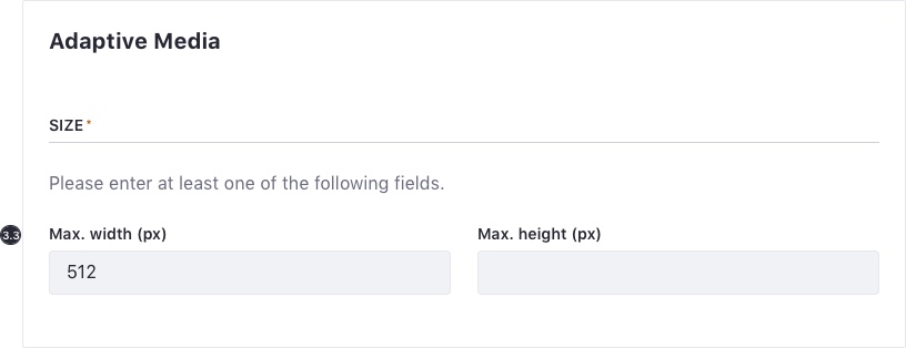
- Only one validation message is shown for one of the input fields in the group, preferably the first. A good help message specifies the error to the user and explains how to solve it.
- Once the validation conditions are met, the alert message disappears.
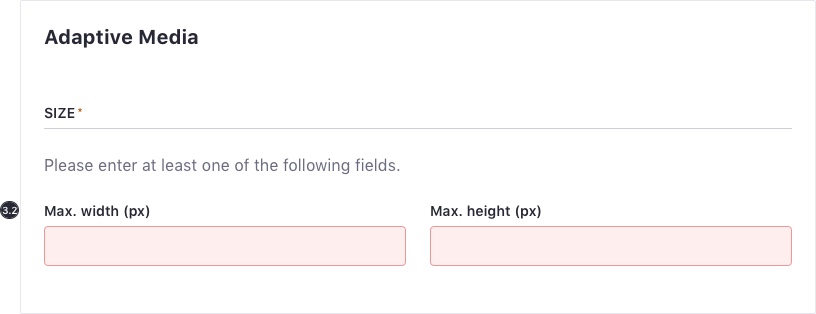
- Losing focus triggers validation, unless a field in the group is already focused.
Full validation
Forms are validated when they are submitted via the submit action. When a form is completely validated, it first runs partial validation on all of the mandatory fields. If this is successful, a service is called.
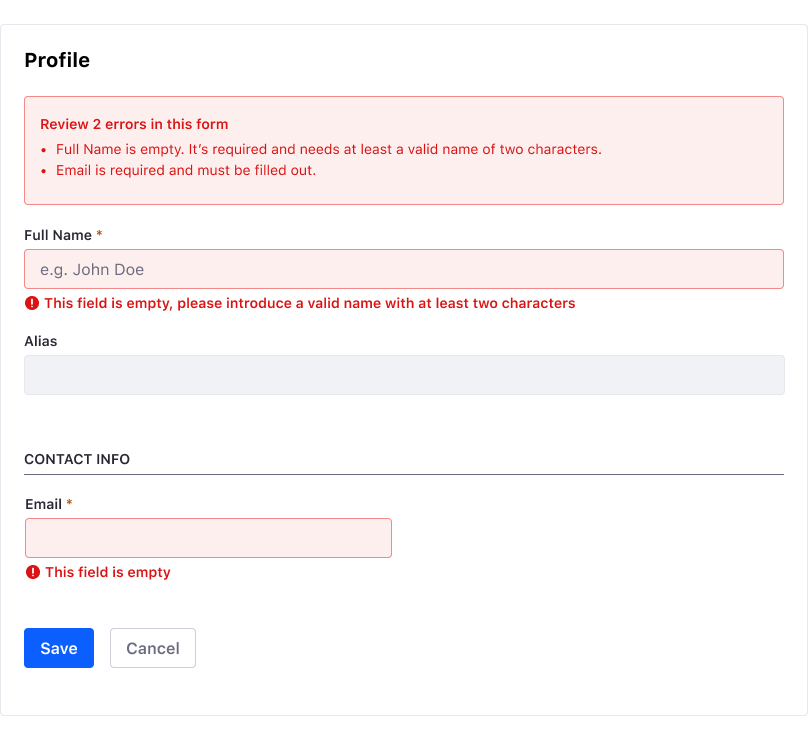
ERROR SUMMARY
If errors occur after triggering a full form validation. List them at the top of the form, between the title and the first field of the form using an embedded error alert. It should have a descriptive text with the number of errors optionally. Each error listed should:
- Include the label of the form, to help the user recognize the control.
- Include an in-page link to the corresponding form control to make access easier for the users.
Additionally, when the submit action is triggered the focus must be located on the Summary. Consecutively, each time tab is pressed, focus must go through each link error.