Table
Sign InA table is a specific pattern for comparing datasets in a very direct and analytical way.
Usage
A table view is useful for comparing entries that need exhaustive comparison. Tables display text heavily. If you need to display images, we recommend that you use lists or cards.
A table entry or row doesn't support two different data types in the same column. The is due to potential comparison and sorting problems.
When a table is used together with the management toolbar, the table entries must include a checkbox since the selection and actions are reflected in the management toolbar. See the dataset display for examples.
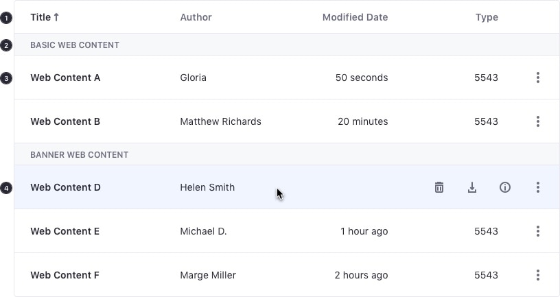
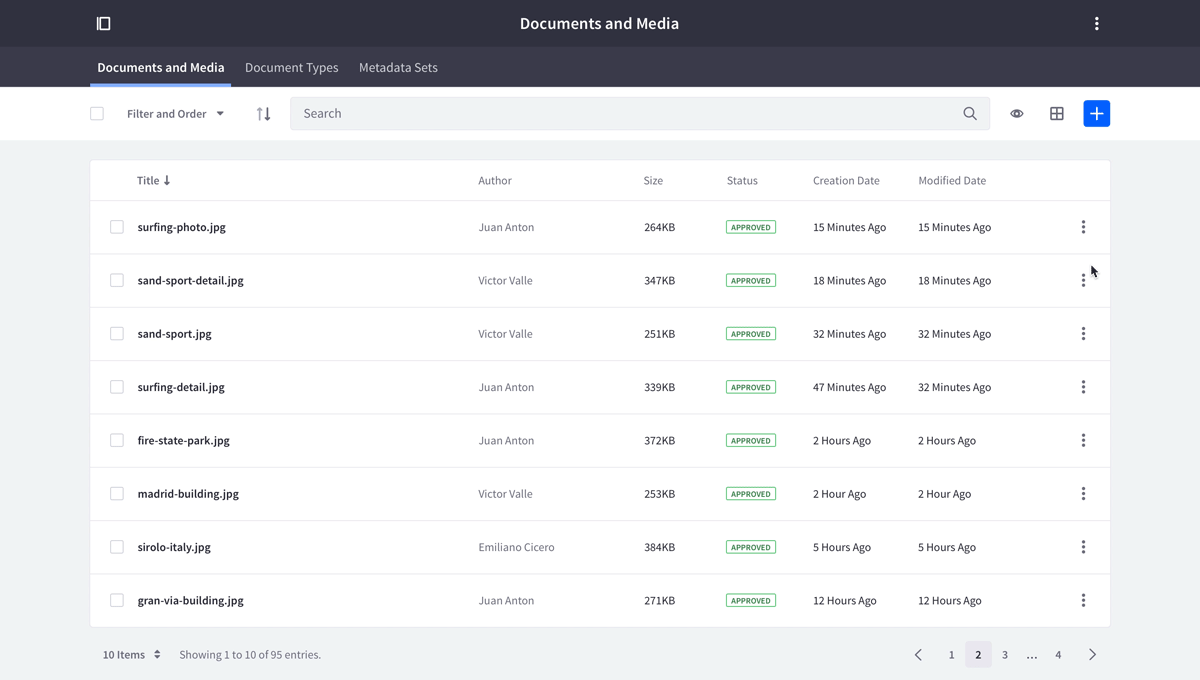
Tables contain the following attributes (labeled in the image above):
- Table header
- Section
- Row
- Row interaction
Table header
Tables headers contain the following elements:

- Selected column
- Sort direction icon
- Remaining columns
Default column headers are left-aligned, 14px and have semibold weight. However, there are other cases in which column headers can be center or right-aligned to improve readability and alignment with table content. For example, when using numbers in a table, we recommend aligning the column header and content to the right.
A table header can have these interactive attributes:
- Sorting (if available): The column header has an arrow next to it indicating the sort direction: descending Z-A (down arrow) and ascending A-Z (up arrow). The text is underlined on hover state.
- Drag & drop (if available): the column header shows a drag-icon on hover state.
Sections
You can use the table group separator to group a series of table entries.

Row states
Default state

Hover state
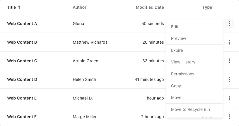
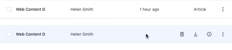
When a user hovers over a table row, quick actions from the actions menu are displayed for the element. A maximum of three actions (represented by icons) can appear.
When the row is selected, the actions do not appear on hover state.

Selected state

Row attributes
Table rows contain the following attributes:
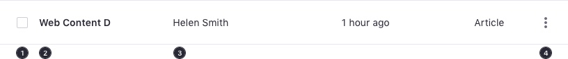
- Checkbox
- Main column text
- Columns
- Actions button
Table rows on hover contain the following attributes:
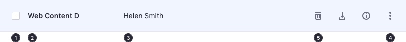
- Checkbox
- Main column text
- Columns
- Actions button
- Quick actions displayed on row hover
Row interactions
- A table entry can have a checkbox, a radio button, or neither of them.
- You can select a row by using the checkbox or radio button, depending on the selection type in the list. The background is not selectable.
- You can add links to a row to navigate to other areas.
- A row can have related actions. If there is only one action for the row that can be represented by an icon, you don't need to use an actions menu. Otherwise, include an actions menu on the right side of the row.
- Use the main text as an action for the following use cases:
- A Folder that navigates to the next level
- A File that navigates to its detailed view
- Never use the row action to view a preview. This is always a secondary action placed inside the row's action menu.
- If the link drives the user out of the site, please identify visually that this link will open in a new page.
- A cell entry can include a button as the main action of a table entry. An example could be "Execute".
- You can drag and drop selected elements into a folder. A click and drag over a non selected element implies selection.
Row hover
Row Interaction Limitation
Note that the actions menu has a limitation on the hover state. It is not possible to have a row with a button in the default state because it would be impossible to click on it while the actions menu is active in the hover state.
Dos and Don'ts
Never hide an action in the table since both static actions in the row and quick actions are not compatible. Quick actions will always hover an action placed in the table row and it will be impossible to reach, as shown for the "Edit" button in the example below.
Do
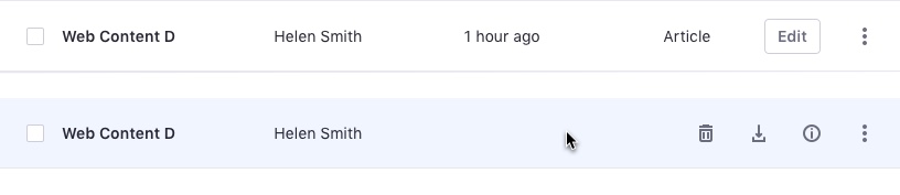
Don't
Columns drag and drop
Drag and drop is configurable for tables. This lets the user exchange column positions, excluding the first column. Tables that allow drag and drop provide the action in the column's header.
Columns visibility
You can only toggle visibility for columns that work with a management toolbar that implements this feature. All columns can be hidden, except the first one since it is the reference column.
Columns layout
A table can contain one or more columns, and deciding how to place them properly can be cumbersome. We provide a set of guidelines that you can follow to make this decision easier.
While the main column must always be placed on the leftmost side, the remaining columns can be placed in a couple different layouts:
- 2 columns: Place the second column right next to the first column, while respecting the margins.
- N # of columns: Place columns equidistant.
Content format and alignment
- Headers must always be left-aligned and semibold.
- The first column's value must always be semibold.
- The remaining columns values must be regular font weight.
- Text values, dates, stickers, labels, and badges must always be left-aligned.
- Numbers, with or without unit, must be right-aligned.
Example