File Upload
Sign InFile Uploader is a pattern that lets users select and upload images to the system.
Simple File Upload
Simple file upload is used to upload a simple file element.

Multiple File Upload
Inside this categorization we have two different patterns: file uploader and image uploader. Both are pretty similar, but the second one is more visual and adapted to the situation.
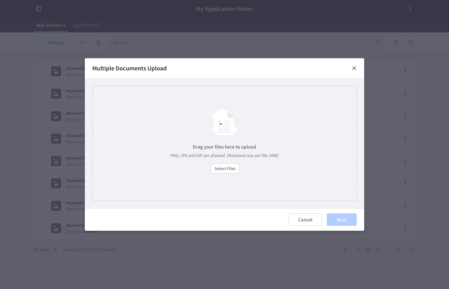
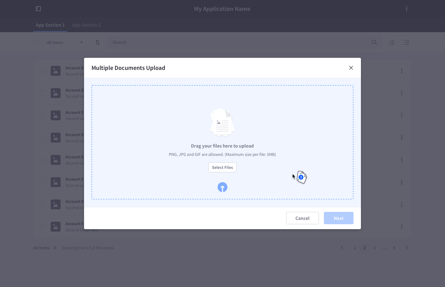
Both uploaders share the same upload area which has the following attributes:
It must always have two different states:
Default
- Message: clarifies the permitted file extensions and max size of each file
- Secondary button: users may not always want to use the drag and drop feature. The button opens the operating system's file uploader with the option to select multiple files.
Active
- It contains an animation that invites users to drop documents on dropover state.
Once files have been added to the upload system, there must be clear options to upload more files: An explicit button and a drag and drop option.
The scroll must only be vertical if needed.
Each file can be deleted individually.
Each file can retry the upload individually.
File Uploader
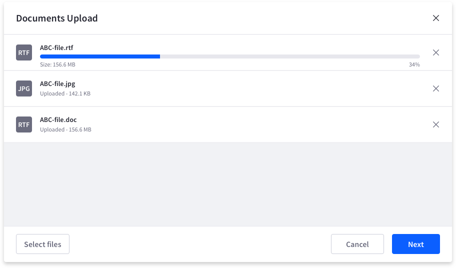
- File uploader accepts any file, including images, pdfs, docs, etc.
- After dropping files in the area, the upload status of each file is displayed in a list.
- Files that didn't complete the upload process provide the option to retry the upload.
- Every file must be removable.
In this example, the file uploader works together with a form to predefine configuration options for the uploaded files:
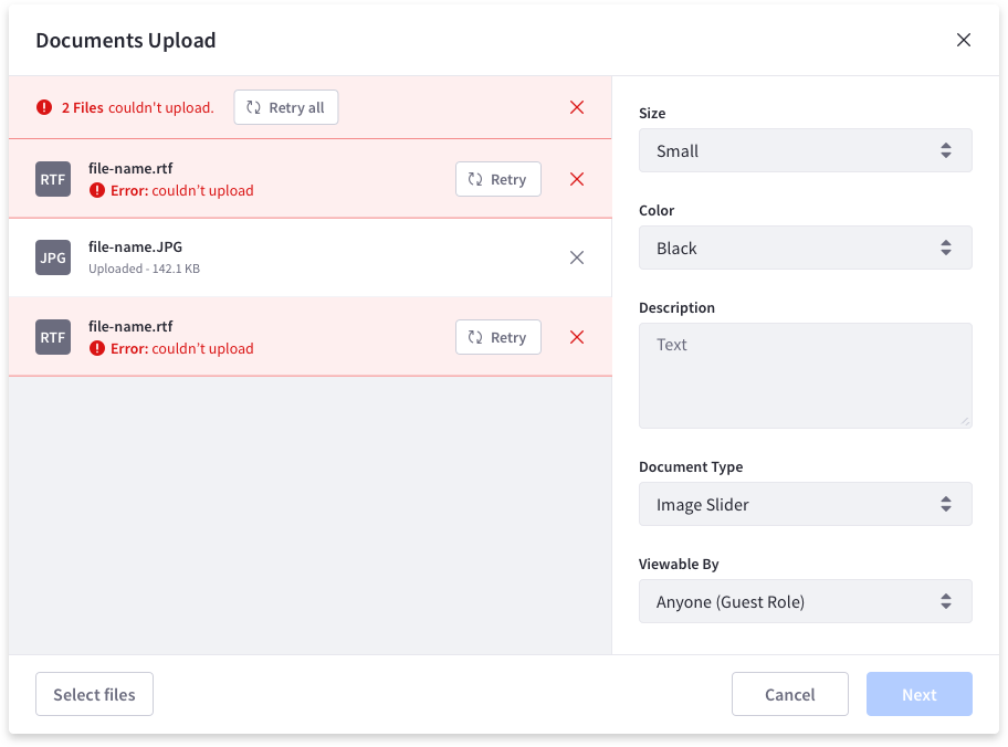
Files can be in different states:
Default state: when the file is already uploaded

Upload state: during the upload process

Error state: when the file upload has failed
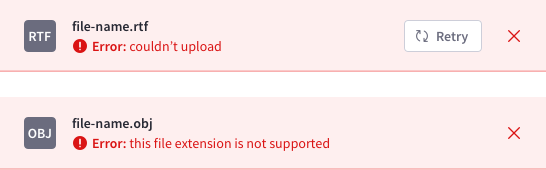
Image Uploader
- Image uploader only admits image file types.
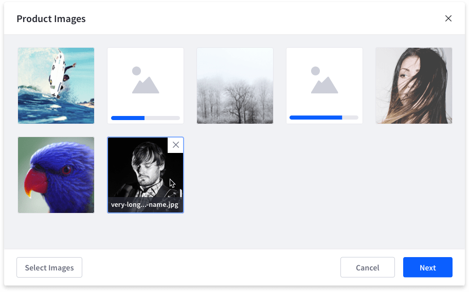
- After dropping images in the area, an image grid appears, letting the user see the upload process.
- The drag and drop area fills the image grid. This area must have a vertical scroll. The cell next to the last uploaded image must have a "+" to invite the user to upload more files. Clicking in that cell opens the file upload for the specified files.
- Each image is represented by a square thumbnail.
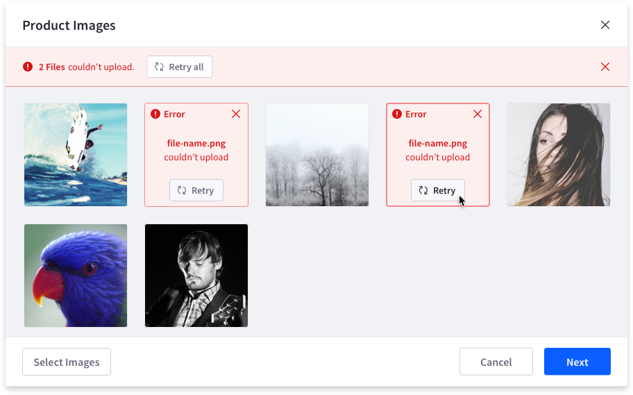
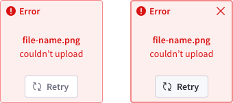
- Images that didn't complete the upload process provide the option to retry the upload.
- Every image must be removable.
Images can be in different states:
Upload state: during the upload process. The default state is shown in the image on the left. The hover state is shown in the image on the right.

Error state: when the file upload has failed
Default and hover image states: when the file is already uploaded

The image uploader may require a checked state for certain options: