Forms
Sign InForms obtain user data and transmit it to the system to either store the data, produce an action, or both.
Parts
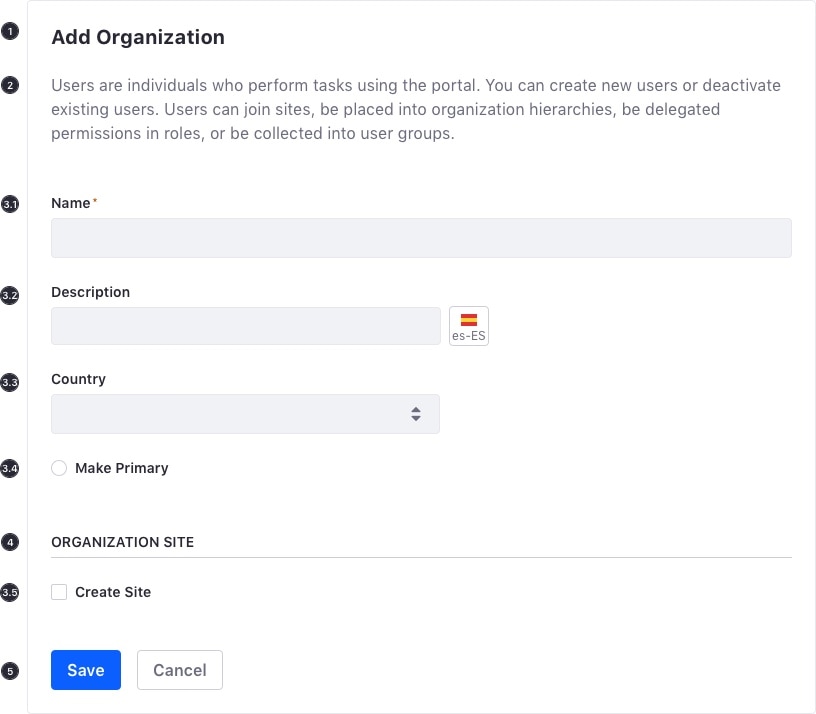
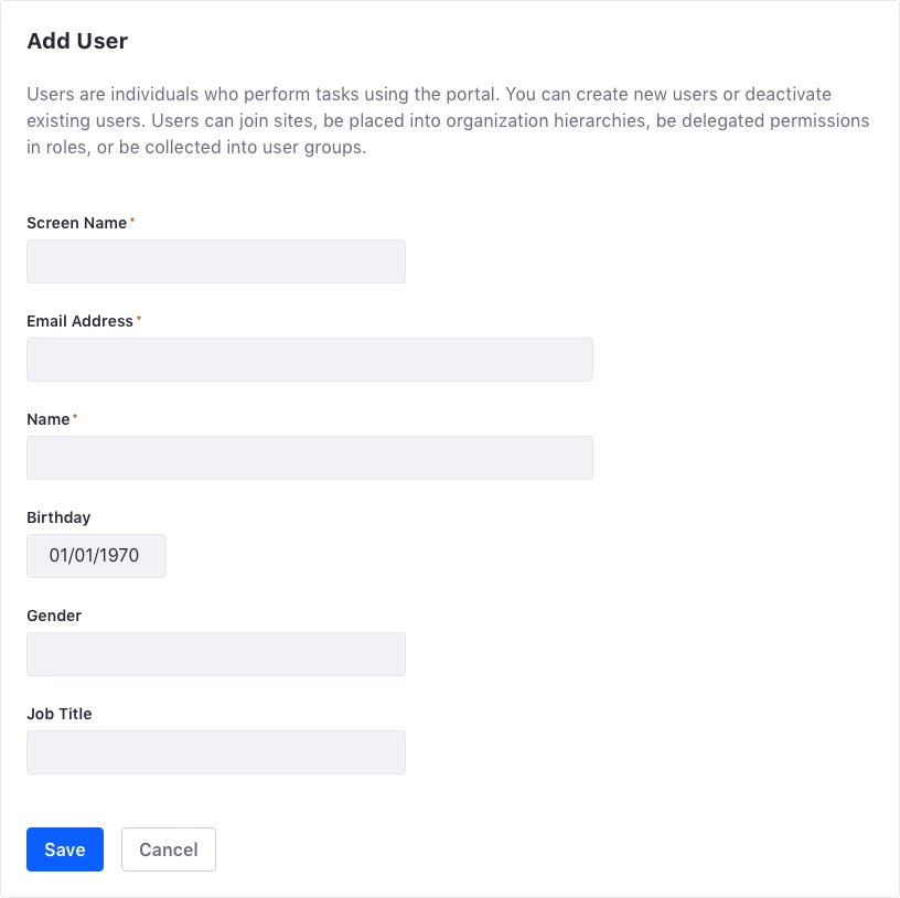
- Title (Required)
- Description (Not required but very useful). It should describe the form usage.
- Form Elements:
- Text input. See text input for more information.
- Text input localizable. See text input localizable for more information.
- Selector. See selectors for more information.
- Radio button. See checkbox, radio, and toggle for more information
- Checkbox. See checkbox, radio, and toggle for more information.
- Section. Sections are identified with a 14px size primary text that is always in uppercase letters. Some forms may require a full width underline for a better visual separation of content. This is usually used in configuration forms.
- Buttons. Visit Actions to learn how buttons are used in forms.
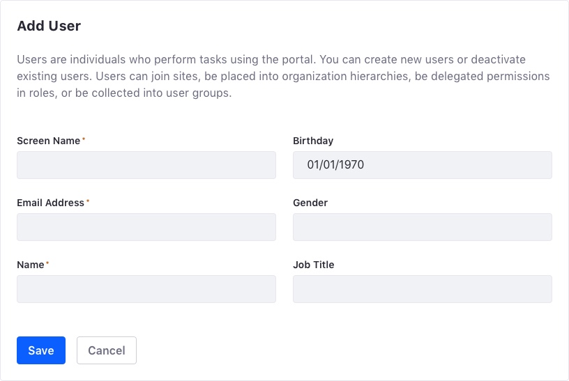
Layout
Forms can occupy one or two columns. If your form is divided into several sections that are stacked, it's best to keep the internal layout between sections. This can affect the experience of filling the whole form. When adding columns, remember that the reading direction for each column is left to right and top to bottom. The user reads column one first, then they read column two.
One single form
Two columns form
Attributes
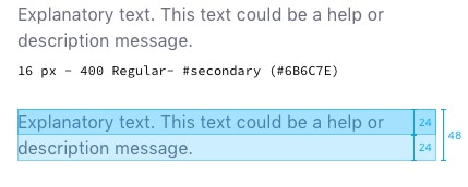
Spacing
It's very important to maintain the distance between form elements, such as texts, fields, sections, etc. Please see our hierarchy page for guidance.
As a general rule of thumb, use the following distances for spacing between form elements:
| Description | Desktop | Mobile |
|---|---|---|
| Form padding | 24px | 16px |
| Horizontal | ||
| - Between consecutive components | 16px | 16px |
| - Between non-consecutive components | 24px | 24px |
| Vertical | ||
| - Between consecutive components: title, fields, section... | 24px | 16px |
| - Between form title or title + description for next component | 48px | 32px |
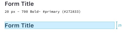
Title
Sections
First level sections can be collapsible. Note that second level sections, however, can never be collapsible.
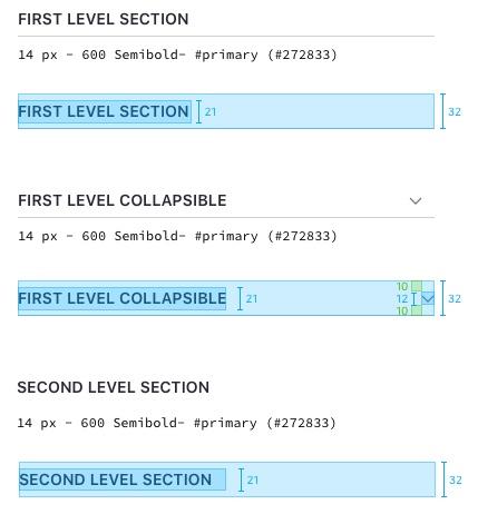
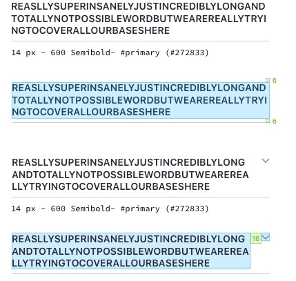
The layout must wrap long section titles.
Paragraph