List Variations
Sign InDifferent list cell types are used in our products
List basic item
A list item is a flexible component arranging the data in different ways. Here, we present our basic list item used to achieve many different list item configurations. These configurations that you see below are possible with the same component.
We encourage you to create more list cell variations with its different configurations that fit your needs when this one doesn't cover them.
Only text
The most simple list item just showing the main text.

Text and description
A list item for versions. It shows its author and creation date.

User representation
A list item where the user is a relevant visual information. To select multiple users place a checkbox on the left side.

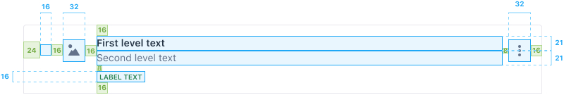
File representation
A list item where represting the file is important. In this case is done through an image, but it can be also done through a sticker that represents the file type or the element type. Additionally, we show that status labels are also possible.

Notifications
Whenever a list item needs support for notifications, place an 8px width line on the left side of the row for an unread notification. The main text for a read notification must be regular.
Unread

Read
