Checkbox, Radio, Toggle
Sign InCheckboxes, radios and toggles provide users with different selection and activation tools.
Checkbox

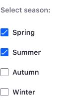
A checkbox is a component that lets the user select the value that is written in its corresponding text label. A user can select multiple checkboxes from a group at the same time.
Note: although we have visually defined the checkbox, we use the native checkbox as it is easier to identify by the end user using different web browsers.
States
| State | Definition |
|---|---|
 | On |
 | Off |
 | On disabled |
 | Off disabled |
 | Indeterminate, variable for multiple selection |
 | Indeterminate disabled |
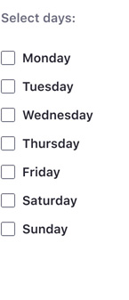
Checkbox group
Checkboxes are commonly grouped in forms to provide a set of options.

Dos and Don'ts
Capitalize the checkbox's label.
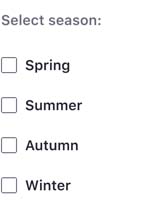
Do
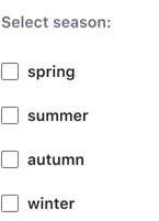
Don't
Use checkboxes for multiple choices in a set of options.
Do
Don't
Use checkboxes when more than one option can be selected.
Do
Don't
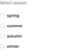
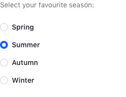
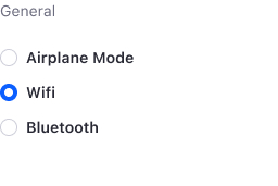
Radio

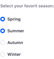
A radio is a component that lets the user select the value that is written in its corresponding text label. Unlike checkboxes, a user can only select one radio button from a group at a time.
Note: although we have visually defined the radio, we use the native radio button since it is easier to identify across different web browsers.
States
| State | Definition |
|---|---|
 | On |
 | Off |
 | On disabled |
 | Off disabled |
Radio Group
Radios are commonly grouped in forms to provide a set of options.

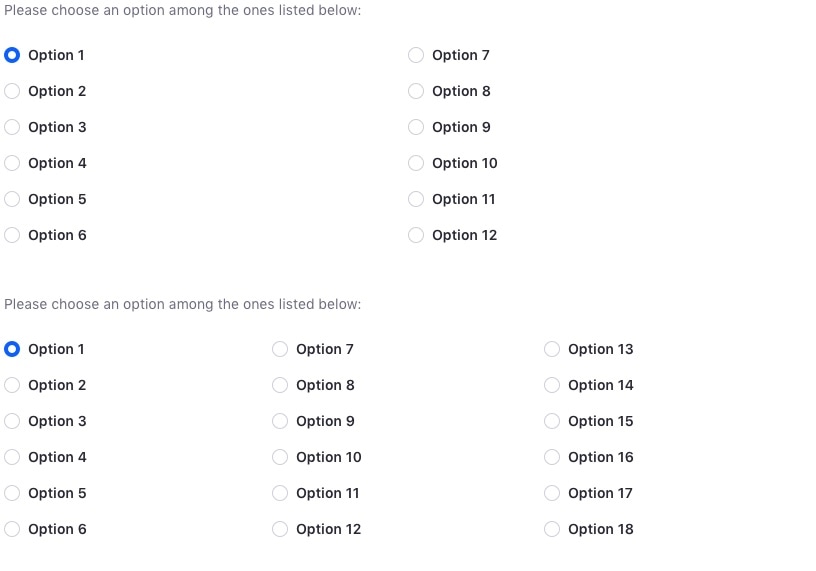
It's common to have to split a long list of options into several columns to reduce space. Deciding when to use one column or several columns can be difficult. The benefits of each approach are shown below:
- One column:
- It is always easier and faster to read, as the eye doesn’t have to jump.
- Use it when you have long descriptions.
- Splitting into several columns: * It reduces space.
- Make sure to have multiple options and to have at least six elements per column, otherwise there is no real benefit.
Radio vs Dropdown Menu
It can be difficult to decide whether to use a radio or a dropdown menu when users need to choose one option from a list of options. Although there is no strict rule to follow in these cases, we have provided some general guidelines below that you can consider when making this decision.
Radios:
- When the number of options is small
- When options require lengthy descriptions
- Radio buttons are always listed vertically.
Dropdown menus:
- When the number of options is large, or has the potential to become large
- Options should be of the same nature (e.g. a list of branches, or a list of people).
Dos and Don'ts
Capitalize a radio button's label.

Do
Don't
Use radios when only one option can be selected.
Do
Don't
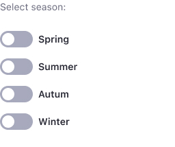
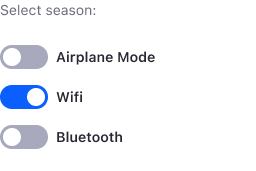
Toggle

A toggle is an interface element that, by its activation or deactivation, provokes an immediate action on the screen.
States
A switch can be in one of four different states:
| State | Definition |
|---|---|
 | On |
 | Off |
 | On disabled |
 | Off disabled |
Dos and Don'ts
- Capitalize a toggle switch's label.
Do

Don't
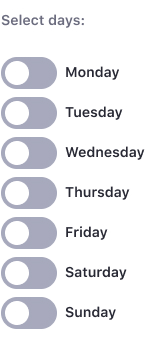
- Use toogles for activation.
Do
Don't
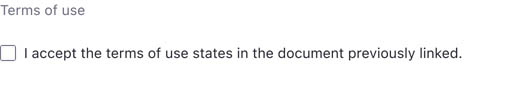
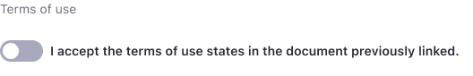
- Use checkboxes instead of toggles in confirmation messages.
Do
Don't
Inline
Checkbox, Radio, Toggle can be displayed also inline.
Variations
Toggle with data attributes
This type of toggle has labels, title label or other support label, that reflect its value. The label can be positioned at the top, right, bottom, or left, and its value should always reflect the toggle's state. Keeping labels in sync with the toggle's value improves the accessibility for your users.
Toggle with icon
Toggle can also have an icon inside the toggle circle to help identify the action. This variation can also have data attributes as the previous variation explains.