Vertical Bar
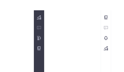
Sign InA vertical bar is a flexible container that organizes items vertically.
Definition
A vertical bar can be placed to the left or right side of the screen and can be expanded or collapsed. It has a defined default vertical tab item but it also supports other components like borderless buttons and custom variations.
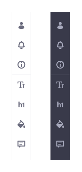
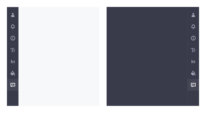
There are two main variations: light and dark, but the vertical bar can also be customized.
- Light
- Dark
Parts
A vertical bar consists of three main parts:
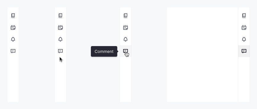
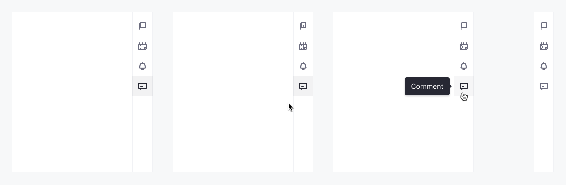
- Tab Item
- Divider
- Panel
Visual States
The vertical bar shows different states to help users make use of it.
Default
The vertical bar is presented in a default state when no items are disabled, on focus, selected or on hover.

Hover
When the user pauses over a tab item using a cursor the hover state is shown.
Disabled
The disabled state is shown when the user is not allowed to interact with a tab item.
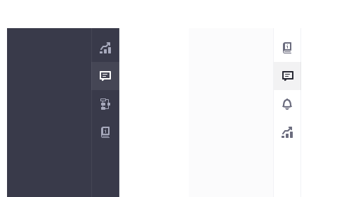
Active
This state shows the user which tab item is currently selected.
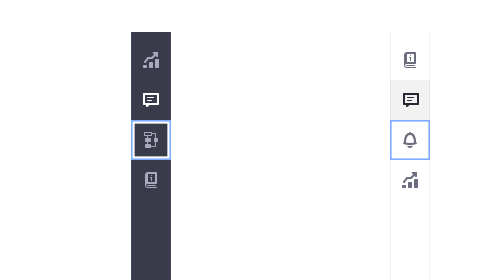
Focus
The focus state is used when the user highlights a tab item using the keyboard or voice.
Stack
Items in a vertical bar can be stacked in three different areas: top (green), center (orange) and bottom (blue). Different arrangements can be made as seen in the following image:
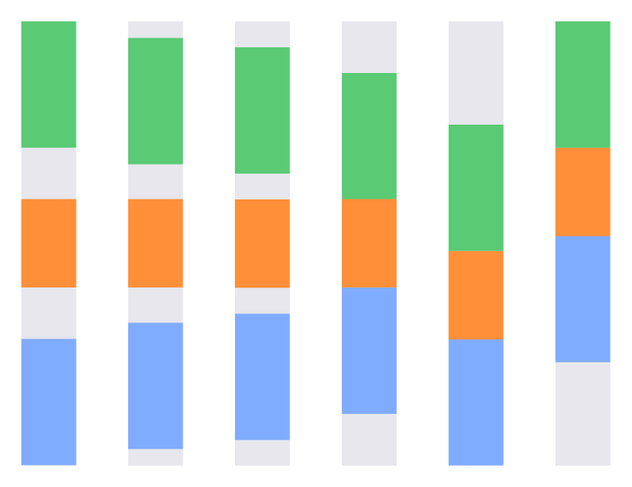
The vertical bars below, use two different stacked areas. In this case, top and bottom.
Divider
A horizontal line between icons allows you to visually group elements. There can be as many groups as needed.
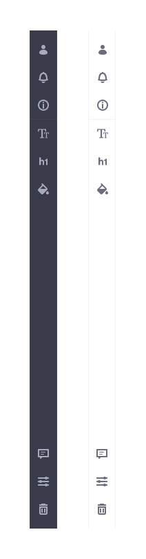
Panel
The panel in a vertical bar has two different color variations: light and dark but as the vertical bar it can have a custom color.
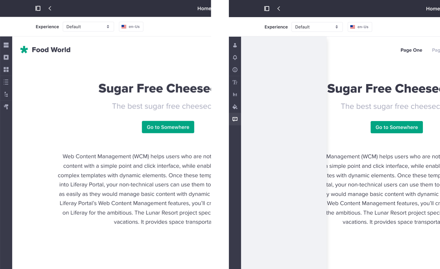
Alignment and opening modes
The vertical bar could be aligned to the left or right edge of the screen and the opening direction of the panel can also be chosen between:
- Slide Left
- Slide Right
The panel also has two opening modes: push/pull and hover.
Push/Pull
- Push: Panel opening pushes the content gaining space and shrinking the adjacent container.
- Pull: Panel closing , in contrast, pulls the adjacent content releasing its space
Hover
Instead of push/pull mode, the hover mode allows you to hover the adjacent container in the panel opening.
Interaction
Case 1: Tab Selected
Case 2: Toggling
Case 3: Item Preselected
Mouse
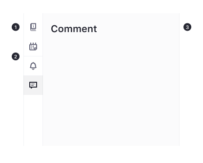
- Click on an item to trigger an action (e.g. toggle panel, navigate to a page, log out.)
- All icon-based items on hover should have a tooltip with 1 or 2 words defining the action they trigger or the object/place they navigate.
Keyboard
Tab order As a general rule, once the focus is received in a vertical bar, the first Tab item receives focus. Then if the user presses:
- Tab key, the focus moves to the next focusable component.
- Shift + Tab. the focus moves to the previous focusable component.
- ↓ or ↑, the focus moves to the next/previous tab item in a wrap from last to first and vice versa.
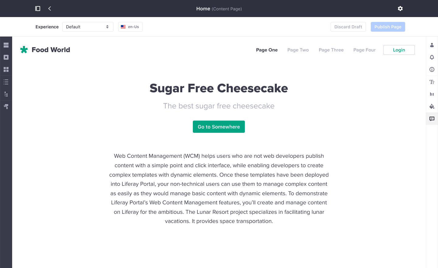
Usage
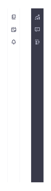
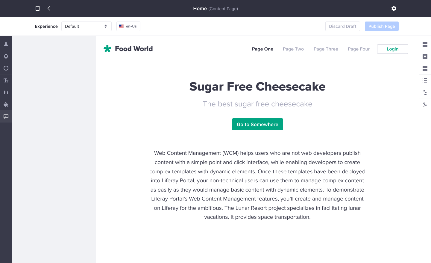
The vertical bar can have different uses. A popular usage is in direct manipulation interfaces such as the content page editor in DX Portal: edit the layout, add fragments, see the hierarchy tree.
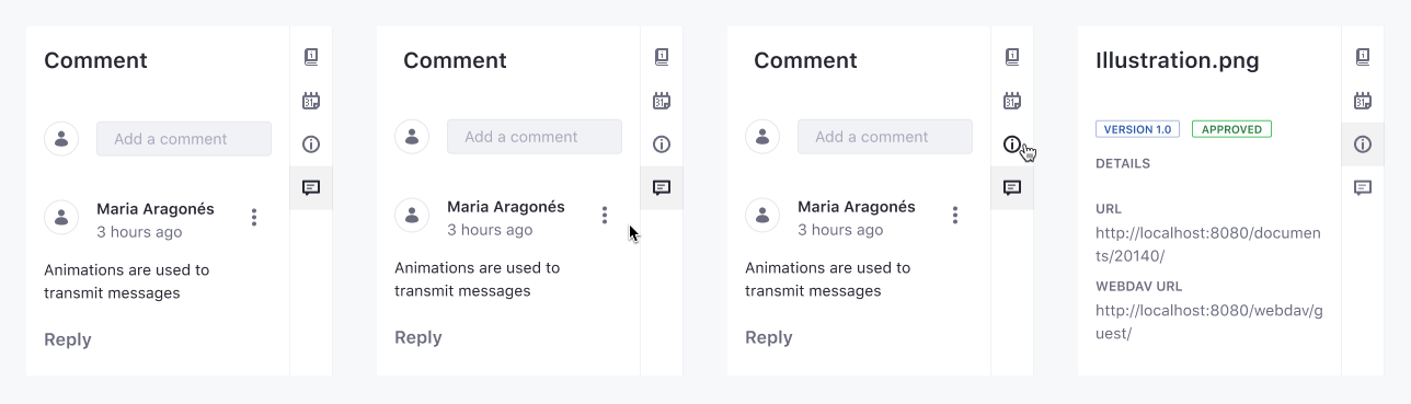
Another example is a document preview where the user has panels with information and metadata of the document in different sections.
Also, a vertical bar can be used as a primary navigation reference for users.
Sidebar with Panel