List
Sign InLists are a visual representation of a dataset, based on groups of related content, that is organized vertically.

Usage
A list is a visual representation of a dataset that provides more flexibility for arranging the data than a table and is less visually explicit than a card view. It's useful for comparing entries that don't require exhaustive comparison. If the dataset requires exhaustive comparison between entries, use the table view instead.
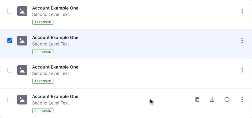
When a list is used together with a management bar, the list entries must include a checkbox, as the selection and actions are reflected in the management bar.
Lists support several text labels in a column, as shown in the examples below.
Row states
Default state
Hover state

Selected state

Row interactions
- A list entry can have a checkbox, a radio or none of them.
- You can select a row by using the checkbox or radio button, depending on the selection type in the list. The background is not selectable.
- You can add links to a row to navigate to other areas.
- A row can have related actions. If there is only one action for the row that can be represented by an icon, you don't need to use an actions menu. Otherwise, include a actions menu on the right side of the row.
- Use the main text as an action for the following use cases: A Folder that navigates to the next level A File that navigates to its detailed view * Never use the row action to view a preview. This is always a secondary action placed inside the row's action menu.
Content format and alignment
- The Main text must always be semi bold.
- To favor legibility, the width of the main content won’t go further than 50% of the row's width on wide screens.
- Inside the main content group, there won’t be more than three elements stacked. The row, however, can grow vertically, if the elements need more vertical space. It will never exceed more than two lines.
- Short descriptions are aligned on the right side of the main content and extend until the tools. These descriptions are not more than two lines long.
- Text elements can’t fill more than two lines. If text elements exceed two lines, an ellipsis is used for the remaining text.
Sections
List sections organize content into separate divisions by a certain categorization or typology.

Examples
See the dataset template for more examples of lists.
Responsive
- Text elements can't fill more than two lines.
- When the entire content for a list can't be displayed, for instance on a smaller screen, it will be replaced with an ellipsis.
- If a list row contains tags, they can’t occupy more than one line. If a tag's row is longer, use an ellipsis.