Dual Listbox
Sign InA dual Listbox allows users to compare and move available and selected options between two lists.
Definition
A dual Listbox consists of two lists used to move options between them. Users are allowed to multi-select different items from a list and sometimes, options in use can be re-order. The scroll must be available in long lists.
Usage
- By default, the destination list is placed on the left, and the origin is on the right, but the order can be changed providing a clear context.
- Lists must be exclusive and their titles must reflect so. Examples: "Selected - Not selected", "Coord X - Coord Y" or "East coast teams - West coast teams"
Parts
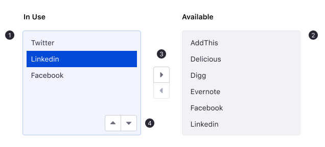
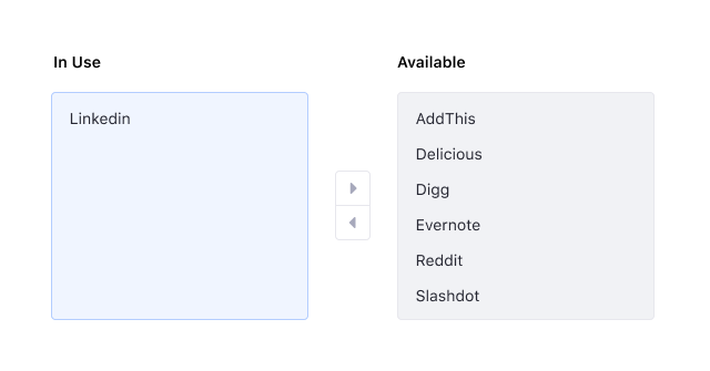
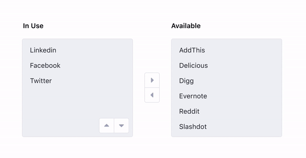
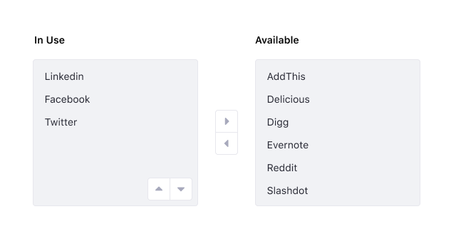
In Use Listbox. This box displays selected or preselected options in use. It is always shown on the left side of the component. This list can allow manual ordering if necessary.
Available Listbox. This box displays a fixed set of options available to the user and it does not show those options that are already in use. It is always shown on the right side of the component.
Transfer buttons. These buttons are always visible showing their different states to help users filter the actions available.
Order buttons. These buttons only appear within an area to indicate that ordering is available on a specific list. Order buttons don’t need to be shown if the dual Listbox doesn't require ordering.
Task Description
To help users making sense of the use of a dual Listbox, we recommend not only to label the boxes but to provide some context to describe the main goal of the task that can be carried.
Selection
A selection is used to highlight an option when users select it. Single selection and multiple selections are available using touch or keyboard actions. When one or more selected options are out of focus, a secondary selection is used.
Transferring items
In a Dual Listbox, left and right carets are used to symbolize moving actions from one list to the other. After an item(s) has been selected, these buttons move the items. Transfering buttons are always displayed but different states are used to guide the user to select the desired action.
Case 1: No items selected
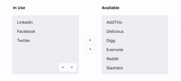
Transfer buttons are disabled when there are no items selected.
Case 2: Focus
If one of the boxes is on focus but no items are selected, transfer buttons must remain disabled.
Case 3: Default buttons
When one or more items are selected in the In use Listbox, the right caret turns into a default state but the left caret must continue disabled. After clicking an item in the available list, the left caret will be shown in the default state and the right caret will remain disabled.
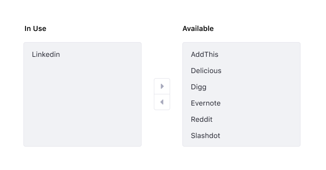
Case 4: Placing items
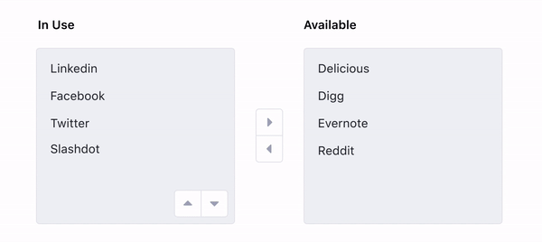
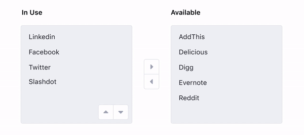
After items are moved to the In Use Listbox from the Available list, they must remain highlighted with a secondary selection in the new box as a visual confirmation. However, the position in which items are placed depends on whether the In Use Listbox allows manual ordering or not. If manual ordering is allowed, items will be added to the bottom of the list. On the contrary, if manual ordering is not allowed, items will be placed automatically in alphabetical order.
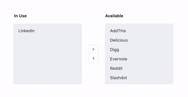
Case 5: Placing items back in the Available list
After items are moved to the Available Listbox, they don’t need to remain highlighted and will be placed automatically in alphabetical order.
Reordering items
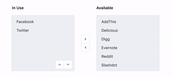
When manual ordering is available in the In Use Listbox, top and bottom carets are used to symbolize moving elements up and down. These buttons appear within the area of the list and are only displayed if there is more than one item on the list.
Case 1: One or no elements on the list
If there is one or no elements on the list when manual ordering is available in the component, ordering buttons are not shown.
Case 2: More than one element in an ordered list
If there is more than one element in the In Use list but there are no selected items, ordering buttons must be visible but they must remain disabled.
Case 3: Default buttons
After selecting an item from the list, ordering buttons must display the default states of the available actions.
Case 4: Ordering multi-selected items
When two or more separated items are selected from the list and the user wants to bring both items to the top (or bottom) of the list, once the first item has reached the top, it should be kept there while the rest of item(s) keep moving up until they are completely stacked.
To improve the usability of this component, when an item has reached the top of the list, users shouldn’t be able to keep moving this item upwards as this will cause an infinite loop bringing the top item to the bottom of the list and getting the user confused. Moving an item(s) to the bottom of the list should have the same restriction.
Focus Management
- No elements should be selected when the user places the focus in a Listbox.
- Once an element is on focus it will be selected.
- When the focus leaves the list, the previously selected item(s) remains selected with a secondary selection. If the user decides to return to the list, the items will still be selected.
- ↓ or ↑ are used to navigate the elements on a list.
- Shift + ↓ or ↑ are used to select multiple consecutive items.
- TAB key moves the focus to the next focusable component.
- Shift + TAB moves the focus back to the previous focusable component.
- Disabled buttons do not receive the focus: If a transferring or ordering button changes its state from default to disabled when the focus is on it, the focus will disappear but it will remain in the same place so users will have the freedom to choose which path to follow. A disabled button won’t be focusable in any other case.