Input
Sign InA description of the different text input types, including usage and validation states.
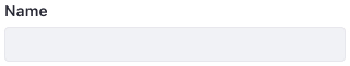
Text
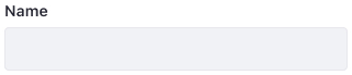
A text field lets users enter data into the system to be processed.
Usage
Text Inputs can have help text. Lexicon provides three different mechanisms to provide help:
- Help text: This is placed below the input box. You can use it to help the user understand the validation rules that apply to the input.
- Help icon: Text inside a popover triggered by a help icon next to the title. Use this when you only want to provide help text if the user requires it.
- Placeholder: A text in the field entry area. This mechanism is not recommended since users can misinterpret it as final text. If you want to use a placeholder, do not write help text, provide an example instead.
Text Inputs can also have help text placed right below the input box.
States
Default
Active Focused
Disabled
Read only
Sizes
Small
Regular

Large

Validations
The validation text for a field is placed right below the input box, just before the help text. This places the error right next to the offending field so the user is not confused about what field failed validation.
Success
Warning
Error
Attributes
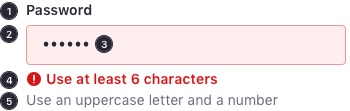
A Text Input, at the very least, contains these elements:
- Label
- Text field box
- Placeholder
- Status message
- Help text
Text area
A text area is similar to a Text Input, however, it supports several lines of text. For example, a user can use a text area to enter long product descriptions.
Usage
- The user can resize the height of the text area to adjust the amount of visible text..
- The Text Area variant has the same states and validation states as a Text Input.
- Text Areas can have help text. They follow the same rules of Text Inputs.
- A Text Area can be configured to expand on input change.
- It requires a height of 44px, like a Text Input.
- The Text Area has a mid-height value set to 88px, equivalent to three lines of text.
- The Text Area's max-height value is 200px. From mid-height to max-height, the text area grows in height. When it reaches the maximum, the text area stops growing, and the vertical scroll bar becomes available.
- We recommend that you configure the min-height with the same value as the mid-height since three lines are the recommended text size.
Menu