Popovers and Tooltips
Sign InPopovers and Tooltips are patterns used to show helpful information in two different ways.
Popovers
VIEW IN CLAYUsage
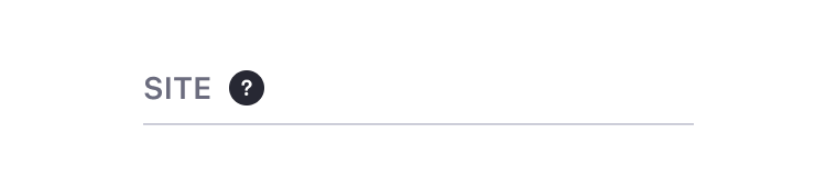
Popovers are used together with the question mark icon to communicate to the user that there is useful information for them to read. Popovers contain helpful information such as an explanation of a context.
Dos and Don'ts
- For readability, keep a distance of 8px between text and the icon.

Do

Don't
- Keep a distance of 16px between text and the icon.
Do

Don't
Tooltips
VIEW IN CLAYTooltips are brief pieces of information that appear on hover state over an element to clarify its meaning or use for the user.
Positions
Tooltips arrows can be placed in 9 different positions:
Usage
- Tooltips are used to help explain an icon button's meaning.
- They can also be used with links and images.
- Tooltips should be brief and contain a small amount of text. Lexicon recommends a maximum of 280 characters. If your description is longer than 280 characters, please use a popover instead.
- The tooltip appears on hover state and disappears on mouse out. This pattern does not exist on mobile, as hover is not a possible state on mobile devices.
- Make sure you properly position the arrow to point to the correct interface element. Improper placement can confuse the user.
- When possible, try to not overlap other interaction elements in the same component.
Dos and Don'ts
Use tooltips on elements that trigger an action, such as button icons.

Do

Don't
Menu