Forms
Sign InForms is one of the most used patterns in Lexicon. Forms capture information from the user and transmits it to the system either to store, to produce an action or both at same time. Forms in Lexicon are defined to be full width.
Structure
Forms can be created in one single column or two columns. If your form is divided in several sections that are stacked consider not changing the internal layout between sections, it can affect the experience of filling the whole form.
When applying columns take into account that the reading directions is left-right, and up-down, in each column. So expect your user to read first column one and then column two.
Sections
Sections help users to fill a form by chunking the form is smaller pieces. A form section is identified with an accordion. There is no limitation in the number of accordions to use.
Fields’ order
Laying out the fields of your form we recommend you to follow an order of importance. Try to place first as many mandatory fields when possible to make the user task short. Non mandatory fields should go in a second place as they are not so important and the user could like to skip them. In case non mandatory fields are in between mandatory fields the user would expend more time scanning the form.
Fields’ lengths
Fields must occupy the space you expect your user needs to fill it. The only requirement for fields is to adapt their width to the grid so they behave properly on window resize. Sharp shape forms do not go against Lexicon but we prefer rectangular shape form as they look more clear. In mobile view ports field lengths should be half of the screen or full length.
Mandatory fields
Fields can be mandatory/required to fill in a form. The way to mark a field as mandatory is:

Inline validation
Forms have inline validation. All form fields that can be checked against a set of rules while filling them must show success or error state to the user.
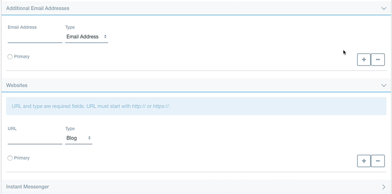
Content blocks
Content block allow you let the user add contents of a same type in a form. Content blocks are usually used to contribute with more form pieces that allow the user to specify more information. Content block always bring the possibility to add or remove blocks. See the following example:
Actions
General actions
General form actions always placed at the end of the form and they are always placed in same order: Primary, Secondary (default), Negative (Link). The button size to use is large.

Interior actions
Interior form actions should not be as notorious as general actions. Therefore they use default button size.