Modals
Sign InA modal is a box with content displayed on top of the page to capture the user’s attention for an specific action inside the same process. Modals are subordinated to pages.
Usage
- Modals can be build in different sizes and configurations. Depending on the amount of content you have you will decide one of them.
- Lexicon recommends to not use full-width size as it will be like a complete new page. If you are in this situation please consider creating a new page instead of a modal.
- Modals belong to a screen, therefore a modal window must never be triggered from another modal window.
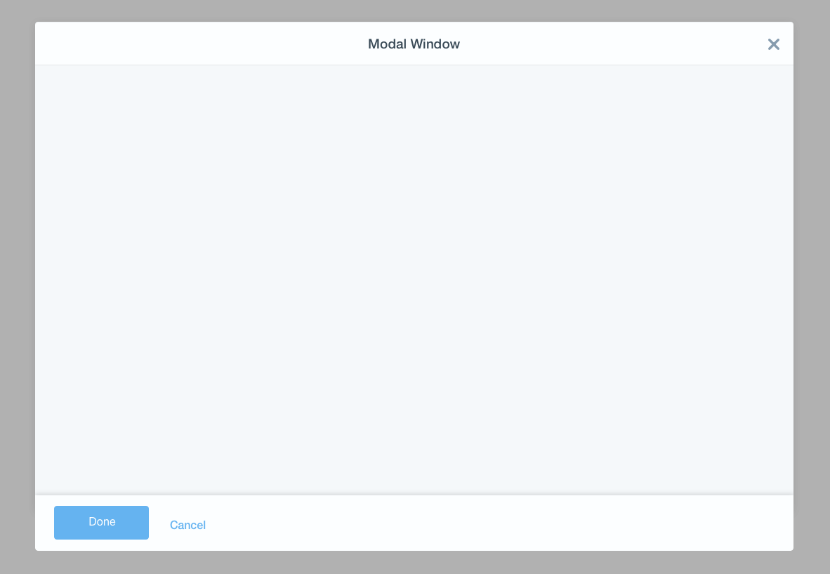
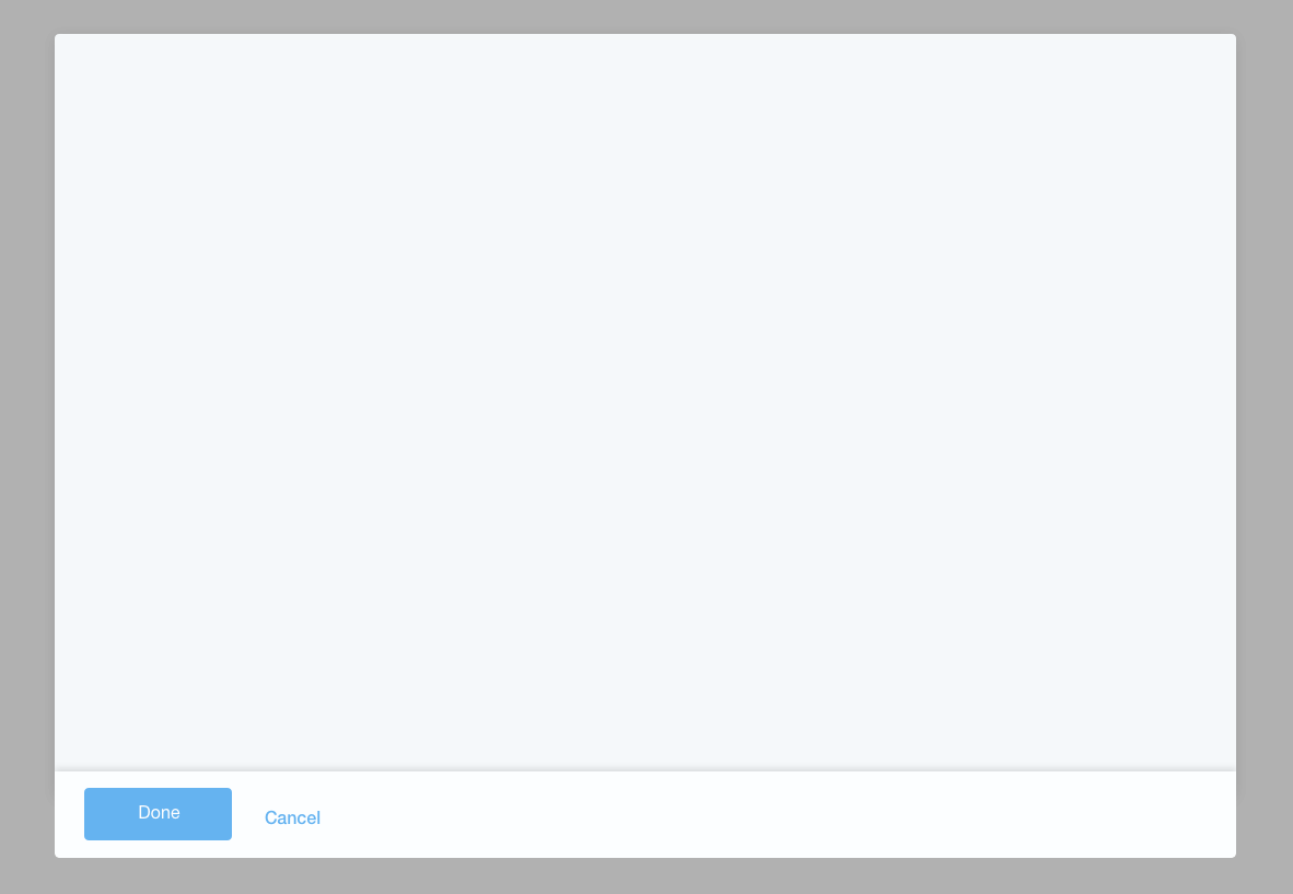
- When a modal has footer, the actions are placed inside and aligned to the left. There is an order of importance and the sequence is: Primary button (only one), secondary button, and button link.
Size
Modals can be configured in 4 different size and they are defined as table shows:
| Size | Description |
|---|---|
| Small | 300px |
| Default | 600px |
| Large | 900px wide modal in window sizes greater than 992px. 600px wide modal in window sizes between 768px and 992px. |
| Full width | A modal that stretches to fit the browser window with 45px padding on every side. |
Configurations
Lexicon allows your modal to have different configurations related to your needs. These needs vary from case to case and that is why not every modal in the system needs to be equal, but needs to follow certain rules.
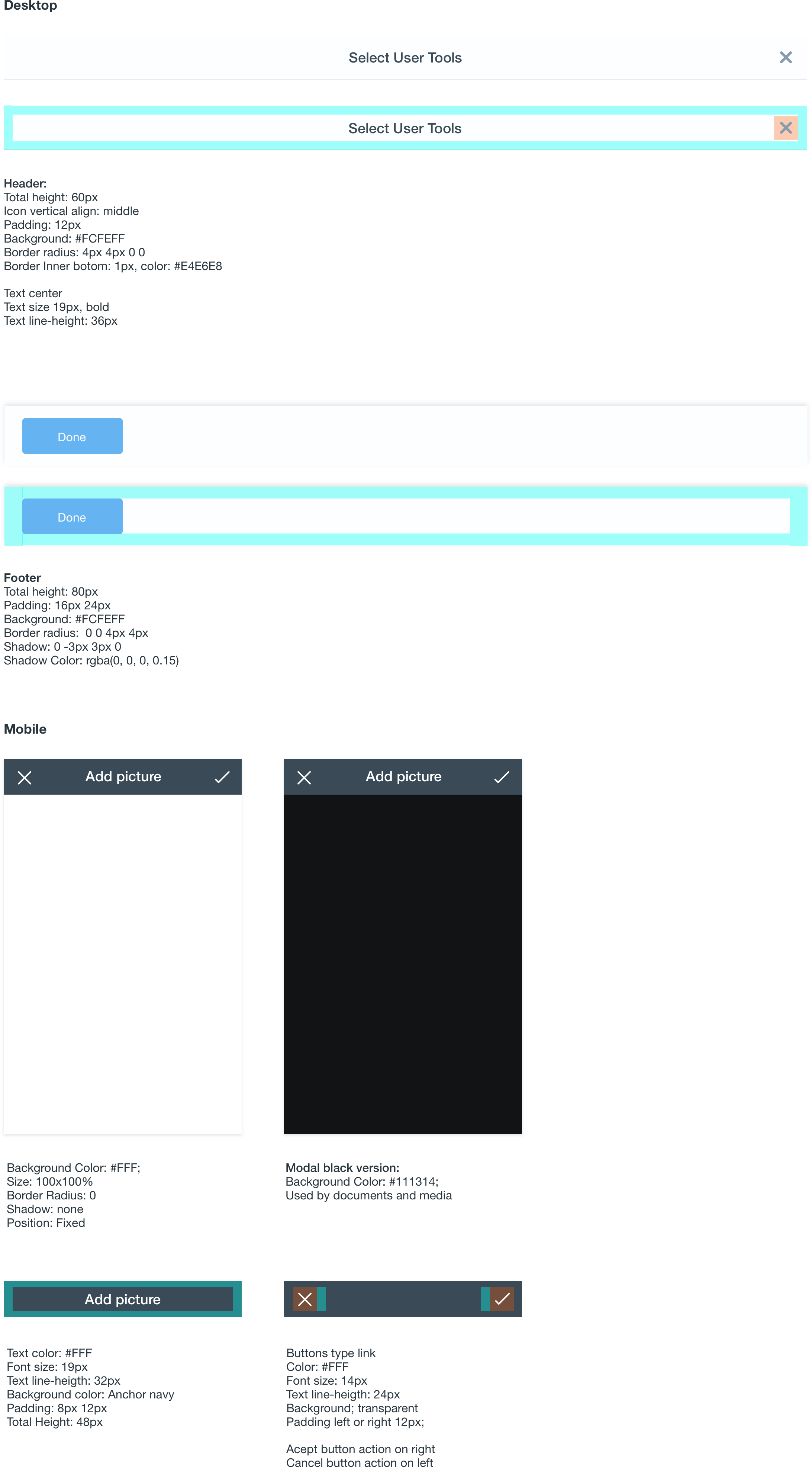
Header, body and footer
This is the classic composition of a modal window with its three main parts: header, body and footer.
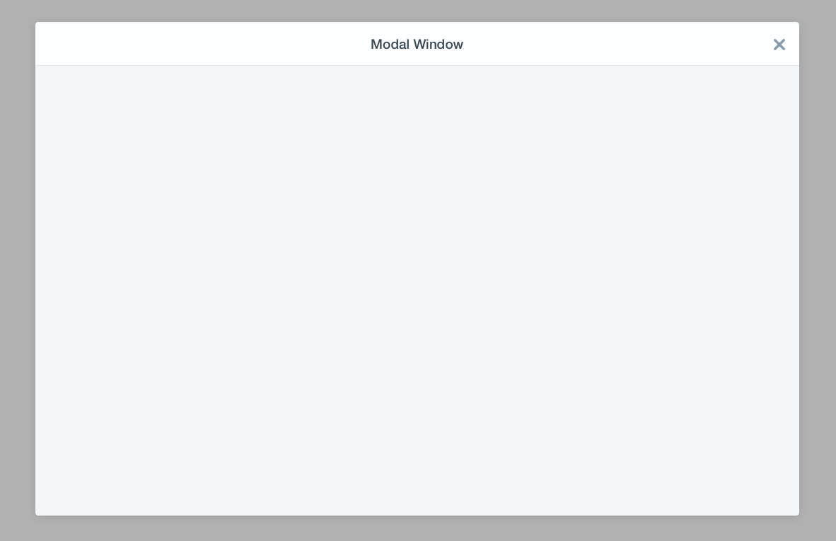
Header and body
This is the case when you don't need a footer bar to place your icons.
Body and Footer
This case is thought for those cases where you need to just show text and buttons to agree or cancel.
iFrame in the body
It is always possible to bring an iFrame inside the body. For more information about this check Quartz.
Mobile
When a modal reaches the mobile viewport size its look and feel is transformed to the one you see below offering a mobile friendly version. Modal occupies the hole screen allowing only the interaction with the modal and its content.

Attributes