Dropdown
Sign InDropdowns are a list of options related to the element that triggers them.
Usage
Dropdowns are used to list a set of options that are not easy to manage in the screen. This mechanism helps to clean-up the screen making everything more implicit.
Dropdowns are usually triggered from a dropdown button or a button with icon. This are the two most extended cases in Lexicon.
Closing a dropdown can be done by:
- Selecting an option in the panel, if they are mutually exclusive.
- Clicking on the button that triggered it.
- Clicking outside the panel.
A dropdown menu can contain any kind of basic form component / element like textfield, list of options, list of options with radio buttons, list of options with checkboxes, or button.
Types
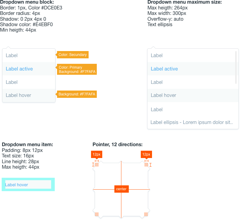
Default
The default dropdown is just a panel not prepared for scrolling the content inside it. Use this type when the number of options you want to offer is short or the panel is big enough to contain all the elements you want to use.
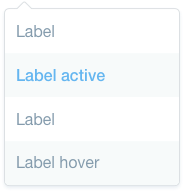
Scrolling content
Scrolling content type is prepared to have scroll in all the dropdown menu or just a part of it. Use it in case your dataset is occupies more than the space you want to provide the dropdown menu in the screen.
Example of use
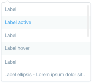
This example shows you how dropdowns would look like in a screen when displayed from the kebab menu and the action button. As you can see in the example the dropdown panel arrow can be positioned in different positions. Check Quartz implementation to get more details on that.
Attributes