Badges, Labels, and Stickers
Sign InBadges, labels, and stickers are used to put extra emphasis on information.
Badges
Description
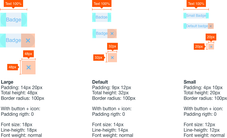
Badges help highlight important information such as notifications or new and unread messages. Badges have circular borders by default.
Sizes
| Size | Usage |
|---|---|
 | Small: Use it to mark the number of notifications in a user sticker. |
 | Default: Use it for marking states. |
 | Large: Use it when previous don't apply. |
Types
| Type | Usage |
|---|---|
| Used to identify. |
 | Used to identify with the possibility of removing it. |
Attributes
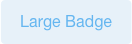
Labels
Description
Labels are a mechanism to categorize information providing quick recognition.
Usage
Use labels to organize groups of items in your application. Labels have rounded borders by default.
Sizes
| Size | Usage |
|---|---|
 | Small: Use it to mark the number of notifications in a user sticker. |
 | Default: Use it for marking states. |
 | Large: Use it when previous don't apply. |
Types
| Type | Usage |
|---|---|
| Used to identify. |
 | Used to identify with the possibility of removing it. |
Attributes
Stickers
Description
Stickers are a visual way to quickly identify content in a different way than badges and labels. Stickers can be either numbers or characters but always restricted to a maximum number of 3 characters. A sticker can also contain just an icon. Stickers are always squared.
Usage
Use stickers to visually identify elements in a dataset that are part of a same group. You can use any color you want for stickers.
Sizes
| Size | Usage |
|---|---|
 | 22x22. Use it in smaller contexts where you only need visual identification but not manual interaction with this element. |
 | 32x32. Use it in cards that are image based, allowing to see more parts of the image. |
 | 44x44. Use it in cards that are not image based, or list entries. |
Position
Stickers can have different positions:
- Static
- Inside (interior to the element that contains it) or outside (overlapping the border of the element that contains it):
- Bottom left
- Bottom right
- Top left
- Top right
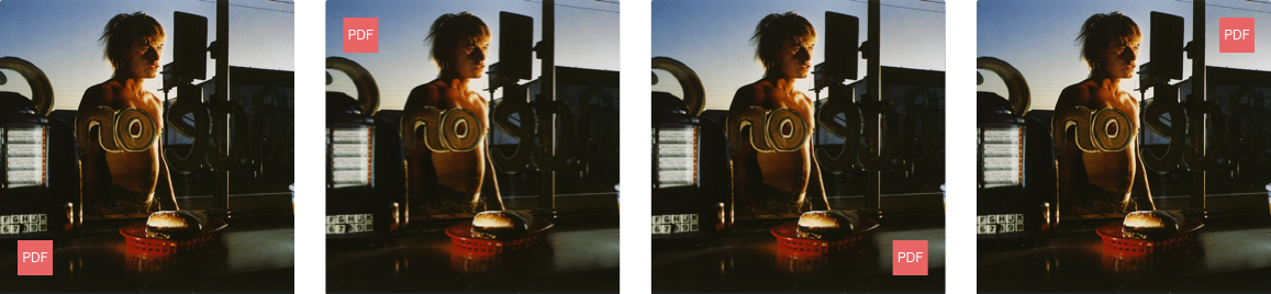
The most used cases in Liferay DE are inside bottom left and static.