Color palette
Sign InColor palette defines a set of colors to be used in the system. Each of the colors has a meaning and a purpose to create a robust a design system.
Usage
Colors have a huge impact in a system as they define the visual identity, they bring armony, they communicate, among other caracteristics. Lexicon defines the following color palette that you are free to change for your own.
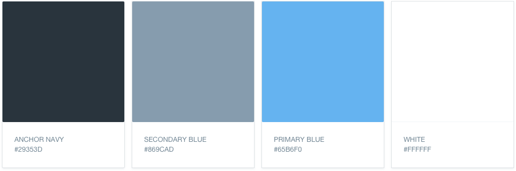
Primary colors
an Primary colors define part of the visual identity of Lexicon as a system. These colors have been carefully thought to be easily combined and be sure that accessibility is well covered.
| Color | Usage |
|---|---|
| Anchor navy | Used as background color in navigation. |
| Secondary blue | Used as default color. |
| Primary blue | Used for active state and hover, primary buttons, etc. |
| White | Used when secondary blue doesn’t respect accessibility rules. |
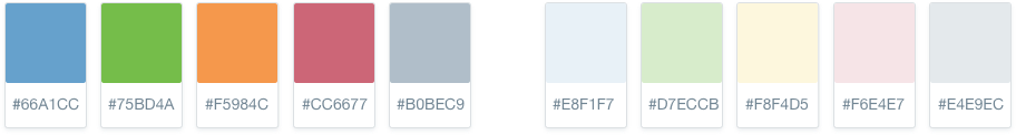
Secondary colors
Secondary colors are frequently used colors, also important as primary but do not define the visual identity in a stronger way as Primary colors do.
| Color | Usage |
|---|---|
| Blue | Information |
| Green | Success |
| Orange | Warning |
| Red | Error |
| Grey | Secondary light |
Each of the color has a variation. These colors and its variations are normally used together, one for text color and the second one as a background color for the message.
Changing Lexicon color palette
Changing the prestablished color palette is always possible. From Lexicon we understand that our color palette might not fit your needs or requirements as you can have a different corporate image. You just need to set you colors instead of our colors.