Panel
Sign InPanels separate your content.
Usage
Panel are use to help separating content a making processes as reading or filling a form easier to the user. Panels are a way of chunking into smaller pieces.
Configuration
Panels can be configured in different ways:
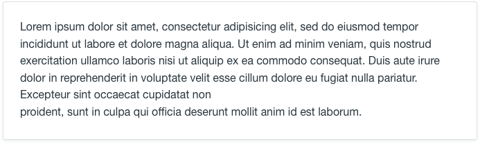
Body
Use this configuration to separate content inside a form.
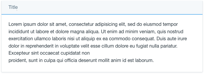
Header + body
Use this configuration when you need to se parate a content that needs a title and the title needs to capture the attention of your user.
Do never use it to collapse content without a disclosure arrow. Use an accordion in that case.
Variations
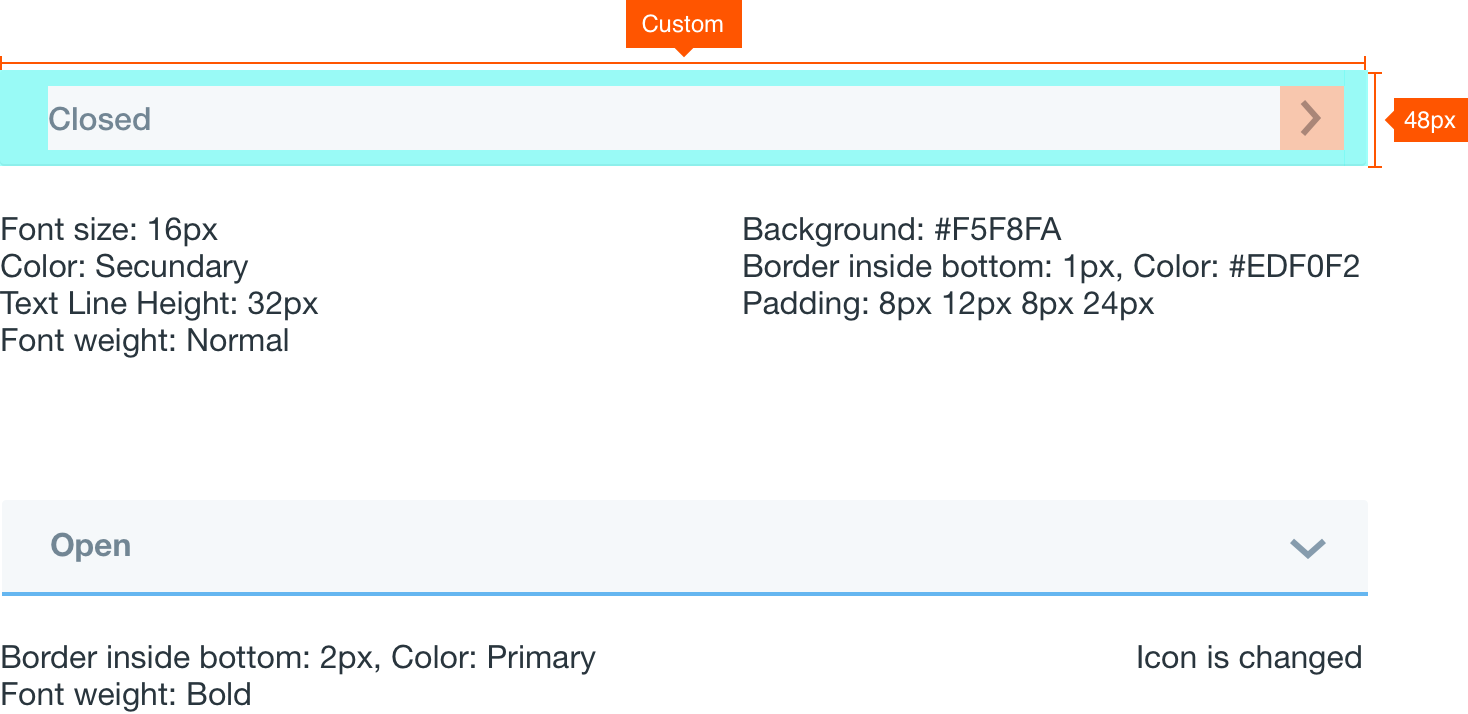
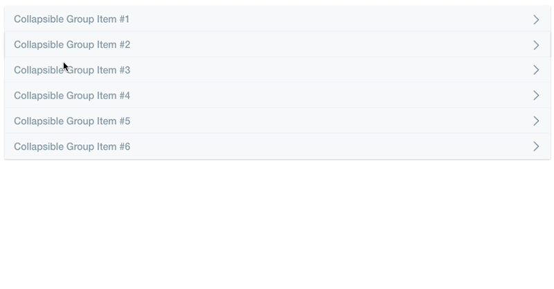
Accordion
Panels can be collapsible. Whenever there is a collapsible panel the header must include a disclosure icon as an affordance to let the user understand that open and close actions can be performed. Please, see that when a panel is open the header is highlighted with a blue line below it marking the active state.
It is not a good practice to anidate accordions. Please try to avoid it.
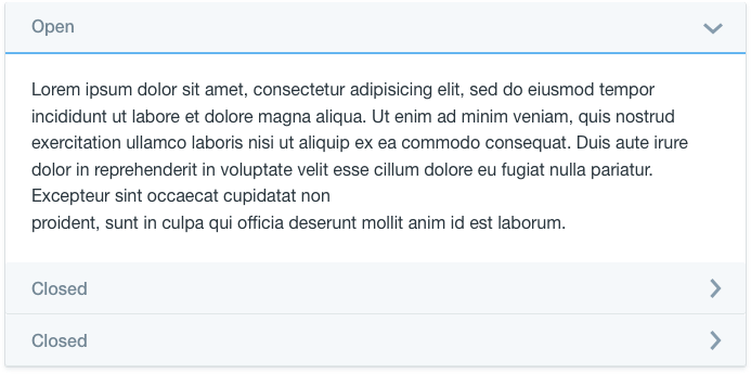
In the following example you can see the accordion working. It is also optional to close all entries when a diferent entry opens.
Attributes