Measured vs Optical Alignment by Naoki Hisamoto on September 26, 2019
1 Min Read

Summary
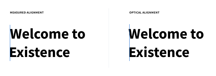
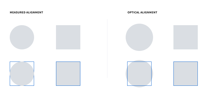
When it comes to aligning content there is often a discrepancy between objects aligned using measurements, which is the case with alignment tools found in software, and objects aligned optically. Measured alignment uses numerical values to align objects. For instance, there is an equal number of pixels on both the left and right sides of an object when vertically centering it. On the other hand, optical object alignment is based upon the human eye’s perception of whether an object is aligned in relation to other objects. There is a myriad of reasons why the human-eye prefers optical alignment over measured alignment: focal point, the occupied area within a bounding box, object visual weight, color, fill, etc.
For more on optical alignment, the human brain, and visual perception, read about Gestalt’s Principles below.


Practically speaking, optical alignment can seem like a lot of work when it comes to seeing the benefits. There are plenty of caveats to optically aligning objects. It takes a lot of manual and painstaking work to optically align text, icons, and objects when it comes to code, especially with responsive layouts. At the end of the day, the goal is to minimize glaring distractions and draw attention to what matters.
 For more in-depth examples, view links below.
Takeaway
Pick your battles. The main point is to draw attention to what matters and minimize distractions, not create unnecessary work.
Here are some tips for creating optically aligned objects:
- Prioritize aligning elements that will be most noticeable and distracting to a user, such as large heading and banners.
- When setting text or creating a set of icons, visualize it in-context in relation to their neighboring objects.
- When creating an icon, leave room around the focal point to adjust for optical alignment.
Read More
- Gestalt Principles
- Optical Effect in User Interfaces: An Illustrated Guide
- Making Your Design Optically Perfect
- 7 Gestalt principles of visual perception: cognitive psychology for UX
- Gestalt Principles