Typographic Hierarchy by Rachel Yuan on September 20, 2019
1 Min Read

Summary
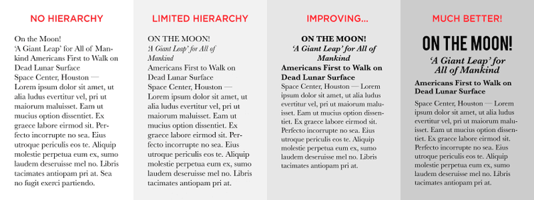
Typographic hierarchy directs the reader from most important to least important words, making the layout clear and easy to digest. The contrast created between text by adjusting the size, weight, italics, orientation and color allows the reader to easily scan the text for key information.
Typographic hierarchy is generally divided into three levels;
- Primary - Big type such as headlines.
- Secondary - Bits of text that add information to the primary level; such as subheads, captions, pull quotes, infographics, and small blocks of text.
- Tertiary - The main text and the smallest, simplest type in the design, but still readable and consistent.
Takeaway
Typographic hierarchy can guide the reader to decipher what information is the main takeaway. It can also act as an interesting graphical way to break up large amounts of text. Organizing content into typographic levels can quickly communicate the objectives in any design.
Read More
- Type Study: Typographic Hierarchy
- Every Design Needs Three Levels Of Typographic Hierarchy