Is Now a Good Time for a Redesign? by Chris Jeong on October 02, 2019
4 Min Read

User: Click, click long pause click? click?
Me: Anxiety level = Maximum
I wish I had more time to finish this feature.
Ugh the requirements weren’t comprehensive enough.
I thought QA, ran through it with no issues…
We didn’t test this?!
Product teams are almost always constrained by tight timelines and ambiguous requirements. It’s a balancing act that often results in suboptimal delivery with mounds of design debt.
In our case, the segment criteria builder feature in Liferay Analytics Cloud’s MVP release stood out above the rest. This was the result of lofty release ambitions meets back against the wall scope cuts. Our most powerful feature lacked a clear purpose and had major usability flaws.
Segmentation
A quick search of “importance of segmentation” tells us that reaching consumers with targeted messaging is critical to success in this highly personalized age of digital transformation.
Segmenting, at its most basic, is the separation of a group of customers with different needs into subgroups of customers with similar needs and preferences. By doing this, a company can better tailor and target its products and services to meet each segment’s needs.
from What You Need to Know About Segmentation
by Gretchen Gavett
This aligns perfectly with our promise of delivering the right content to the right people at the right time. Because segmentation was playing such a central role in the product’s vision, our feature had to be a differentiator.
Minimum Viable Product
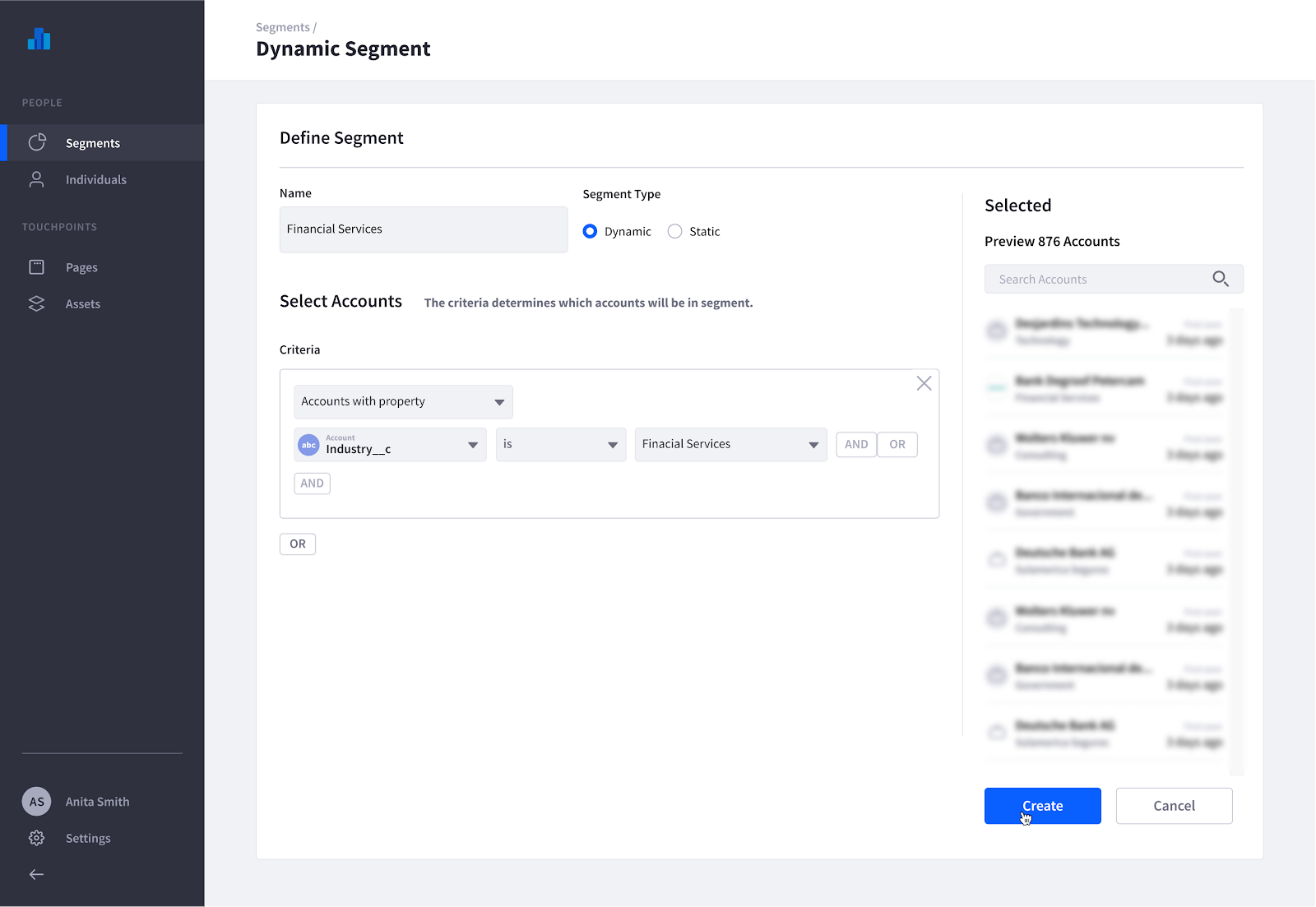
The MVP satisfied basic requirements of grouping people based on their behaviors and properties. However, we noticed right away the friction users were having while creating a segment.
While they were able to complete their tasks, we found many pain points:
The UI left users guessing whether the correct assets were selected (Partly due to naming conventions)
It was tedious to select multiple assets related to a behavior
Segment creators and editors had difficulty understanding what was built
Drop downs hid the available criteria categories, which made it difficult to plan
Timing is Everything
It can be tempting to go all in on a redesign when you see users struggling with the intended task. But it was more important for us as a product team to add new features to continue our forward progress.
Designers, don’t feel defeated — while product excellence is certainly a top priority, providing value to the business is also our primary objective.
As you work to deliver your new features, invest your spare time in recalibrating, discovering the unknowns, and talking to people to better understand the problem space. There is a certain freedom of working on something without a timeline. Eventually, an opportunity will come and you’ll be ready to capitalize on this investment.
Gathering Feedback
After reviewing our initial feedback — we designed 2 low-fidelity interactive prototypes for testing. The goal was to start a conversation with would-be users, validate concepts, and generate new ideas to take our criteria builder to the next level.
We tested using the System Usability Scale. This score, in combination with the time to complete a task, would serve as a success indicator of each prototype’s unique interactions, information organization schemes, and efficiency/scalability.
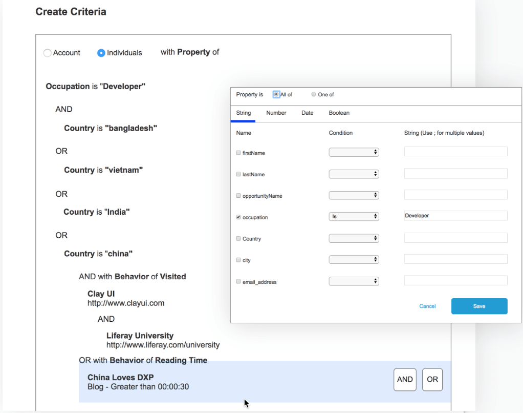
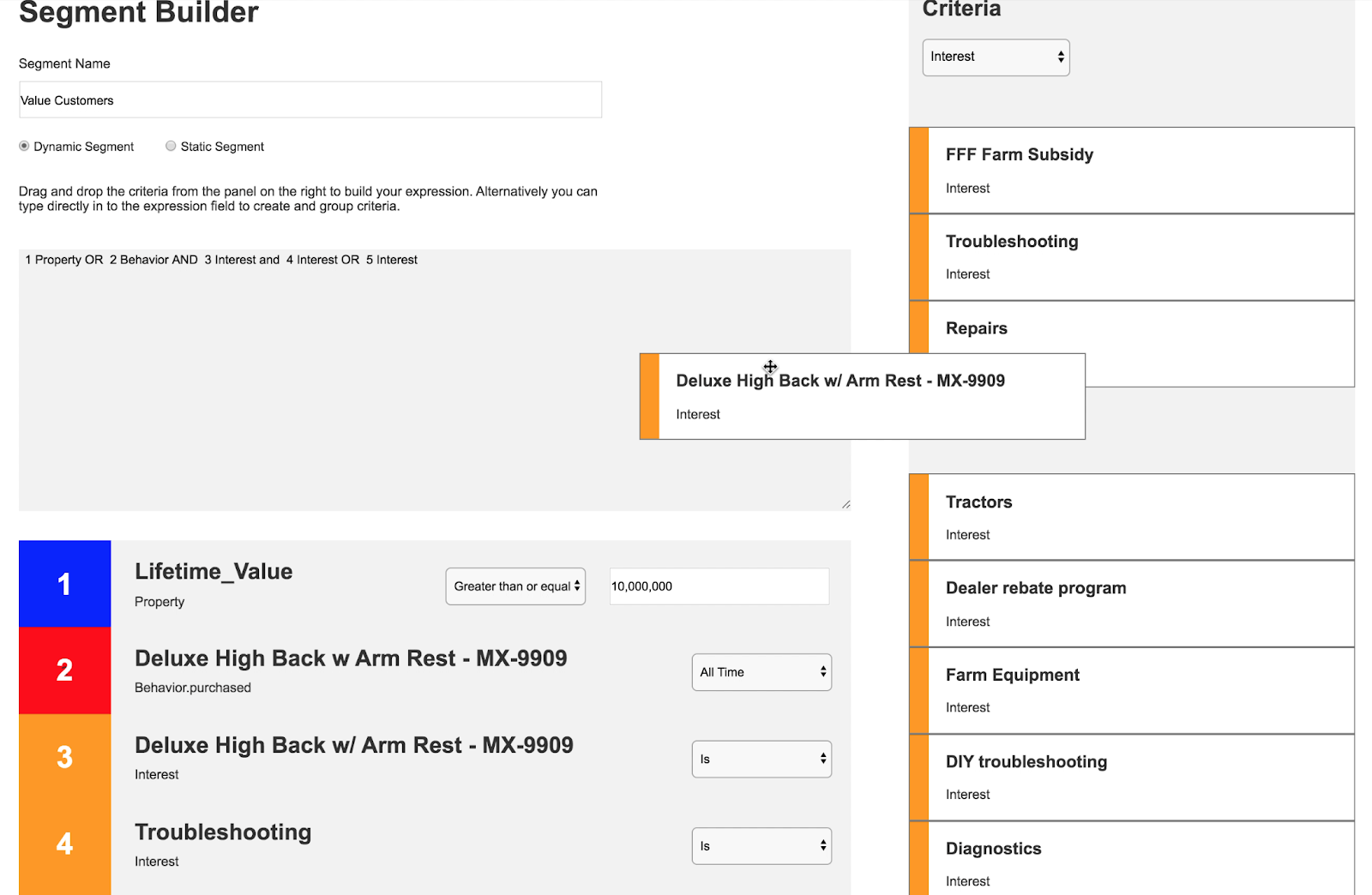
While setting an aggressive target SUS score of 77, the average results were 83.5 and 81.5 respectively. Quantitatively both prototypes passed our benchmark and were independently usable. However, each design was made better by combining elements of the other and including some feedback from users.
Some post-test interview qualitative insights:
Exposed properties for drag and drop made it easier for navigation and segment design
Live view of members were not useful, and added unnecessary friction
It’s hard to set a benchmark for behaviors, in the context of segment building, without a point of reference
People wanted to create criteria using mathematical operators
Improvements related to visuals cues and information proximity. Prototype B had user’s eyes jumping around, which caused some confusion (A great resource about Gestalt principles)
Writing queries (a requested feature) was only beneficial to the most technical users
Waiting for an Opportunity
Once we completed and documented the tests, the feature requests sat in our backlog for a couple of months. It wasn’t until a whole release later that opportunity struck.
The convergence of personalization features and new account criteria requirements stemming from the recent release sparked renewed interest in the segmentation feature.
Personalization would finally give the big purpose to segmentation that we always had in mind, while the requirement of additional criteria gave us the excuse to fix our usability flaws.
The final product would be a marriage of the interactions and elements that worked well from each prototype along with the qualitative feedback we received from the interviews.
Delivered Design
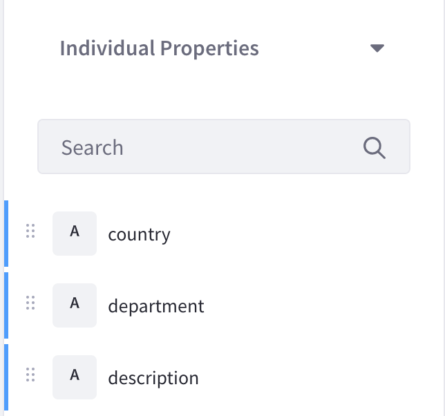
Exposed Criteria for Effortless Planning
With all available criteria now exposed, segment creation is easy as selecting criteria from a list. This gives the ability of the user to explore the available criteria without expecting them to know them all prior to arriving to this screen.
Supportive, Scalable, and Scannable
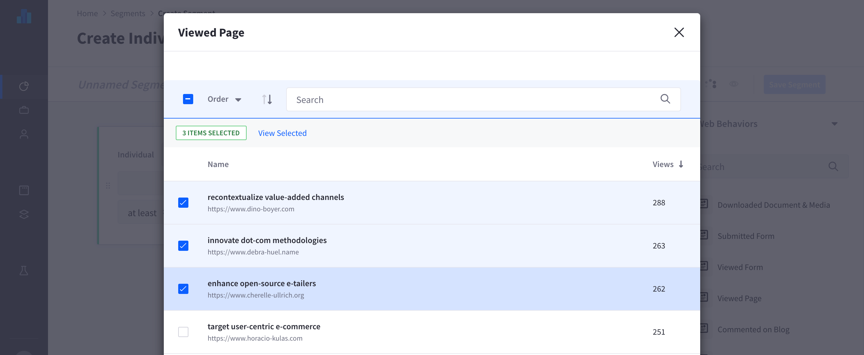
We changed asset selection from a drop down to a modal. With this change it affords us more display space for names, urls, and metrics. The use of these 3 data points, supports the user in finding and selecting the correct asset.
The modal also now allows the user to be able to select multiple assets of the same type. This is to help reduce repeated behaviors to make for more efficient segment design.
Nestable Criteria
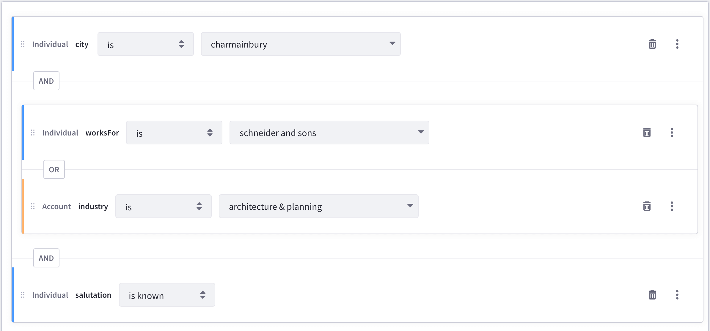
Nestable criteria was a hypothesis that proved to be useful to our users when creating segments. This is a case where building a query might be easier for the advanced users, but we wanted our product to be used by the average business user.
To make nesting easier to read and manipulate. The UI clearly shows the nested groups, color codes differentiate criteria types, and introduced a drag and drop functionality.
We also spent some time making each criteria as semantic to the reader as possible. This effort was so that our users, under different contexts, would be able to understand the criteria easily.
Forward Looking
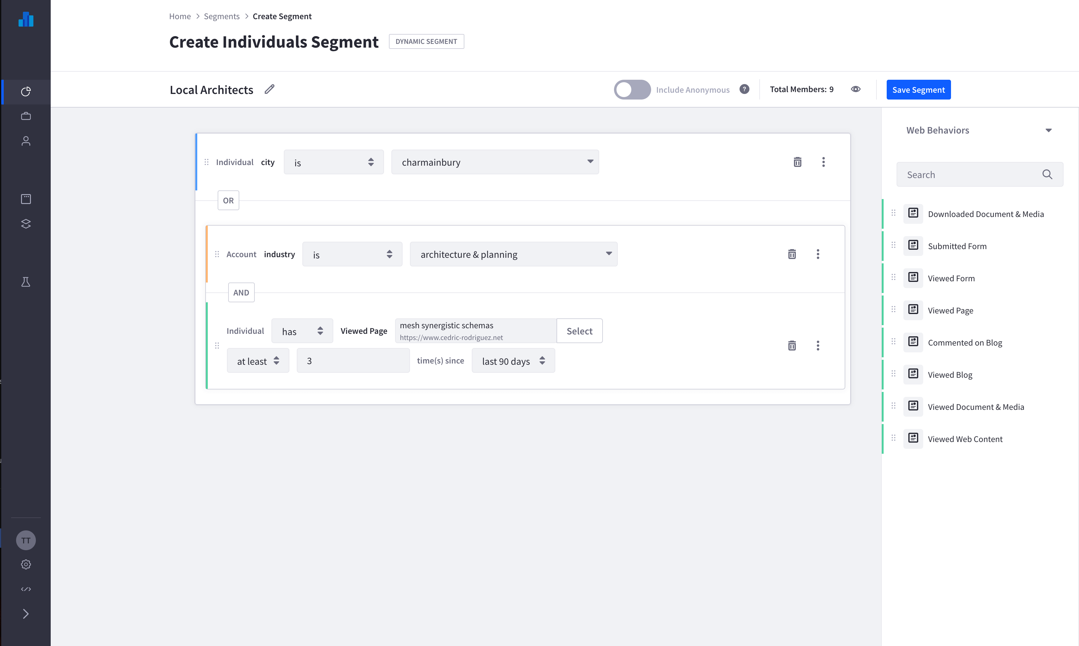
Redesigns are inherently costly for the company. It requires redoing something that already exists and for our user might need to relearn how to use your product. So to make this one count, we had to accommodate to scale for more future (unknown) criteria. Once we understood this, it was an easy fix in the UI which we handled with a dropdown.
Final Thoughts
First of all, big shout out to everyone on the Analytics and DXP segmentation feature for an excellent delivery. It was a great joint effort and I’m very proud of our team.
There isn’t a perfect design workflow and sometimes things can slip through the cracks, especially in large teams. If there are areas needing improvement in your product, work closely with your product manager to align the redesign with the roadmap.
Once you have a sense of priority, you can get to work planning and researching. Remember, not all design work has to be sprint related. Preparation will give you the edge you need to deliver a great solution when you are sprint bound later.
Featured photo by Alena Vavrdova on Unsplash


