Gestalt Principles by Miriam Manso on July 12, 2019
1 Min Read

Summary
Gestalt psychology (1912, Berlin School of experimental psychology: Wertheimer, Koffka, Khöler) is an important school of thought about visual perception. There are two basic principles in the Gestalt theory:
- A form or structure is defined, perceived and remembered by the pattern of relations between its elements or parts, and not reducible to them.
- The whole is other than the sum of the parts, and not reducible to them.
Many people still think that the application of the Gestalt principles it is something superficial but I'd like to highlight it's deep roots in cognitive neuroscience and neuropsychology with three fundamental concepts:
- The perceptual constancy (a flower is a flower, despite differences in color or size)
- The essence of every cognitive function
- The structure and dynamics of neural networks
In short, how the human brain works in terms of perception and cognition.
Knowing how our brains work, gives us a powerful weapon for our designs to influence the perception and attention of our users.

Takeaway
Gestalt tips to design:
• Law of Simplicity: Group and separate the most important areas of your screen to provide the user with a clear and simple perception of the visual concept
• Law of Proximity: Pay attention when ordering the elements on the screen, the user's brain will group those that are closest to each other forming a unit
• Law of Similarity: If you have several similar items on the screen, the user will tend to group them as a unit. Decide if you are interested in putting them together to enhance that effect or perhaps separate them to avoid it
• Law of Closure: You can help you from this law to create elements with less visual weight. The brain does not need that the figures are completely drawn. The brain can complete the missing spaces itself.
• Focal point Law: Always think about where you want the user to focus their attention: colors and location are important to help the user to focus on what you want him to focus
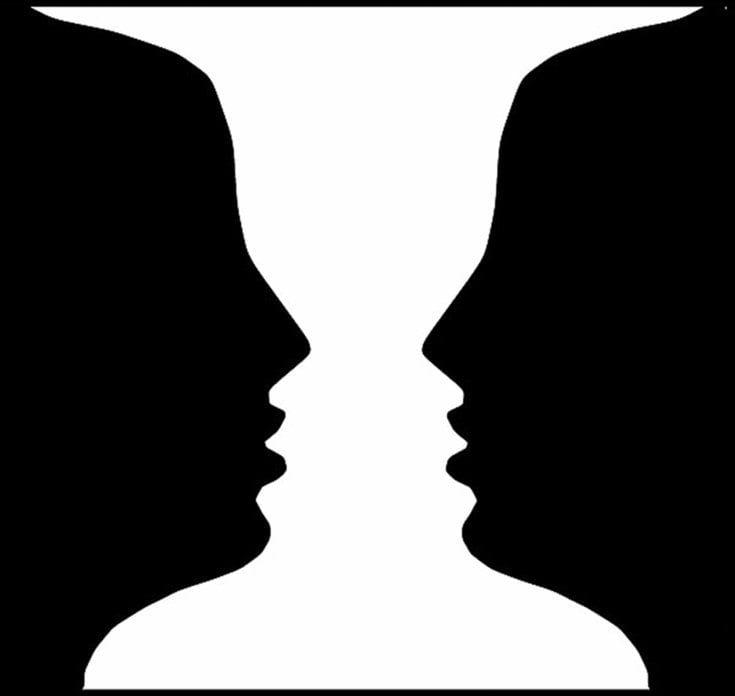
• Figure-Ground Law: The user’s brain tries to accommodate the visual perception into a background and foreground. Make it easy by using neutral backgrounds and pay attention to the contrast of colors to make it accessible
• Gestatlt Principles for design
• Gestalt Principles of visual perception
• Effectiveness of the Gestalt Principles of perceptual observation for virtual reality user interface design


