Gestalt Principles: Dance and Design by Miriam Manso on July 31, 2019
7 Min Read
Introduction
The first twenty years of my career were spent in the world of professional ballet. The transition to a career in product design might not be the most conventional — however there are many principles I learned in dance that crossover to design.
Gestalt psychology is foundational in dance and scenographic design — and I want to highlight, from a scientific perspective (cognitive neuroscience and neuropsychology), that the Gestalt principles are indispensable to understand, among others, three fundamental concepts:
- Perceptual constancy (a flower is a flower, despite differences in color or size)
- The essence of every cognitive function
- The structure and dynamics of neural networks
In short, how the human brain works in terms of perception and cognition.
Knowing how our brains work, gives us a powerful weapon for our designs to influence the perception and attention of our users.
Gestalt Theory: quick intro
Gestalt psychology is an important school of thought about visual perception. There are two basic principles in the Gestalt theory:
A form or structure is defined, perceived and remembered by the pattern of relations between its elements or parts, and not reducible to them.
The whole is other than the sum of the parts, and not reducible to them.
Some Gestalt Laws
We are going to analyze some of the most important Gestalt principles. In every case I will provide a little law explanation, a dance scenography example and the same example in digital product design (Liferay).
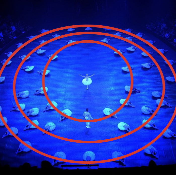
Good Figure or Law of Simplicity
This is the most important Gestalt law. It means that “People will perceive and interpret ambiguous or complex images as the simplest form(s) possible.”
Have you ever seen the scene from the Swan Lake ballet? What do you see?
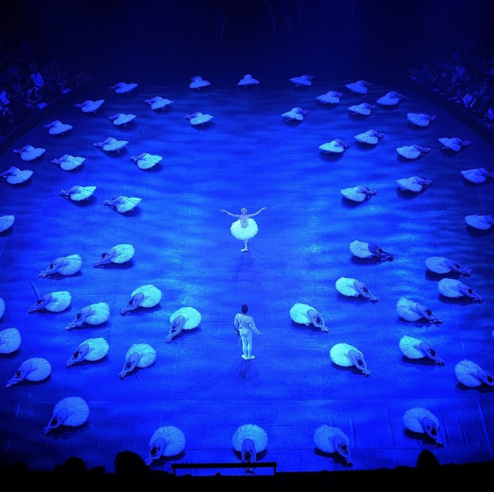 English National Ballet. Swan Lake. Photography: Laurent Liotardo.
There is a complexity in the scene design but what we perceive at first glance, is what seems to be concentric circles around the main figure.
Here you have a screenshot of the page editor of Liferay Portal. On this screen we can see a lot of elements.

However, our brain needs to simplify the visual perception to understand all the context as quickly as possible. Keeping this in mind, designers can group the items into three large blocks that allow the users to identify the different functionalities of the parts of the screen (green: information header, blue: page construction tools, red: canvas where to build the page).

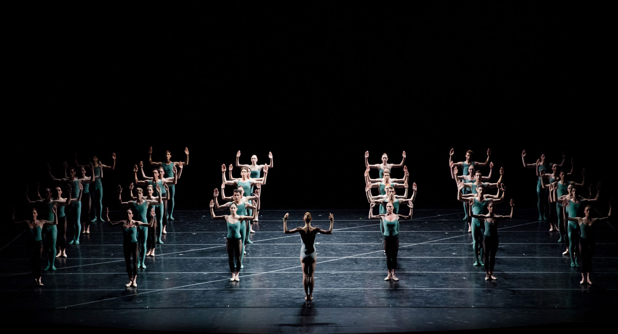
Proximity Law
“The law of proximity states that items placed near each other appear to be a group” (Fisher and Smith-Gratto, 1998). Viewers will mentally organise closer elements into a coherent object, because they assume that closely spaced elements are related and those further apart are unrelated.
 Artifact. Choreography by William Forsythe
In the picture above we can see how the dancers are forming six columns: three on the left side of the stage, and three on the right side.
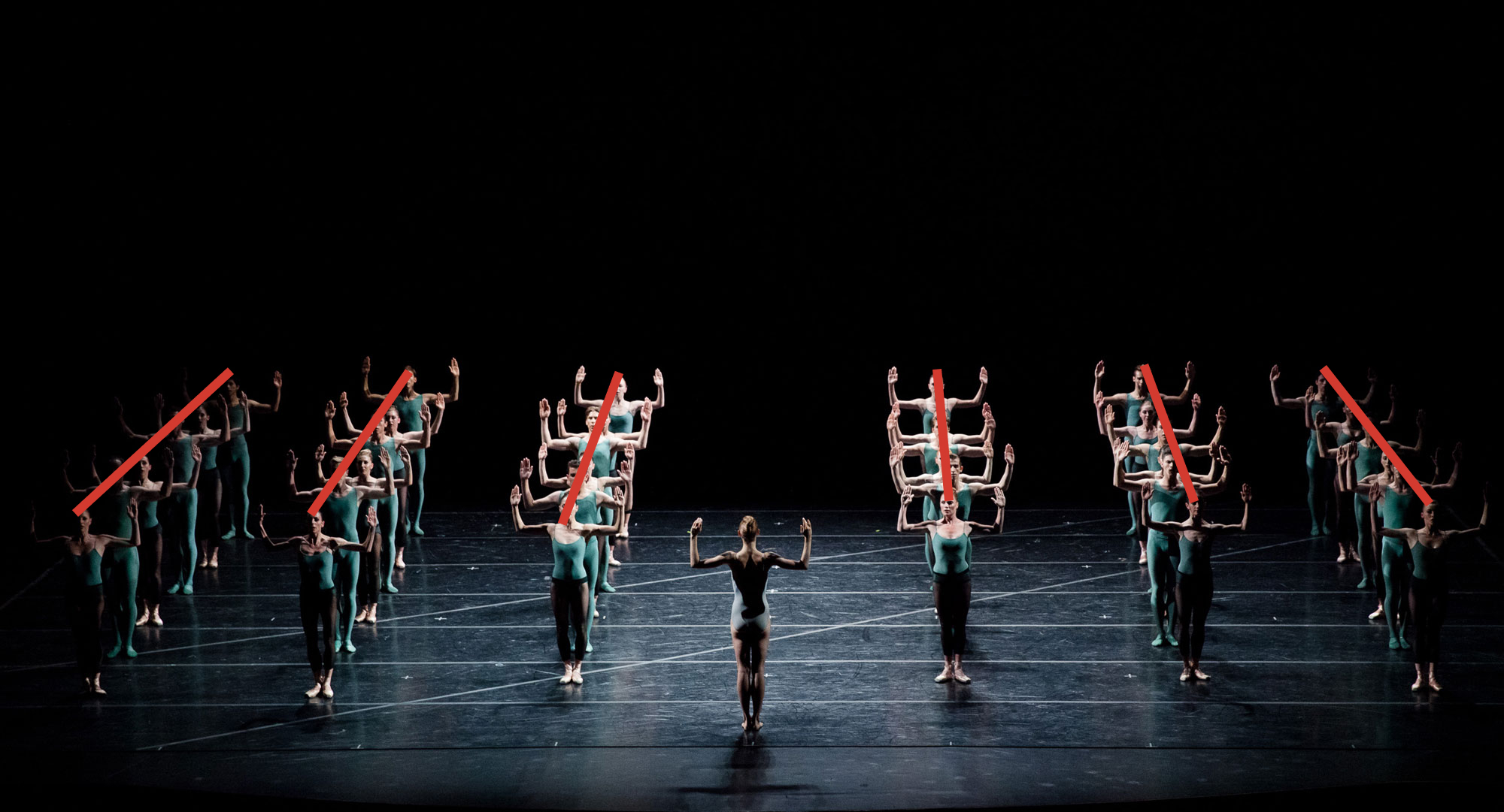
We can perceive these columns because the distance between the dancer front to back is smaller than the distance between the dancers side by side.
In the example below, what do you see?
Rows?

Columns?

According to the law of proximity, what the brain perceives are columns. If we look closely, the shortest distance between the elements is in the vertical direction. The description of the items (text) makes the horizontal distance between elements larger.
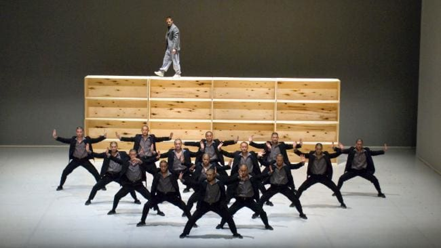
Similarity Law
According to Fisher and Smith-Gratto (1998) similar objects will be counted as a group so this technique can be used to draw a viewer’s attention to where we want it.
Sudra. Choreography by Sidi Larbi Cherkaoui
In the picture above we can see a group of dancers, all of them wearing the same clothes and doing the same movement. Behind them there is a scenographic element formed by several rectangular parts of wood, all of the same color and size.
Although there are fifteen dancers on stage, the brain perceives a single triangular shape occupying the central part of the scene. The same thing happens with the scenographic element that is behind the dancers. There are sixteen identical rectangular elements that we see as a single larger one.

We can observe the effect of this law of similarity in the Liferay Logo. Within the blue square, we see twelve smaller white squares (like the fifteen dancers), but by their similarity and by the law of proximity we perceive two triangular shapes on each side of the square.
Closure Law
Fisher and Smith-Gratto (1998) point out that “open shapes make the individual perceive that the visual pattern is incomplete” and the “sense of incompletion serves as a distraction to the learner.” Our minds will tend to close gaps and complete unfinished forms.
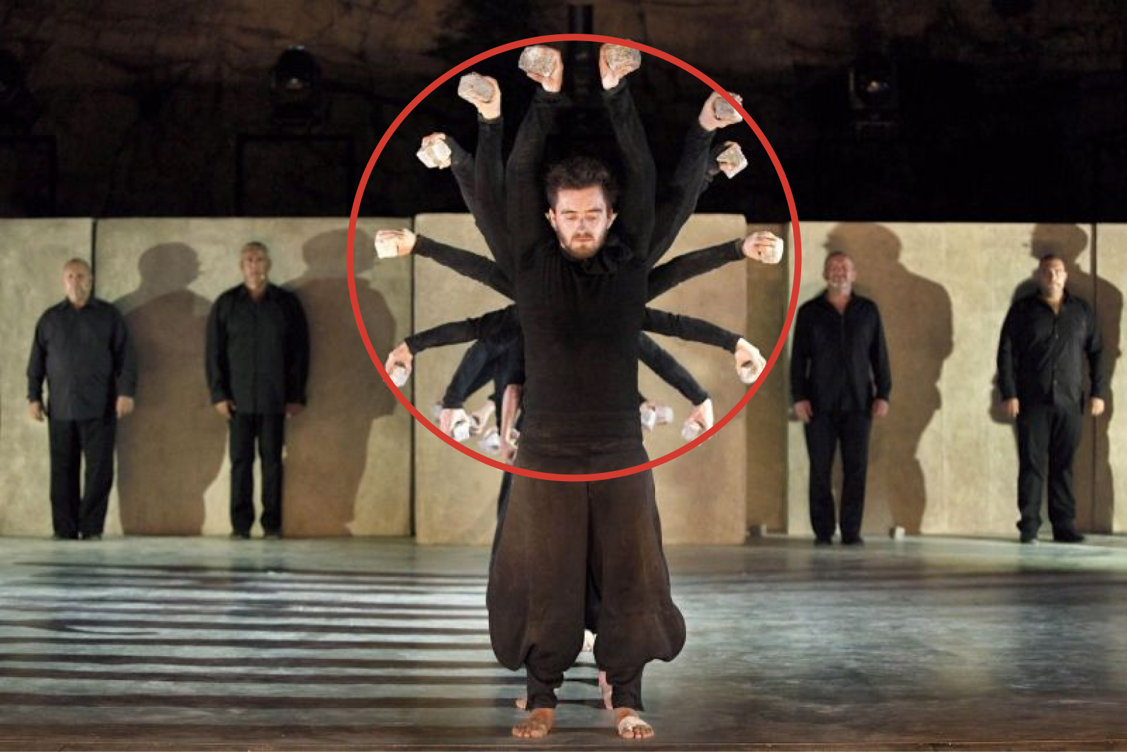
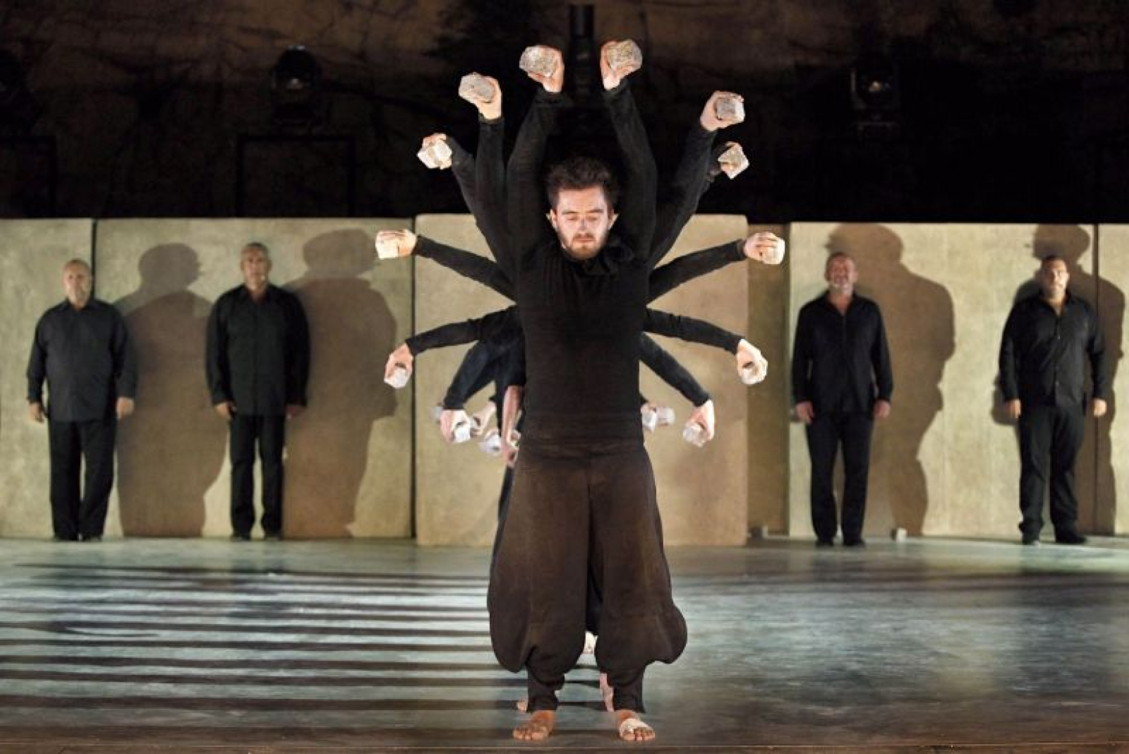 Puz/zle. Choreography by Sidi Larbi Cherkaoui
Upon seeing this image the brain tries to close the unfinished form. The hands of the dancers are arranged in the space forming a circle. The circle is not a finished form since there is an empty space between the hand of each dancer, but, nevertheless, our brain perceives a circle.
In these Liferay icons we see how part of the forms are unfinished. The brain does not need all the lines to be united to understand that these are scissors, this is a pushpin or a recycling bin. The brain just completes the nonexistent information to make sense of it.
Law of Symmetry / Balance
A psychological sense of equilibrium, or balance, is usually achieved when visual ‘weight’ is placed evenly on each side of an axis.
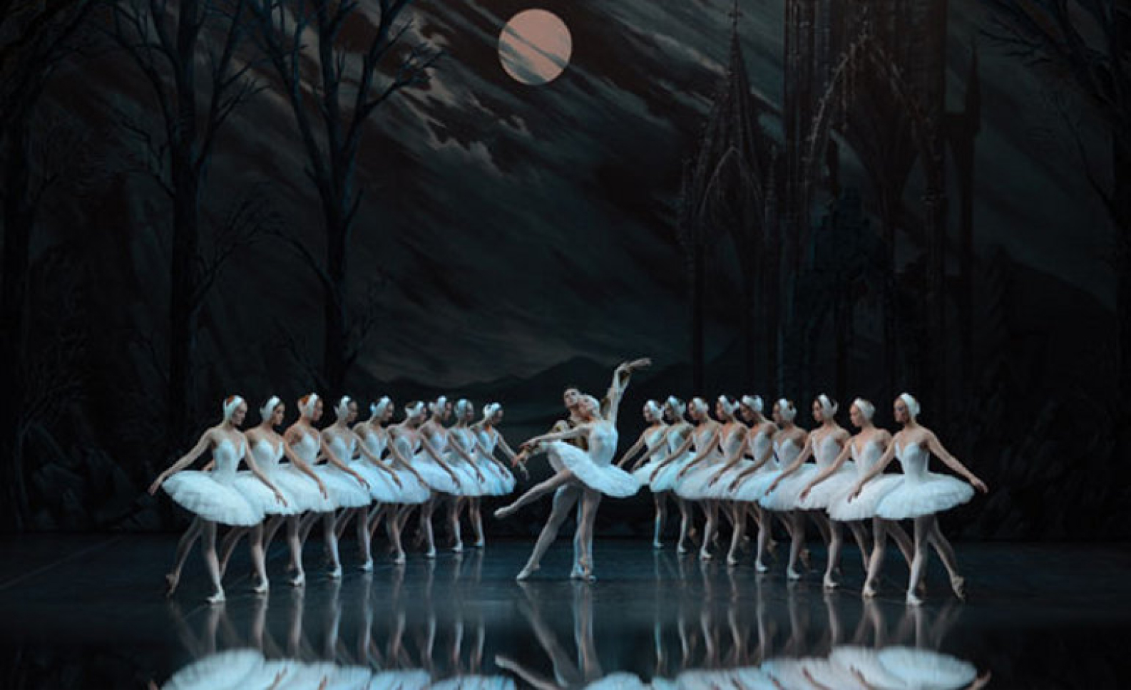 St Petersburg Ballet. Swan Lake
In the image above we see how the elements of the scene are distributed in a balanced way. The main dancers are located in the center and the corus dancers are arranged in two diagonal rows, one on the left side of the stage and the other on the right side. The figure they form is absolutely symmetrical, provoking a sensation of scenic equilibrium.
In the screenshot below (www.liferay.com), we see how the information is well distributed in a balanced way: the text on the left side; the image that accompanies it on the right side. Neither occupies more visual space than the other, nor assumes a greater weight, so a sense of equilibrium and balance is achieved.

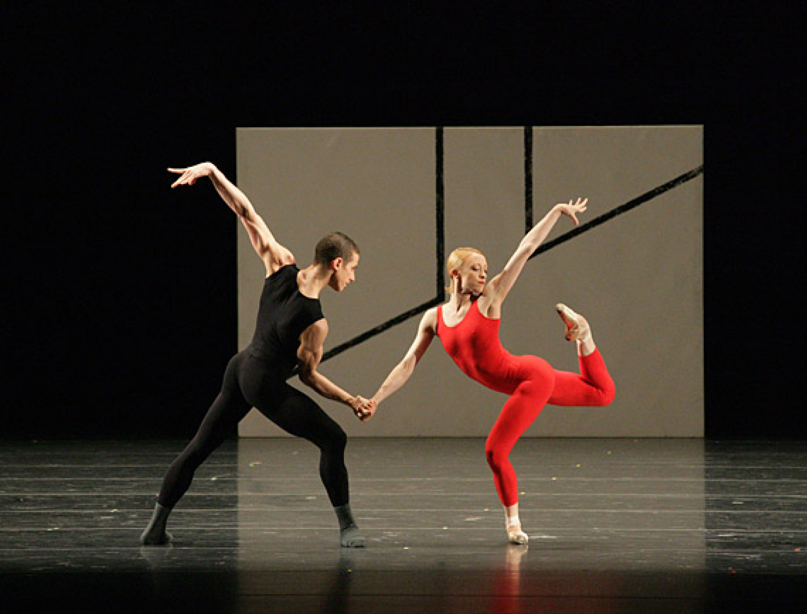
Law of Focal Point
Every visual presentation needs a focal point, called the centre of interest or point of emphasis. This focal point catches the viewer’s attention and persuades the viewer to follow the visual message further.
 Natalia Sologub and Claudio Cangialosi of Dresden SemperOper Ballet,
Dresden, Germany, performing Steptext.Choreography by William Forsythe.Photography:Costin Radu
Natalia Sologub and Claudio Cangialosi of Dresden SemperOper Ballet,
Dresden, Germany, performing Steptext.Choreography by William Forsythe.Photography:Costin Radu
In the image above we see two dancers on stage. However, the visual focus is on the dancer wearing the red leotard. The rest of the scene, as well as the costume of the male dancer are in neutral colors to make the figure and movement of the woman stand out.
In the modal window used in Liferay Portal we can see that the focal point is the primary button. The blue color on a white background, and next to a neutral color button, causes the user to direct their attention to the primary action button.
Law of Figure-Ground
We distinguish the foreground and background in a visual field. When there are two different colors in the visual environment, the brain tries to accommodate them by giving each of them a role: background and foreground.
In the performing arts, the light design is a very important aspect. With it we can "manipulate" the attention and perception of the viewer. In the image below the center of attention is focused on the dancer with direct frontal lighting and a black background.
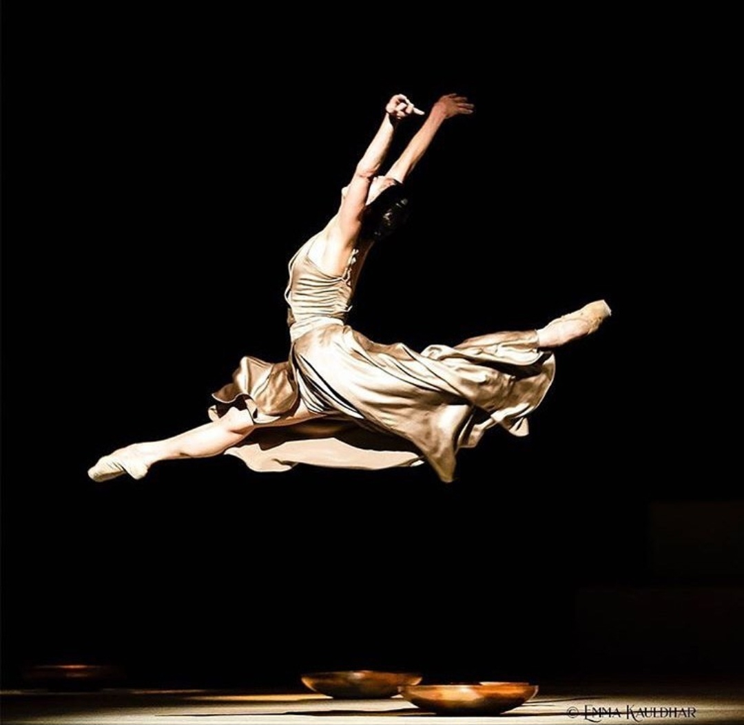 Royal Ballet. Photography: Emma Kauldhar
Liferay has designed this type of informative tooltips (the image below) that stands out on the white background of the element on which it gives information. In design, in addition to making it clear to the user what the background is and what the elements are in the foreground, we must pay attention to the color contrasts.
If we look at the following image we see how the choreographer and the illuminator of this ballet use this law to create different effects: on the one hand, the contrast between the blue cyclorama and the white costume of the dancers is sought to focus the attention of the spectator in this. But on the other hand, the scene is filled with white smoke, eliminating the contrast of color around the legs of the dancers. It seeks to create an ethereal and volatile effect for the dancers.
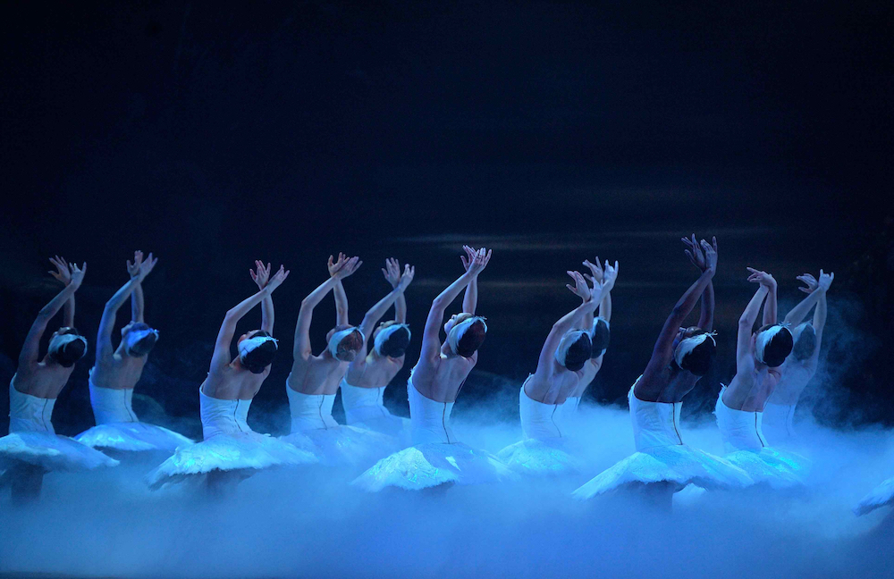 English National Ballet. Swan Lake
This is a very cool effect in the performing arts, but we should refrain from using it in digital visual design. If we do not take care of colour contrast, we will make our product difficult to consume and in many cases, inaccessible.
Conclusions
Law of Simplicity
Group and separate the most important areas of your screen to provide the user with a clear and simple perception of the visual concept.
Law of Proximity
Pay attention when ordering the elements on the screen. The user's brain will group those that are closest to each other forming a unit.
Law of Similarity
If you have several similar items on the screen, the user will tend to group them as a unit. Decide if you are interested in putting them together to enhance that effect or perhaps separate them to avoid it.
Law of Closure
You help yourself with the law of closure to generate elements with less visual weight. The user's brain will be responsible for completing the missing information without much effort.
Focal Point Law
Always think about where you want the user to focus their attention: colors and location are important to help the user focus on what you want them to.
Law of Figure-Ground
The user’s brain tries to accommodate visual perception into a background and foreground. Make it easy by using neutral backgrounds and pay attention to the contrast of colors to make it accessible.
More Reading
- Gestalt principles in UI design
- Gestalt Principles. Interaction Design Foundation
Bibliography
GKOGKA, E. (2018). Gestalt principles in UI design. Muzli - Design Inspiration
FISHER, M., and SMITH–GRATTO, K. (1998). Gestalt theory: a foundation for instructional screen design. Journal of Educational Technology Systems. LAUER, D. (1979). Design Basics. New York, Holt, Reinhart and Winston.
The Interaction Design Foundation. (2019). What are Gestalt Principles?
WAGEMANS, J. et al (2012). A Century of Gestalt Psychology in Visual Perception I. Perceptual Grouping and Figure-Ground Organization. Psychol Bull.