Designing animations for a multicultural product by Susana Vázquez on July 23, 2018
3 Min Read

The world is big and diverse. Right now there are around 7.6 billion people in the world, 4 billion with an internet access. When you’re improving a Design System for a product used worldwide, like Lexicon for Liferay, you should take this simple statement into account. Cultural, religious and regional concerns need to be considered. It may sound obvious, but the true fact is that we sometimes forget about it.
I’m going to explain how we redesigned and tested empty state illustrations for Liferay products.
1. The past
Let’s put a bit of context around this story. As you may know, an empty state illustration is shown when there is not any other info to display and capture the user’s attention. A friendly face looking around, smiling, or winking was the animation family for empty state in Lexicon 1 by Marcos Castro. They were created to give feedback in a memorable way and provide a pleasurable experience for the user but the fact was that the smiling face animation caused some cultural issues.

In some cultures a wink could be understood in a sexual way. Of course, we fixed that ASAP. For our next version, Lexicon 2, we wanted to avoid possible misunderstandings and make sure that our set of animations are universal, appropriate, understandable and polite for every culture in different geographical localizations all over the world.
2. The theme
How did we select a common theme? Firstly, the subject was very carefully chosen. It should suggest the emptiness in a pleasurable and descriptive way. Think about it, but the way of representing emptiness is not so obvious. In fact, we started crafting ideas around the desert concept but at the end the selected topic was outer space. The reason behind this decision was that the space is usually related with curiosity, technology and challenges in a good way unlike the desert which is normally related to death.

3. Visual identity
With the topic selected, it was the turn for visual design, where Emiliano Cicero turned concepts into illustrations.

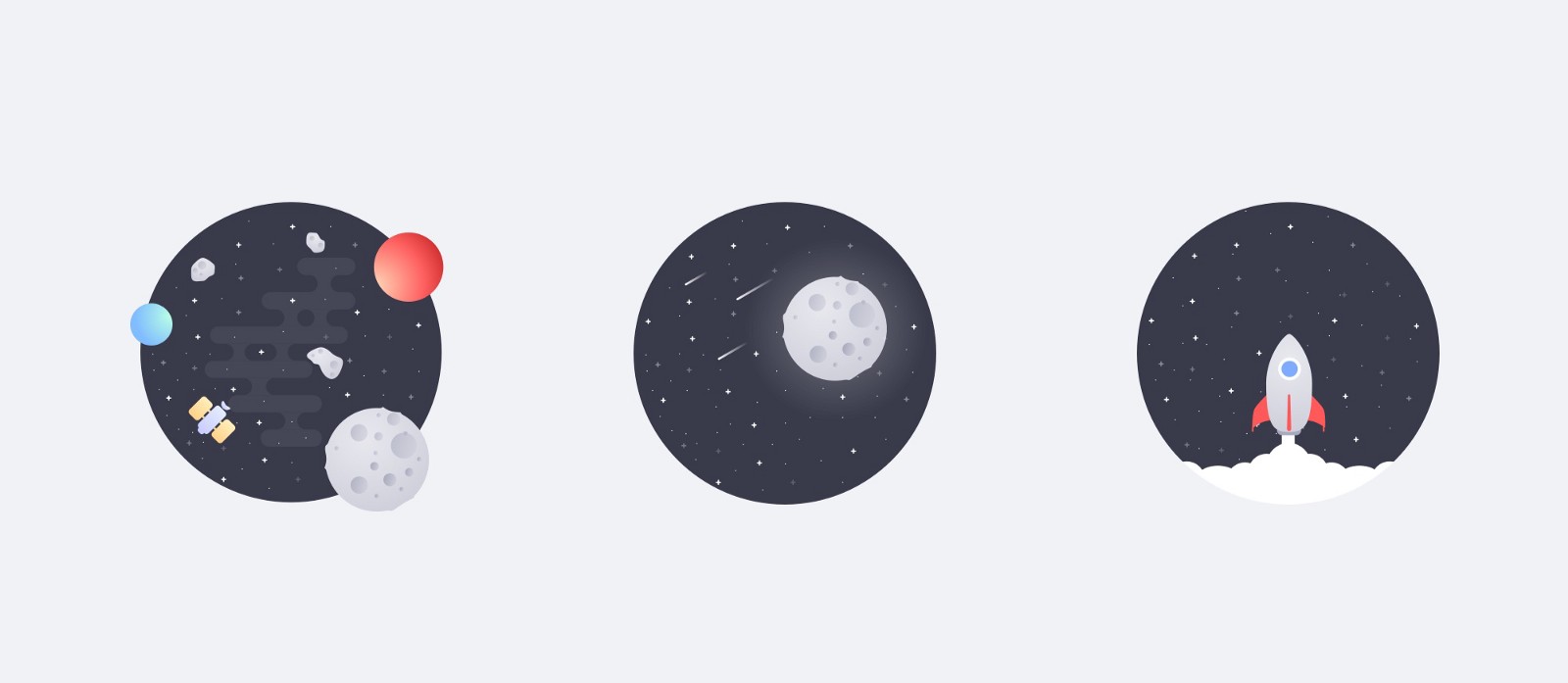
Regarding the visual guidelines, it was necessary to make a clear, understandable design, with clean shapes that show the idea with simple animations to catch the user attention but without being too aggressive. We created 3 illustrations as part of the collection: a satellite surrounded by asteroids, the moon with comets and a spaceship launch.
The idea was to tell a story that accompanies users in their journey using the product, giving consistency through different animations depending on the interface status but totally related to a common topic, outer space.
4. The test
Next step was the testing stage to validate the new concept and design. For the test, we chose different profiles of Liferay workers all around the world, representing different regions, cultures, and religions. Then they were requested to fill a questionnaire to make sure that the illustrations couldn’t be interpreted as offensive, obscene, inappropriate, menacing, insulting or impolite for anyone in their culture or region. We asked participants to answer the questions with specific comments, ideas or feelings on why they thought the animation could be appropriate and understandable or not. Moreover, we included the description of future possible ideas to use in new illustrations related with outer space, as an astronaut arriving to the moon, an astronaut putting a flag, a comet, a spaceship flying or planets orbiting around a star. All these scenes together create the story.
As a summary of the test results, 100% of the answers agreed that the images weren’t offensive, obscene, inappropriate, impolite, menacing or insulting for them, their regions or their cultures. Nevertheless, 40% pointed that the pictures didn’t necessarily mean an empty state because of the presence of many elements. And comments on other possible scenes related to the space gave us lot of information on what to do and what to avoid.
5. Design iteration
Regarding all the information provided by participants, we iterated the design again, refining and polishing details to get to the new empty state animations set. We took into account the importance of having a universal, appropriate, understandable and polite design for each of the possible users for our product. As an example, we reduced the number of elements based on the feedback and we changed the powerful bright colors to a grayscale to not be so intense but still eye-catching.
6. The result
As an outcome of all this study and design process we created three animated illustrations for our empty state.
 A telescope looking into the sky for the empty search/filter action when there are not results.
 A satellite when there are no elements yet in a dataset.
 A spaceship launch when the user has emptied the dataset for a good end, for example, when the notifications list has been cleared out.
Our animations set for empty state conformed a collection that makes users feel comfortable and part of the story. This is just the beginning and we expect to expand the family as our needs grow. We expect the experience using Liferay products will be more pleasurable, memorable, understandable and universal.
What do you think?


