The Danger and Pitfalls of Uniformity in Design Systems by David Aragonés on June 11, 2018
4 Min Read
In 2008, I came across design systems for the first time. Back then, we didn’t know (nor did we care) what a design system was. We didn’t have design principles, nor a grid, nor did we follow established patterns. The only thing we care about was being as pixel perfect as possible with the final product. To achieve pixel perfection we had a resource dictionary with basic UI controls. Within these style series, we had resources: colors, measures and sizes, which we applied to our UI elements. This helped us to maintain consistency in the application. A change in the dictionary was transmitted to all the controls and styles where they were applied. It was simply marvellous. Does this sound familiar?
Design Systems
Nowadays that’s a “thing of the past”. What we now call design systems have become a trend. This progression towards design system is now a common practice. This means that what we had for desktop applications 10 years ago is being applied now to all digital products. Mostly, we have better tools and technologies for designers and developers that make things easier, specially with web design. I would like to talk a bit about that complex world that goes beyond traditional webs such as product intranets, app site, which can make an intensive use of design systems. From my experience, a design system is more than that. A design system is a group of elements, instructions, design rules and interaction patterns that can be applied to more than one product to achieve a common identity without losing each product’s own characteristics. This is the key: without losing each product’s own characteristics.
Identity and Consistency
A common practice in interface design to know if the visual relationships and hierarchies are working, is to make a Squint Test. This is, you close an eye and partially close the other one to see which items stand out, are blurry or look like they go together. Basically, a change of perspective that helps us become aware if something is not working as it should or as we would like it to work visually.
Following this idea of change of perspective and having a wider vision of a product, we observe that a design system could be used with other products which have more features and different goals. All of this means users can make use of various products that must keep their own identity and use the same design system.
Let’s compare two Google products: Drive and Calendar. Different products using the same design system: material design.
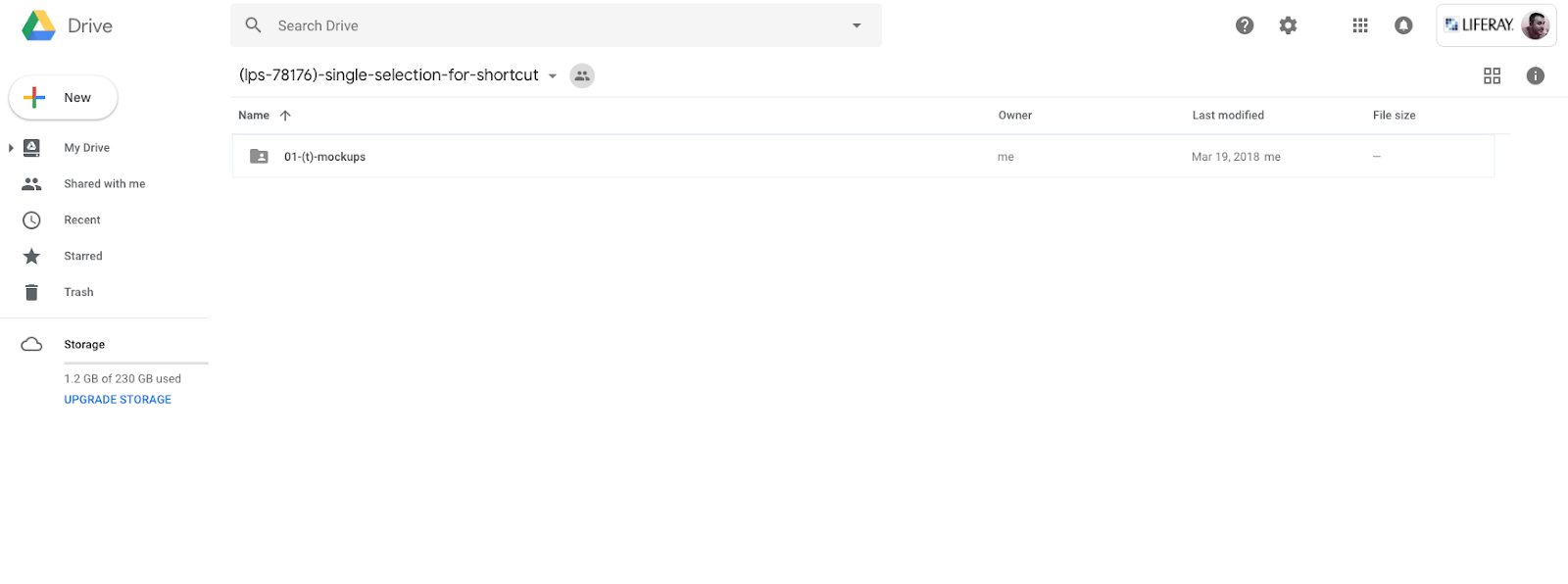
If we take a more careful look at the most basic elements of these two products, we can observe that both of them have a series of components that are shared: such as the notification area, the user sticker and the application menu, just to name a few.
However, if we focus on the functional part, both examples require a search feature. Drive has a visually clear search box with a shaded background but on Calendar you must click on the magnifying glass to activate the search box. Why have they solved the search in a different way?


Knowing the reasoning behind this, it makes sense. The Calendar search weighs less and it’s not considered the most important task for their users, but it is important on Google Drive. This is a good example where the consistency principle is not put above the real needs of the users. In addition, it contributes to the characterization of each product. Consistency is easier said than done because when you design using pieces that are part of a design system you can easily fall into the mistake of uniformity. Unfortunately, in the end, the system has the solution established and the designer can just follow the rules without asking themselves if they really make sense. It’s a way for designers to avoid responsibility and blame everything on the design system.
Bend without breaking
When talking about reusing, developers have a lot to say. Their expectation is that if a code they have created works well, it can and should be reused as much as possible. Of course, this makes sense. This reasoning works in a similar way for designers, if we can be consistent, why not be so? The natural reasoning is that consistency comes from our need to save time and energy by reusing the same solution when we have similar needs to cover of design or interaction. However, applying a rule or a component indiscriminately, without thinking about the context or the users’ needs, doesn’t sound like it’s user centric design but system centric design.
Let’s look at an example: We have decided that all the forms of our desktop application will follow the float label pattern, must all the scenarios with inputs follow the same pattern? The login screen? In an inline edition of a table? In an info panel? And what if the information of the panel is editable? We have to be flexible when making decisions, not only when applying rules but also with the atomic elements. It’s preferable to have several decisions in the system that permit variations than to have strict decisions that are not customizable. A flexible system that allows exceptions without causing chaos. This would help the system grow better. Allow exceptions supported on: user research, validated hypothesis and contrasted scenarios. And obviously, these exceptions are needed because there are users and business needs that the systems can not cover in specific situations.
Conclusion
Uniformity produces bland and easily forgettable experiences that do not create the bond of our brands and products with the users. Because after all, our goal must be to provide the best and most memorable user experience. The challenge for design teams is to find the balance between consistency and flexibility when applying a design system to an ecosystem of products. With the increasing popularity of design systems, it seems as if we’ve found the philosopher’s stone of the interface design. Although said design systems can provide a solution to difficulties and problems, it’s essential that we analyze in depth the application of the solution to each problem keeping in mind the end user. So here again, the key is, the user.
PS. The UX Liferay Team released a design system called Lexicon, have a look. We love feedback! You can talk with us via twitter.
Ah! and I also wrote this article in Spanish a couple of months ago.
