Building Charts for Multiple Products by Emiliano Cicero on September 10, 2018
3 Min Read
With Liferay releasing new products such as Analytics Cloud and Commerce we decided to cover the need for charts by providing an open source library.
The technology
Clay, our main implementation of Lexicon, created Clay charts. These charts are built on top of Billboard.js where many contributions have been done by Julien Castelain and other Liferay developers. Billboard.js is an adaptation layer on top of D3.js, probably the most known and used for data visualization these days.
The issue
Although Billboard.js is a very good framework, it was not covering all our needs in terms of interaction design and visual design. Therefore, we have been working on top of it, contributing some work and keeping the rest of it inside Lexicon and Clay.
Improving accessibility
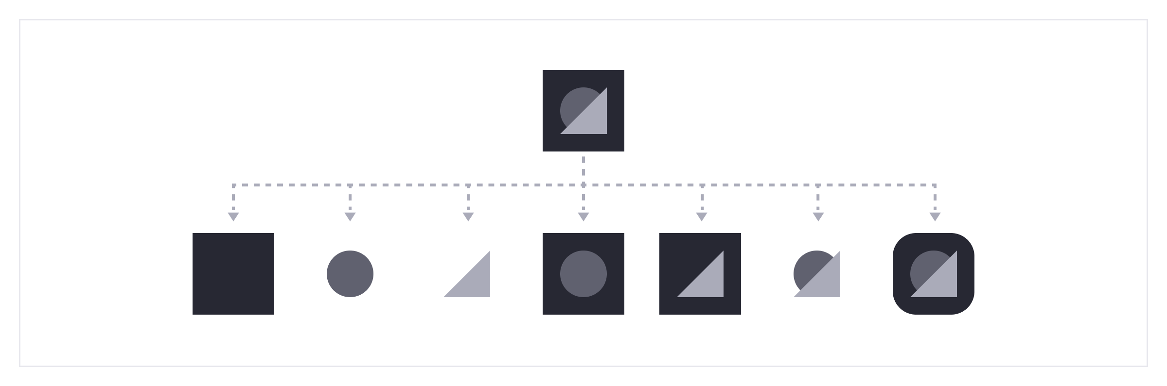
Improving the accessibility aspect for different charts was one of our first contributions to Billboard.js. We provided 3 different possible properties that help to differentiate the data before having to include colors.
- 9 different dashed strokes styles for the line charts that helps to follow the shape of each line.
- 9 different shapes to use as dots inside the line charts and the legend that helps to read the points in each line.
- 9 different background patterns to be used on shaped charts like the doughnut chart or the bar chart, adding this property to a chart background helps to recognise the different shapes even if the colors are similar.
Here is a clear example so you can see how the user would perceive, read and follow the different data from the line chart, without the direct use of colors.
Creating a color palette
Color is one of the first properties that users would perceive along shapes and lines, making it our next priority. We needed a flexible color palette that allowed us to represent different types of data.
This set is composed by 9 different and ordered colors that are meant to be used in shaped charts as background or in line charts as borders.
Each of these colors can be divided into 9 different shades using a Sass generator. It is useful to generate a gradient chart to cover all the standard situations for charts. Here’s an example using the color blue:
Ideally, to take advantage of these colors use the charts over a white background.
Warning: using these colors for texts won’t reach the minimum contrast ratio requested by W3C. Using a legend, tooltips and popovers to provide text information is the best course of action.
Introducing a base interaction layer
The idea behind the design of these interactions is to provide a consistent and simple base for all charts. This increases predictability and reduces the learning curve.
These interactions are based on the main events (click/hover/tap) applied to the common elements in our charts: axis, legend, isolated elements or grouped elements. We also reinforce the visualization, with highlights, between related information and extended information, displayed through popovers.
As you can see in the example below, the Stacked bar and the Heatmap share the same interaction of the mouse hover to create a highlight on the selected data. This is done without any change to the main color when focusing on an element, but instead decreasing the opacity of the other elements.
In addition to this, each designer can extend these interactions depending on their products as well as working on advanced interactions. So, if they need specific actions such as a different result on hover, data filters, or data settings they can add them to the chart as a customization.
Conclusion
Working with D3.js allowed us to focus on our project details such as accessibility, colors and interaction, adding quality to the first version of Charts and meeting the deadline at the same time.
Thanks to the collaboration with Billboard.js we were able to help another open source project and as a result, share our work with the world.
You can find more information about Clay, Charts and other components directly inside the Lexicon Site.