White Space is Necessary Space by Emily Young on September 18, 2019
1 Min Read

Summary
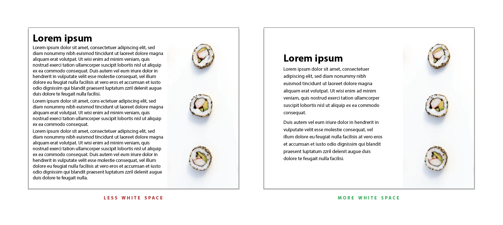
White space is not wasted space. Quite the contrary! It is the empty space between and around elements in a design that draws the eye of the viewer to what is important through content prioritization. Properly framing important elements with white space tells the viewer, “This is special and important.” It also guides the eye of the viewer to the next important elements on the page/screen. White space plays an important part in creating balance and harmony in a design.
In the form of margins and space between lines of text and paragraphs, white space gives readers’ eyes (and the text) room to breathe, thus increasing readability and reducing fatigue. Lab tests have shown white space can even increase comprehension by up to 20%, which is vital to messaging.
While layouts using white space are preferred over those without, white space also has an effect on the perception of a brand: more white space is associated with sophistication and being upscale, while little white space is associated with being cheap.

Takeaway
We are creating materials to be read by humans, not robots. The visuals created for these human brains need to work with their senses. Filling every inch of real estate with content comes across as clutter and may deter audiences from reading even the best-of-the-best content. Properly employing white space allows the viewer to more easily:
- find what is important
- know where to go next
- understand what is being communicated
- leave with a positive experience
Read More
- Reading Online Text: A Comparison of Four White Space Layouts (PDF)
- UX Planet: The Power of Whitespace
- A List Apart: Whitespace
- 99 Designs: Embracing Space in Interaction Design