Isolation Effect by Abel Hancock on July 02, 2019
1 Min Read

Summary
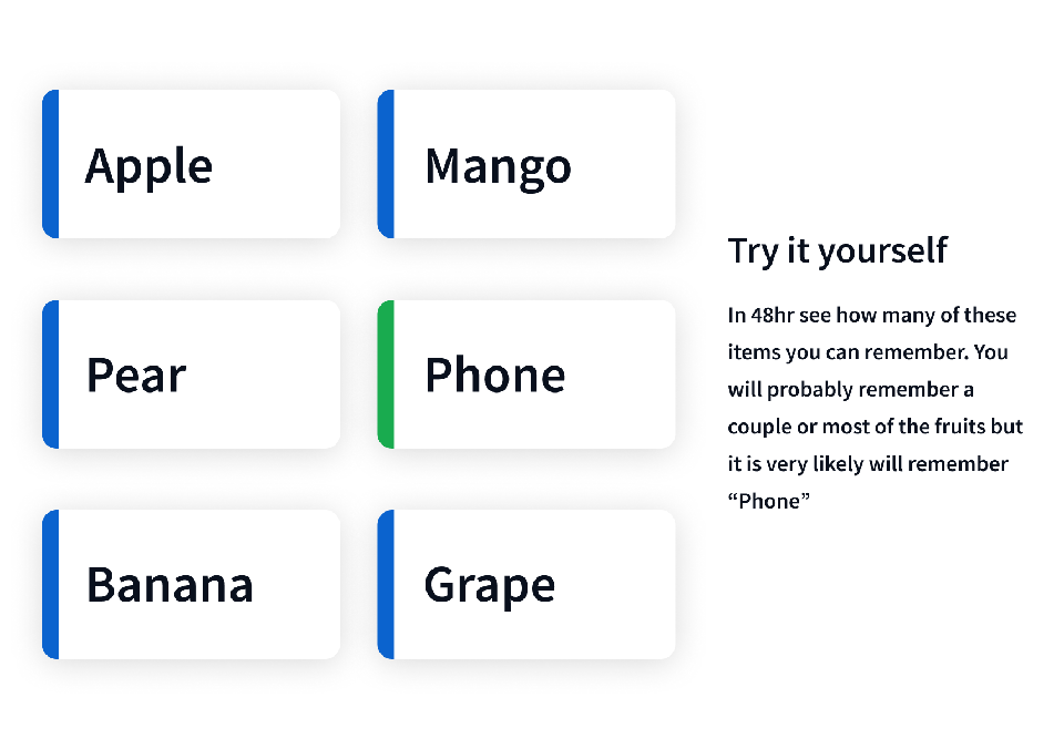
When multiple similar objects are presented together we are most likely to remember the object that is most different from the rest. This is a simple but powerful effect know as the Isolation Effect or the Von Restorff effect. This effect was studied with lists of words containing one "isolated item" but applies to any objects that "envoke reactions of bizarreness, vividness, distinctiveness, surprise, and the like." This means the effect could apply visual elements, words, sounds, tastes, and really any stimulus.

Takeaway
On a high level, this effect could be seen with something like brand, whether it is color palette, voice & messaging, or logo design, etc. Having a distinctive brand that evokes one of those reactions would make a business more memorable than competitors. More granularly, a common example of this is CTA design. Creating a CTA that stands out visually from other elements in an interface is more noticeable and memorable for users. However, overuse of this tactic can reduce its effectiveness. If everything is different, nothing stands out – apply this principle sparingly.
• Von Restorff Effect Laws of UX
• The Isolation Effect: Why we notice the red tomato, and ignore all the green ones
• Von Restorff Effect Wikipedia


