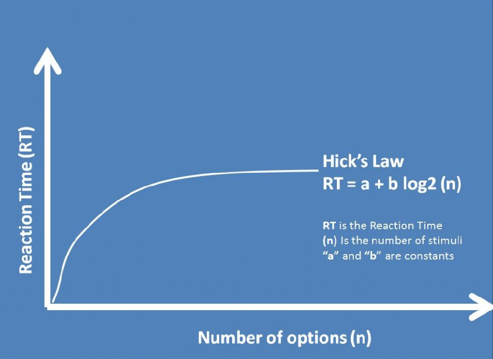
Hick's Law by Duuriimaa Bargaid on June 28, 2019
1 Min Read

Summary
Delivering a good user experience requires
a. Find out the functionalities that will answer their needs
b. Guide them through specific to-dos
If users presented with too many choices or stuck up in the decision-making process of "what's next?", they may become confused, frustrated, or leave your website or application. Hick's Law states that more stimuli to choose from, the longer it takes to make a decision. You should examine how many functions you should offer and how this will affect your users' overall approach to decision making.
The application of Hick's Law is simple, reduce the number of stimuli and get a faster decision-making process.
To Illustrate this idea, the "Payment process" would be a practical example. Instead of showing everything at once, you can break it down. Show the screen with shopping cart details, another with delivery information, then account creation, and so on.

Takeaway
- Narrow down big volumes of information without overloading the user.
- Simplify choices for the user by breaking down complex tasks into smaller steps.
• Hick’s Law: Making the choice easier for users • Hick’s Law • Quick decision making

