Revamping the page building experience by Carolina Rodriguez on January 22, 2023
4 Min Read
2022 was a year full of achievements for DXP and our product teams. We dedicated a lot of time on research and talking to our users. We managed to find critical pain points and identify usability improvements in Page Builder. Although some of us were new in the team, we could all see that one of the main challenges for the next few months would be advancing this powerful tool to be more usable and accesible to everyone.
Our users
Liferay is a modern and secure solution that offers personalization, analytics, content management and everything related to portal development in one place. It has a very large community of developers that see Liferay as a solid and integrative tool. Traditionally Liferay has been developer oriented. However, most of the companies that use our tool have marketers, designers or content creators in their teams and they also need to take part in the building process so it becomes a much more complete experience. As designers and product managers we need to keep these users in mind. We are here to make all our customers’ work easier even when they do not have coding knowledge. Our goal is not becoming fully low-code but it is to evolve into a tool that is universal and can be used by all.
Where do we start?
We had a lot of feature requests, PTRs and feedback from our community channels. This could have resulted in a huge backlog so, before putting all these ideas on the board and start planning, we decided to get to know more about the existing problems and challenges we were facing. We did the following:
Organized all FRs, PTRs and general requests around product initiatives to keep them on track and make deeper analysis.
Arranged a set of interviews with a wide range of users: Product designers, CMS users, marketers, developers, etc.
Sent surveys to collect information about theming, corporate design systems, and templates.
All the data gathered allowed us to prioritize and have a broader vision of our current features, needs and expectations.
Formulating hypothesis
Once I read that good hypotheses come from good observations - and imagination. As designers we will need to use these skills to innovate and create change. Start by writing down as many potential ideas as possible. These are your hypotheses and they are all valid.
Discovered problems
- Difficulty in applying own brand in new sites and pages.
- Important customizations can be done when going deeper into the code but this should also be available from the UI for less techie users.
- Usually, the side panel needs to be manually readjusted due to lack of space. Users need to be switching from browser to configurations.
- Lot of content and options in the side panel. It is hard to scan and find the right setting.
- Navigation through fragment list is quite tedious. It takes a lot of time to find what users are looking for.
Hypothesis
- Allowing users to upload own design systems will make customization process quicker.
- CSS add-ons or extensions are a way to easy extend default look and feel.
- Adding classes and custom CSS from the UI will make fragment customization much easier.
- Separating the browser from the fragment configurations and placing them in two different side bars will decrease building time and avoid constant workspace readjustment.
- Fragment sets ordering will allow users to organize their resources and to make page building quicker.
For those you do not know, we call fragments to the components we provide to our users so they can build their pages.
Prototype solutions and validate.
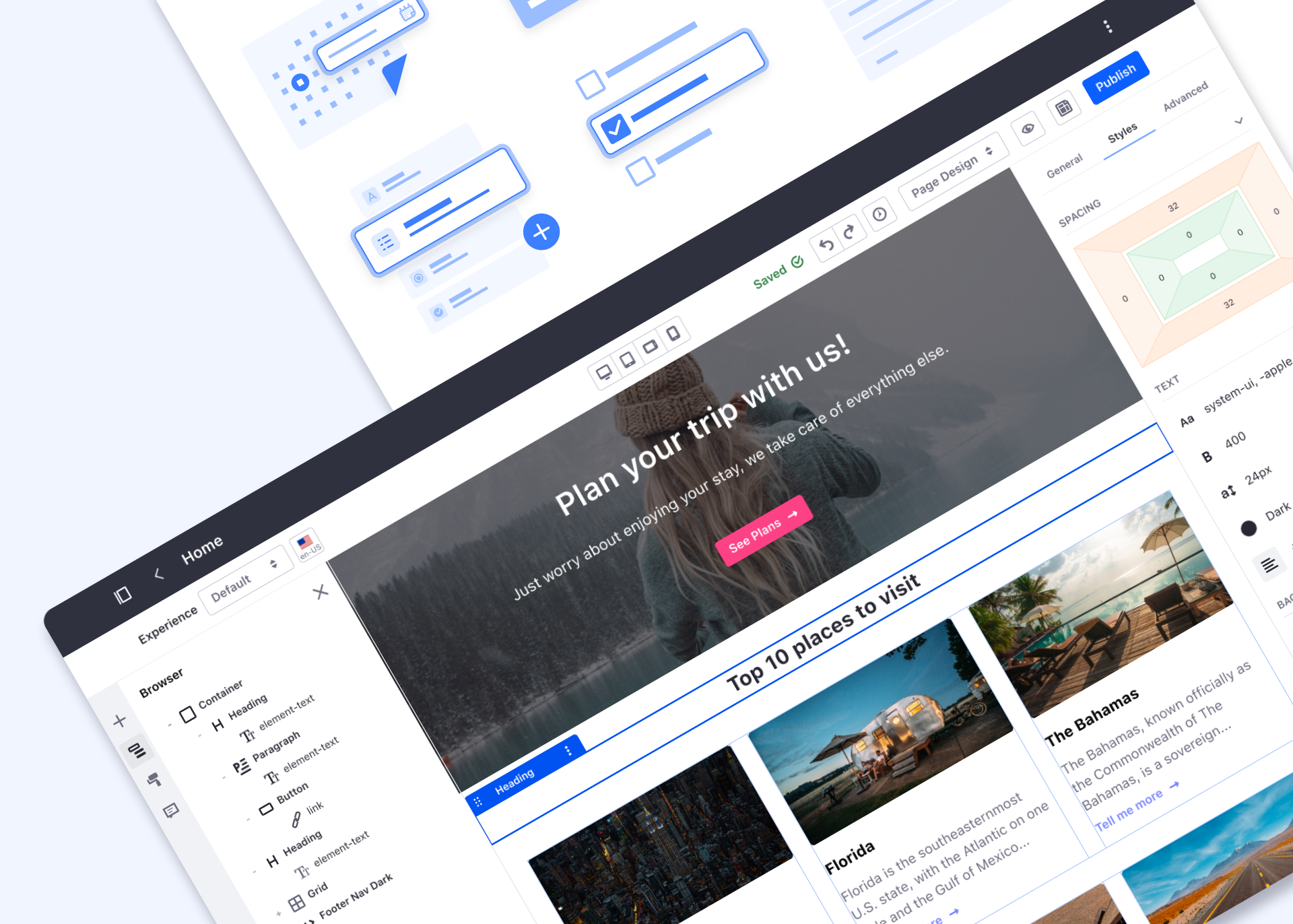
1. Styles and inputs
In previous Liferay versions, our users used to customize their pages by giving values to form inputs and selectors. Visually, they all looked the same and the only way to distinguish them was by the label text. In this iteration, we adapted inputs to be more usable, identifiable and to provide more functionality.
- New color picker.
- New padding-margin component.
- Action to switch between different units.
- Access to token values.
- Ability to detach from token.
Old inputs vs new styles configuration
2. Classes and Custom CSS
We provided different options to extend CSS for both fragments and pages. We have enabled a custom CSS feature inside fragment edition to easily extend look and feel without going deeper into the code. Also, one of the main achievements was the first iteration of CSS extensions that will allow our clients to quickly apply own design systems to style their sites.
Fragments custom CSS and CSS extensions
3. Ordering and Favorites
Now, users have an access to the Fragments they use more often. They are able to “add to favorites” and prioritize the most used sets so they can build pages faster and easier.
Fragments ordering feature
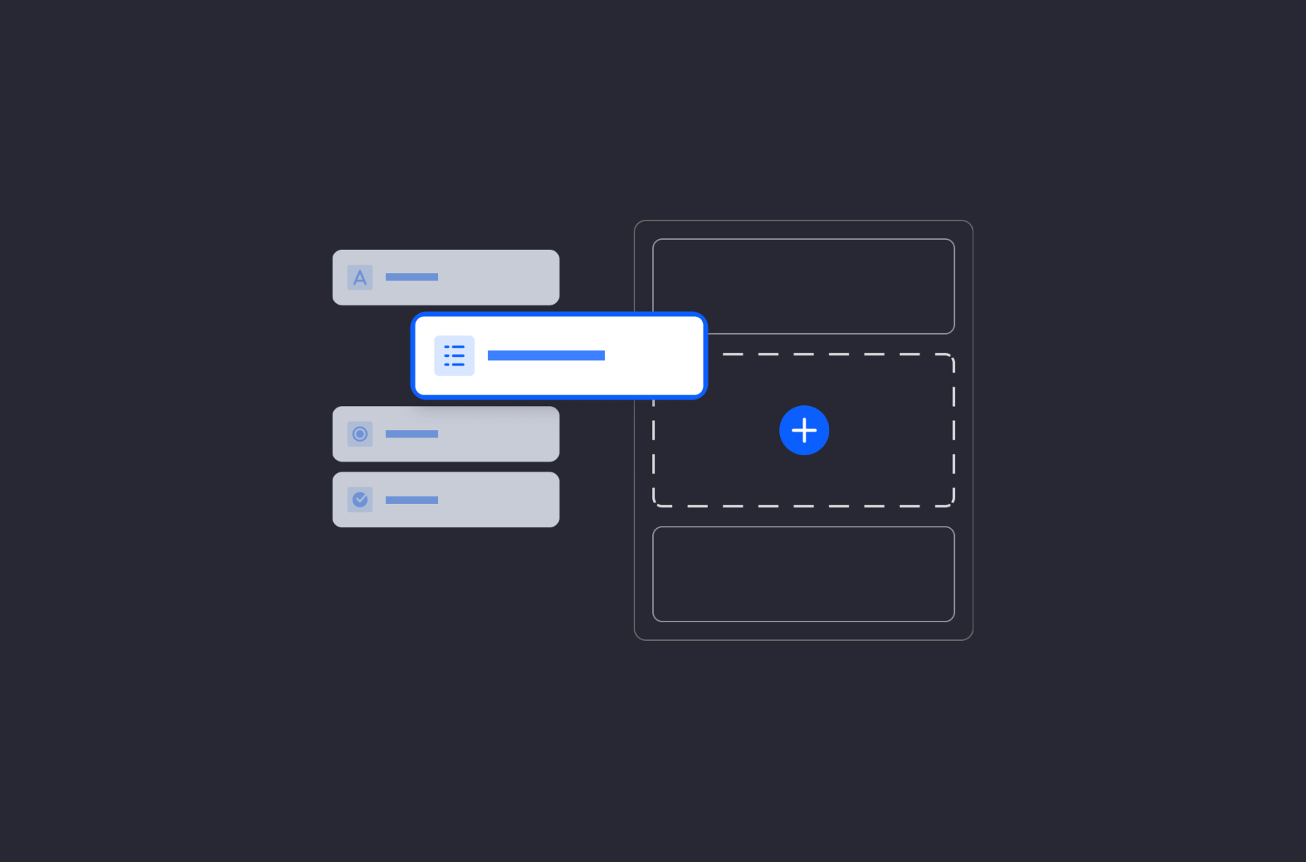
4. Two-side panel layout
We have reorganized the builder. By splitting the options in two sidebars, users have a quicker access to all the available tools. Also, we give a different function to each of the sidebars. Left sidebar has now all the related features to page architecture: Browser, Page Content, Fragments, Widgets, Page Design Options and Comments. Right sidebar contains the settings and styling options of a selected fragment.
New two sidepanel layout for page builder
This said, it is important to mention that all the page building experience needs to be 100% accessible. We did a lot of work to improve accessibility last year - I will talk about this in a separate and dedicated article soon 😊.
User testing results
We validated all the above proposals with two rounds of tests. The first round focused on validating the new inputs, detaching and linking states and changing-unit buttons. The average score for these proposals was 8.3 / 10.
These tests also helped us to polish some copies and find more accurate ones. We moved forward with these features but also discarded others that were not as successful as we expected.
In a second round, we tested how our users reacted and worked with a two-panel layout. In general, people who tested this renewed version found these enhancements and the new layout more pleasing. An easier search of the elements and their editing is the result.
What`s next?
Software development can be tedious. It can be easy to see the final implementation as the goal and forget about these already delivered features when they look functional enough. However, good designers will see this as a starting point, a small part of the puzzle that will allow them to dive deeper.
So I leave you with this, use your imagination and experience to give solutions to existing needs, fill in forgotten gaps and never stop improving your product!