Making Drag and Drop fully accessible by Carolina Rodriguez on February 15, 2023
4 Min Read
Many people think that disability is the result of a physical condition and intrinsic to the individual. This is often called the medical model of disability. While this model looks at a person’s impairment as the cause of being unable to participate fully in society, the social model takes a different approach.
The social model redefines disability by referring to the restrictions caused by society when it does not give equitable social and structural support. This model identifies systemic barriers and seeks to change society in order to accommodate people living with impairment.
It's about design
Nowadays, 15 to 20% of people experience some form of disability, impairment or limitation, be it temporary or permanent -- over 1 billion worldwide. These numbers reveal accessibility as an important and inclusive practice that we all should keep in mind when designing a specific solution. This is needed to ensure we design environments that can be accessed, understood and used by the highest number of people regardless of their age, size, ability or disability. And of course, it must be considered at every stage of the development of our products and services.
When design (and code) provide the flexibility to meet all users' needs, then they are inclusive. It is not about a person's abilities or impairments, it’s about design; and good design is enabling.
Drag&Drop - traditionally a mouse interaction
Drag and Drop is a good example. This type of interaction is well understood and quickly adopted by users. Unfortunately, It has usually been a mouse or touchscreen-only interaction, so making it fully accesible for people that use assistive technologies is both crucial and necessary.
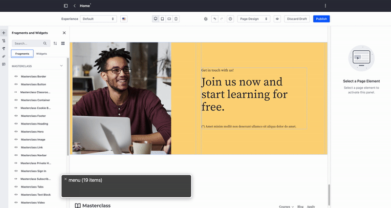
In Liferay, we have several functionalities that include Drag and Drop in order to transfer and order data. Examples of these are web content structures, knowledge base, forms, segmentation and page builder, among others.
Drag and Drop examples in Liferay products
Most of the components of our design system are accessible. But it is also true that not all the features or patterns that are built over them are always accesible as a whole.
Given this situation, we set “Accessible Drag and Drop” as a priority and chose page builder for its first implementation. Page building experience is accessed by a wide range users and different roles so it was the perfect scenario to design a fully accessible pattern that served to all similar interactions across Liferay portal.
The Challenge
The main challenge was not only to give an accessible alternative. There were lot of solutions that could have covered this need. The main challenge was to make it accesible along as filling all the gaps in terms of usability. We wanted to do more than offering a way to drop elements on a page using keyboard. We really wanted to provide a more complete experience by allowing a quick fragment adding and easy re-ordering.
1. Interactions
All buttons in fragment list are now focusable and actionable using a keyboard. They have a visible focus state, and focus order is logical.
- Use
↑and↓to navigate the fragment list. - Use
Tabor→to get into the fragment options.
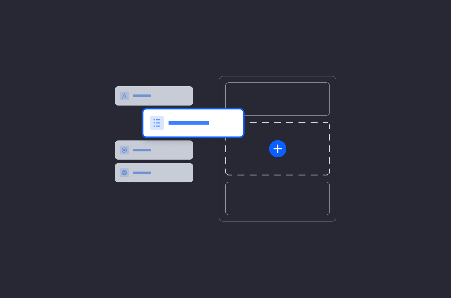
Fragment list and available actions
As indicated in the previous image, we show a “+” button when navigating with keyboard. This allows to add that specific fragment to the page.
- By pressing “+” button, the fragment is moved to the bottom of the page (it is positioned but not placed yet).
- Fragment can be re-positioned by using
↑and↓. enterplaces the Fragment in the chosen position.esccancels the fragment adding.
Fragment positioning by keyboard
Clear feedback is constantly provided throughout the interaction. Screen reader indicates what options are available and next steps to complete the action.
2. Implementation
Accessible Rich Internet Applications (ARIA) is a set of roles and attributes that define ways to make web content and web applications more accessible. ARIA helps people who use assistive technologies, such as screen readers or voice recognition software, to interact with web content and to have equal access to information. Some of the WAI-ARIA roles and properties we used in the implementation were:
aria-orientation
The aria-orientation attribute indicates whether the element's orientation is horizontal, vertical, or undefined. We declare that fragment menu is a menubar with vertical orientation. This orientation defines the expected behaviour of the up and down arrows.
aria-expanded
The aria-expanded attribute is set on an element to indicate if a control is expanded or collapsed. This is used in fragment menu accordions so screen readers can announce if these menus are open aria-expanded="true" or closed aria-expanded="false"
ARIA: tablist role
The tablist role identifies the element that serves as the container for a set of tabs . They can be navigated with left and right arrows.
aria-live
The global aria-live attribute is used to set parts of the application as live regions, providing a way to programmatically expose dynamic content changes in a way that can be announced by screen readers. In this specific case, this attribute is used to announce each fragment movement.
This attribute needs to be set with a level of priority. When set to assertive, assistive technologies immediately notify the user, potentially clearing the speech queue of previous updates. When aria-live's attribute is set to polite, assistive technologies will notify users of updates but generally do not interrupt the current task.
In our case, we have added a span element with aria-live="polite". When the user starts positioning, for example the “Card-fragment”, the content is updated and indicates instructions on how to move it.
- Each time
↑or↓are pressed, the current target position of the fragment is indicated: Use up and down arrows to move the fragment and press enter to place it in desired position. Currently targeting [bottom] of [slider fragment]". - When “Card-fragment” is placed, we announce a final message confirming that the movement was done successfully. Card fragment placed on [top] of [heading fragment].
Drag and drop interaction for page building
This initial implementation has been now transferred across portal. It allowed us to standardize Drag and Drop interaction and make it available for everyone. This has also served as a reminder for ensuring that we design scenarios that do not compromise accessibility. Accessibility is a shared responsibility and everybody involved in the development cycle has a role to play.