Design Tokens. Definition process for a themeable product-service system by Rubén Jiménez on October 11, 2021
5 Min Read
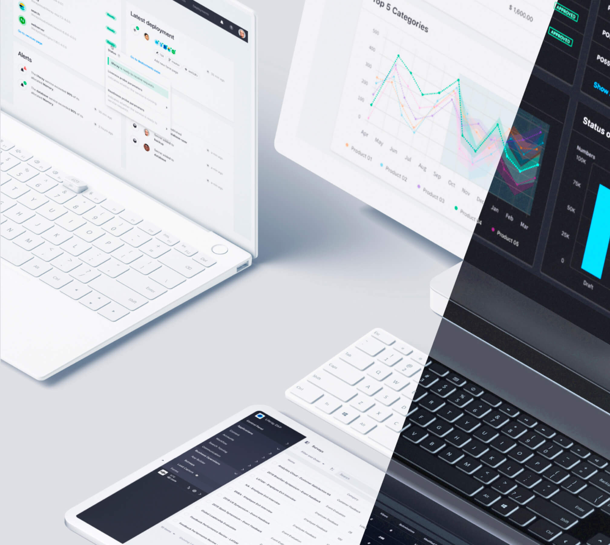
When designing customizable user experiences, keeping styles consistent and synchronized across multiple products while iterating on new features for different devices and viewports can be challenging.
To enable efficient work and communication between teams, designers, developers, PMs.. all stakeholders should share a common understanding of the system’s core foundations, its rules, and how to build on top of them.
Design Systems are stronger when they communicate to each team member how to apply its several elements to different contexts effectively.
An integrated toolchain with a logic for design tokens provides an ideal solution to this challenge by generating style definitions across all platforms from a single source.
What are Design tokens?
Design tokens are variables that store foundational design values / design decisions needed to build and maintain a design system — spacing, color, typography, object styles, animation, etc.
In an atomic model, design tokens would be the "visual design sub-atoms" for a design system. They are named, versioned, and used in applications and libraries instead of hand-coded values to ensure flexibility and unity across all product experiences.
These variables are declared as group of styles and objects from our design tools (Figma, Sketch, XD...), compiled and exported by a design handoff tool to be instantiated over any code component.
As long as the variables comply with a common logic while grouped based on taxonomy rules, the smaller number of variables, the easier to locate each change made to the values stored in these variables. Different teams will be able to easily understand the logic applied to each style.
For example, it would be easier to see where we would apply the “border-primary-hover” design token using a semantic nomenclature than using a more encrypted one such as background-01. When handling multiple styles, such a decision turns into critical when it comes to avoiding technical and design debt.
Different products/initiatives that integrate the system should be able to create new design tokens if needed and modify those components already existing in the system.
When the creation of design tokens is normalized, we will evade the requirement to build so many snowflake components and development solutions, thus saving time/money and avoiding creating redundancy processes.
Design tokens defined in our design software libraries and consumed by UI Tookits integrate foundational styles with production code and make the system capable of changing values from a simple set of units.
Example: Styling a component
Take a component, let’s say a button. We could set its color values as design tokens by using a self explanatory naming convention with taxonomy delimiters depending on their usage (bg-primary-base).
We don’t need to name it as a button in the token description, so we could group its color logic with the same color logic we could apply to other components for the changes to come to be linked.
If we need to, we could create another specific button color design token that overrides the group logic in order to create exceptions to the system.
These design token exceptions will live inside temporary shared product team solutions, pending to be aproved for integration to the system when there is an alignment in its usage.
Providing such flexibility could be very helpful when the Design System team cannot examine every new use case or component that product teams create. Be aware that it is not the most recommended approach; it could quickly turn into over-personalization and design debt when the design system governance, rules, and adoption lack enough maturity.
Global & Context Tokens
This design tokens color model approach introduces two general hierarchy levels: global tokens (a.k.a. primitive palettes), named after its color and lightness code value (primary-50) and context tokens named after its ui pattern value (bg-primary-base). These hierarchy levels establish the needed consistency as well as the scalability across design and engineering tools.
Since context tokens are defined prescriptive to use cases, a self explainatory naming convention would encourage designers to choose the right tokens they need, while linkage to global tokens provides agility to update specific values without requiring much work on renaming referenced tokens for each component.
Global tokens are descriptive definitions of the design foundation. An example of global token could be: White = #FFFFFF and this global token name in Figma element would be: $global/white. They enumerate all possible design foundation parameters that could be used anywhere in the design file and implementation. However, global tokens are not meant to be directly used in any design files beyond the foundational file.
Even though we created color palettes as global colors, not every value will be linked to a context. They always need to spawn context tokens to define its use cases, so context tokens are meant to be instantiated over different design components.
Defining Contexts
We need to understand the breadth of the components and their foundational UI logic to begin developing those components, understanding the scope of what we need to do.
We organize design tokens into four main categories — colors, typography, space, and effects (radius, motion...)— . These specific stored values could be applied to different component properties.
The context definition would allow designers to distinguish design tokens and know what tokens are working on a design template.
Regarding color values. This model is meant to replace the color logic that we were applying over components with an interaction logic and keep the color logic for decoration values. This model creates a more robust and understandable system with the smallest number of design tokens applied over as many components as possible.
Token categories
In our Design Language: Lexicon, all of the design foundations are defined in the DLS Foundational Figma file. All Design tokens are applied over components; each token representing one value applied to a parameter.
We consider four different categories of design tokens:
- Colors: HEX / RGBA values that represents color palettes and their applications: color, shadow, opacity, etc.
- Typography: Font family/size for headers, body, links, etc. Font, font size, line height, etc.
- Spacing: Standardized units of spacing inside/between elements for components, patterns and layouts/grids.
- Effects: Defined visual/motion identity: e.g., radius, animation duration, ease curve, etc.
Each category should include both global tokens and context tokens applied as regular styles in our design library. The global and context token relationship doesn’t work in Figma due to the lack of double linkage between styles.
For the sake of clear communication with teams regarding this relationship between both hierarchies, it’s important to reference these connections in the foundational file.
Toolchain and Versioning
After declaring all the different styles and elements that configure the design token model in our foundational figma file, the next stage would be to apply design tokens over components and finally transpile to platform specific formats (custom variables, sass, xml...)
We bring our logic closer to the development logic to be able to change code components from design in the future, while reducing communication challenges that causes friction between both, the design and dev teams.
When speaking about toolchain, having Figma and Storybook as the repositories for teams, provide several solutions we explored towards the end of the definition process. In general, we have plenty of possibilities to achieve our goal, connecting both, the design and dev worlds:
Zeroheight
Can generate tokens for different platforms and link both dev and design environments. Not all token types are supported (e.g. animation). Supports versioning.
Custom service
Shopify and other companies have developed in-house solutions that generate design tokens. There are also open-source toolkits from Amazon and Salesforce.
Plugins
Figma support different plugins that can export styles as JSON or YAML files (e.g. Themer, Theemo & Switor), and allows creating a custom-tailored solution for design tokens.
This design to dev toolchain integration will allow us to iterate and release in a controlled environment. If teams wanted to experiment with a new feature, or make a change, they could do it by simply making a copy of the library, and when it's ready for review, they will be able to share their proposal with the Design System team to study the inclusion of their new feature into the system.
