Liferay Design Week 2018 is over by Juan Hidalgo on April 27, 2018
4 Min Read
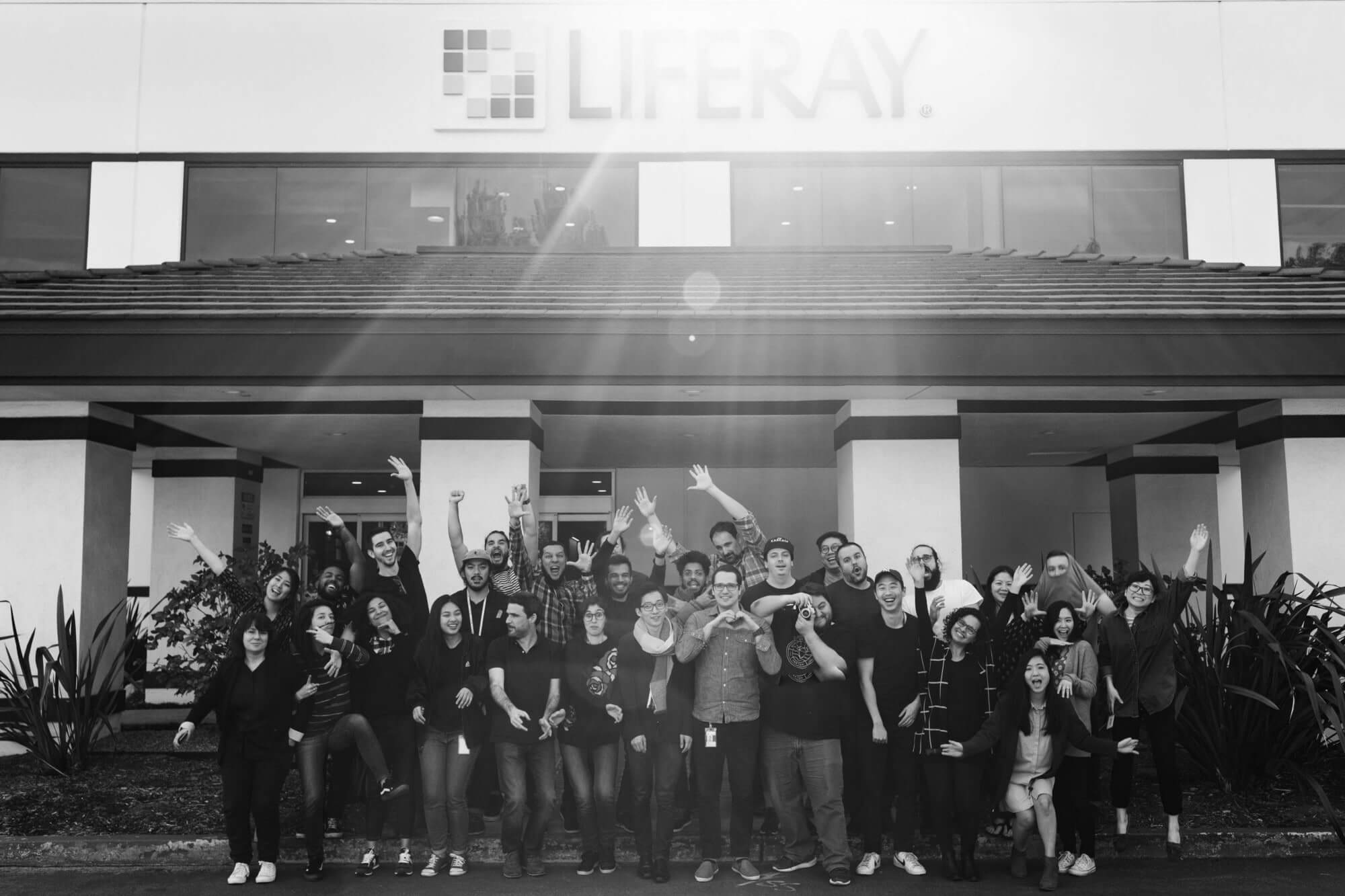
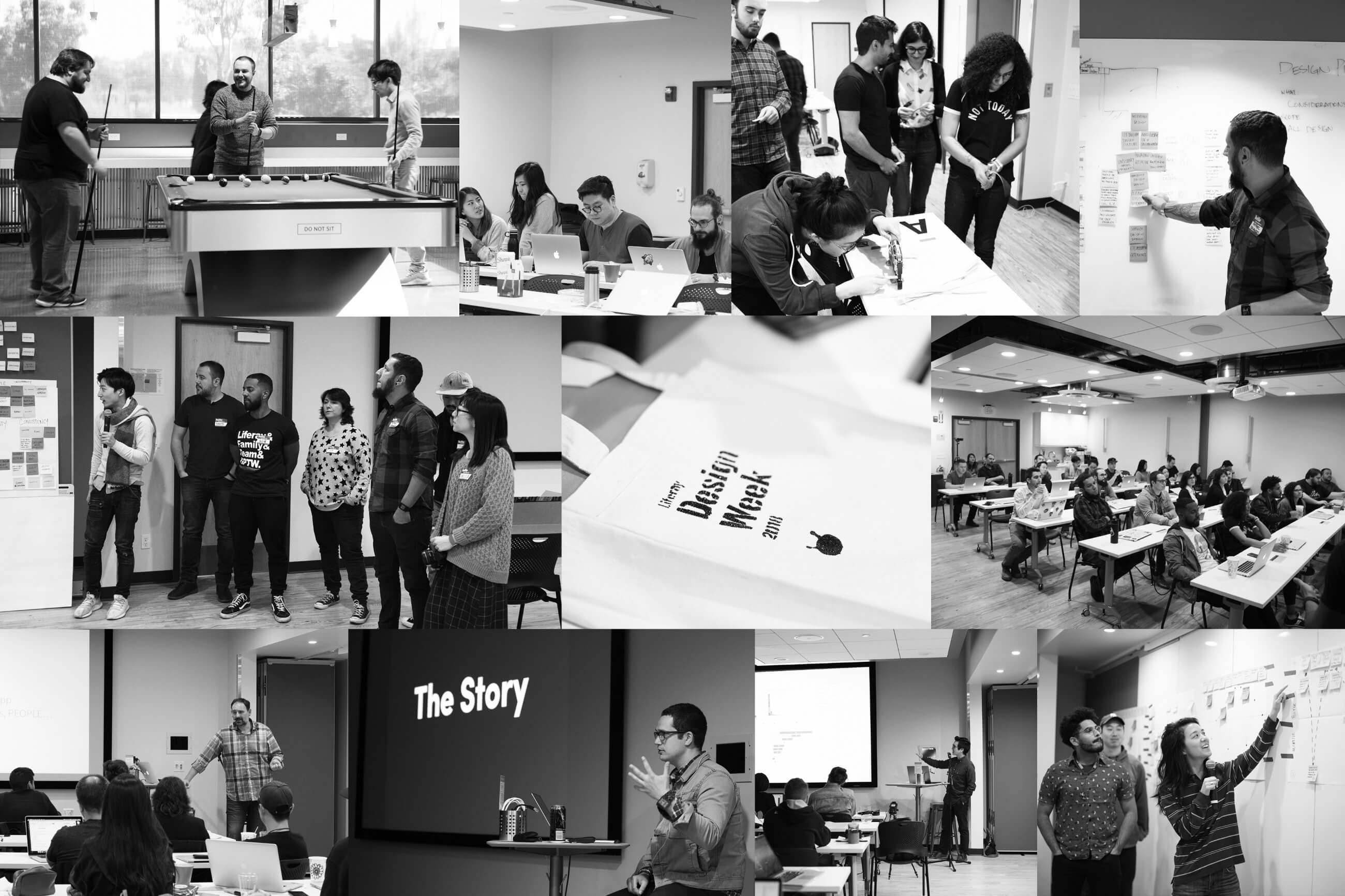
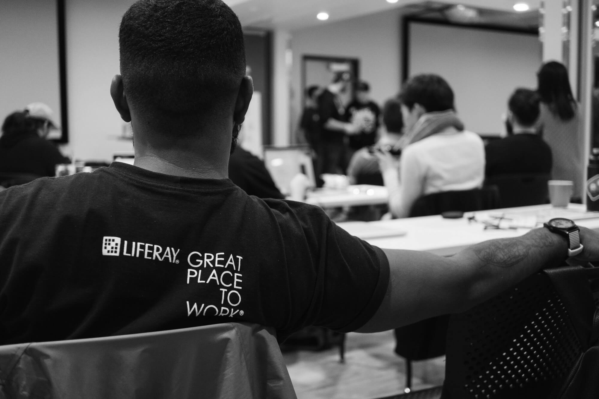
Over 5 days, 31 Designers from (Diamond Bar, Frankfurt, Madrid, Recife, and San Diego) attended 21 Talks, 6 Workshops, and Group Activities. The week was intense and a challenge to synchronize our projects with our deadlines — it was awesome.
 What a MARVELOUS Team!!!
The format was five days with talks and some hands-on workshops in the mornings and then working in the Products/Projects in the afternoons. In the future, true to conference style, we are going to plan plenty of activities and networking events every evening.
It was the first time that we were in the same room talking about our needs, issues, and even our dreams. We talked and discussed these things with each other face to face instead of skype. We’re now in the same boat, on the same side, even in the same dream. So let’s maintain this incredible collaboration to design awesome experiences. We have the talent, we have the aspirations, let’s go for it.
Highlights
Liferay.Design Site
Liferay.Design Site is going to be an example of our Liferay Design Culture. It’s going to be a great way to show the quality of our team’s work, a way to attract talented designers, and also a way to express our thoughts and goals.
Lexicon
When we are talking about Platforms and Unifying Customer/People Experiences, we always consider how to articulate a cohesive experience. Lexicon should be the tool, language, and the alphabet to achieve it. In order to be more flexible for the different strategies, audiences and goals, Lexicon needs to involve other designers and projects than can provide that broad vision.
Files & Folders
Our new Digital Asset Management (DAM) process is going to provide us a better way to maintain projects and files. Also reinforcing the idea to improve the collaboration between different designers through different teams in multiple locations. And, yes, we will never ever use “Final Version 002 v3 final final” for a file name. :)
Design as business tool
During Henry Nakamura’s talk we discovered that he was a Graphic Designer. AWESOME.
Design is usually used to solve problems, but it has many applications. Design is also the way to create emotion, to build consistency, and it’s a transversal business tool for creating better relationships with our customers.
Please remember that our customers are not only looking for necessary features, they are looking for cohesive experiences.
Brand Continuity
Cohesive Experience is Brand Continuity and Brand Continuity is Cohesive Experience. It’s simple.
Design Principles
Your native language, the music you love, the tools you use and the way you use them — none of this matters in design. We have a lot a lot in common, and the Design Principles activity was a perfect example to show our common thoughts and goals. Next steps? Let’s work with the first drafts.
Words matter
When we were discussing about our vocabulary, we realized that we have a huge range of definitions for all our terms: Mockup, Wireframes, Assets… words and their meanings matter. We concluded that this vocabulary is part of our work and it is an essential part of our experience. That beings said, we need to work to clarify more our definitions and vocabulary.
Research
I would like to say that Corbin Murakami is really good at creating collages :) The most important aspect of research is the fact that it is going to help us with data, to gain an understanding of contrasts to our design assumptions. We realize that research is a big part of our future with design.
Design = Stories
We learned that good Designs are good stories and how we are defining and creating the narrative is paramount. Visual storytelling uses graphic design, infographics, illustration, and photography to convey information in the most elegant, entertaining, and informative way. Today, the creative scope of existing visual storytelling techniques is being expanded to meet the formidable challenge of extracting valuable news, surprising findings, and relevant stories from a daily flood of data head on.
Legal
As our team grows, more legal necessities are going to come. Licenses, naming, branding, or inspirational logos, should be validated. The creation of a Visual Inventory (Logos, names, resources, etc) is going to be a task for us in the near future.
Accessibility
Accessible design is a big part of our design process in which the needs of people with disabilities are specifically considered. Accessibility sometimes refers to the characteristic that products, services, and facilities can be independently used by people with a variety of disabilities.
Mobile experiences
It’s not about devices, is about experiences. It means focusing on what matters to the mobile user and delivering a cohesive user experience.
Better Design reviews
Getting feedback plays a critical role in the design process. We should listen closely and keep our minds open. Part of accomplishing that involves ditching your ego and remembering that we are not our designs. Let’s think that all feedback is a gift that shouldn’t be ignored, but it should be addressed.
When the Design Review is done right it provides much needed insight and perspective, plus they might be really fun.
Information Architecture
When IA is designed well, it helps users’ understanding of the information presented: where they are, what they can expect and how they can achieve what they want to. However, not all categorizations will be suitable or relevant to all users. For us to genuinely understand our users, it is necessary to know the context they will be approaching our products with, and design it appropriately to meet their needs and expectations.
User journeys
User Journeys are crucial for our work. I usually use this sentence that I heard in a Design Congress:
“…Answering customer needs is the end-point of our journeys through the structure and the starting point of our thinking about the journey itself.”
A User Journey might be described as a conceptualized map to think through and figure out the different paths that a user might take, while reflecting the thoughts, feelings, emotions, and considerations that your user would experience.
Overall
Overall, Design Week 2018 was very different from most other Business Retreats or Product Gatherings that we attended. A lot to learn, a lot to ponder over, and a lot of inspiration. Hope you found the pictures and references helpful.
If you did enjoy the article, feel free to recommend to family, friends, and colleagues.
Thanks
I would like to say thank you Liferay, and also to: Nate, Jessica, Susana, Julia, Jadson, Victor, Beatriz, Vitor, David, Paul T, Paul H, Ryan, Davi, Emiliano, Emily, Cassia, Rebecca, Sharon, Naoki, Chris, Markus, Rafael, Rachel, Angelo, Cassandra, Juan Anton, Nathalia, PJ, Felipe, Bho, and Abel.
YOU ARE ALL INCREDIBLE.
