Illusion of Completeness by Abel Hancock on April 25, 2019
1 Min Read
Summary
Patrick Pentz recently shared some info and tips on user scrolling. We know that in general, users don't mind scrolling and swiping when online. However, sometimes a user will not view all the content on a page, not from a lack of interest but because he/she doesn't realize there is more content available to be seen. This happens with both vertical scrolling and horizontal scrolling/swiping and is called the Illusion of Completeness.
Takeaway
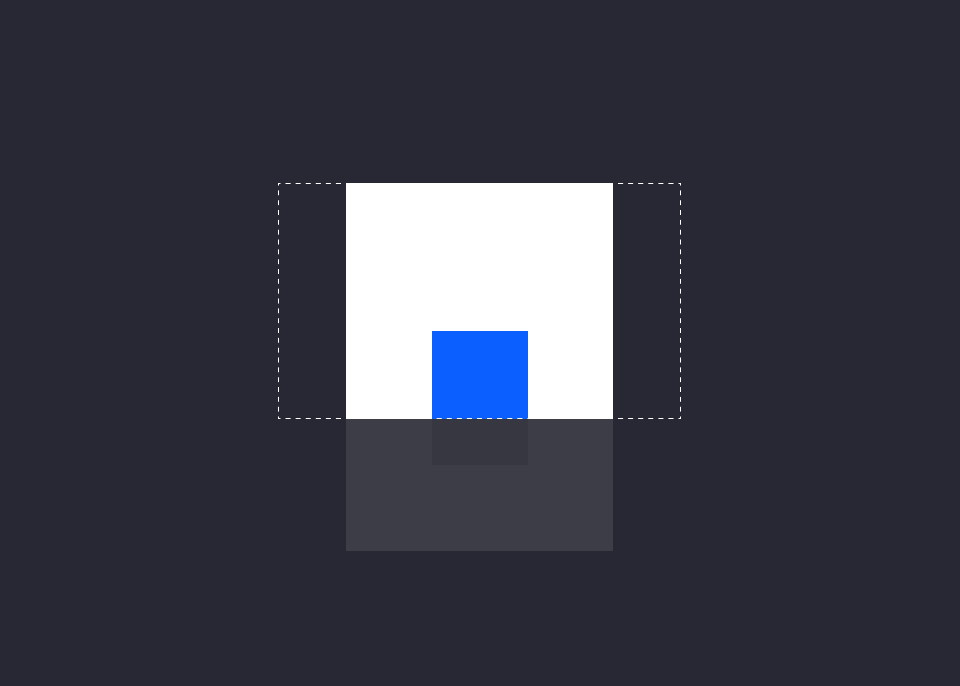
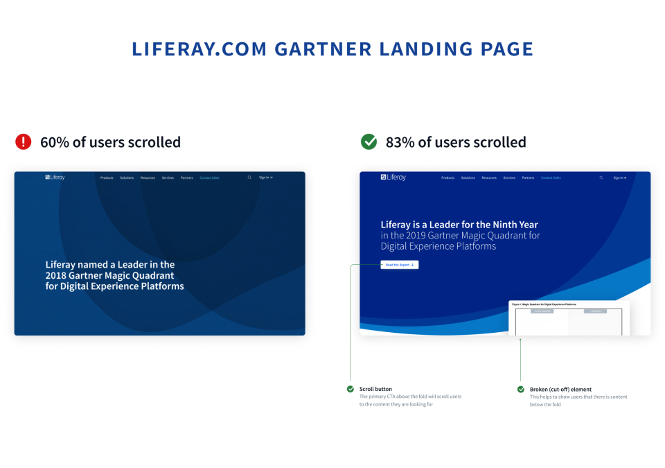
Providing proper visual cues will encourage users to scroll or swipe to additional content. The most common visual cue is "breaking" content. Showing a cut-off portion of content causes users to want to "fix" it by scrolling the cut-off item into view. In the example below, the top portion of the Gartner MQ above the fold says, "Hey user, scroll to see this image". There are many creative ways to provide visual cues, like Amazon's "bouncing banner", all of which aim to make navigating through content intuitive and eliminate the illusion of completeness.
↓More interesting examples in the links!
• The Illusion of Completeness: What It Is and How to Avoid It
• Breaking the illusion of completeness
• Beyond the False Bottom: How to Avoid This Costly UX Mistake