Banner Blindness by Abel Hancock on April 02, 2019
1 Min Read

Summary
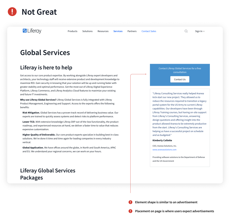
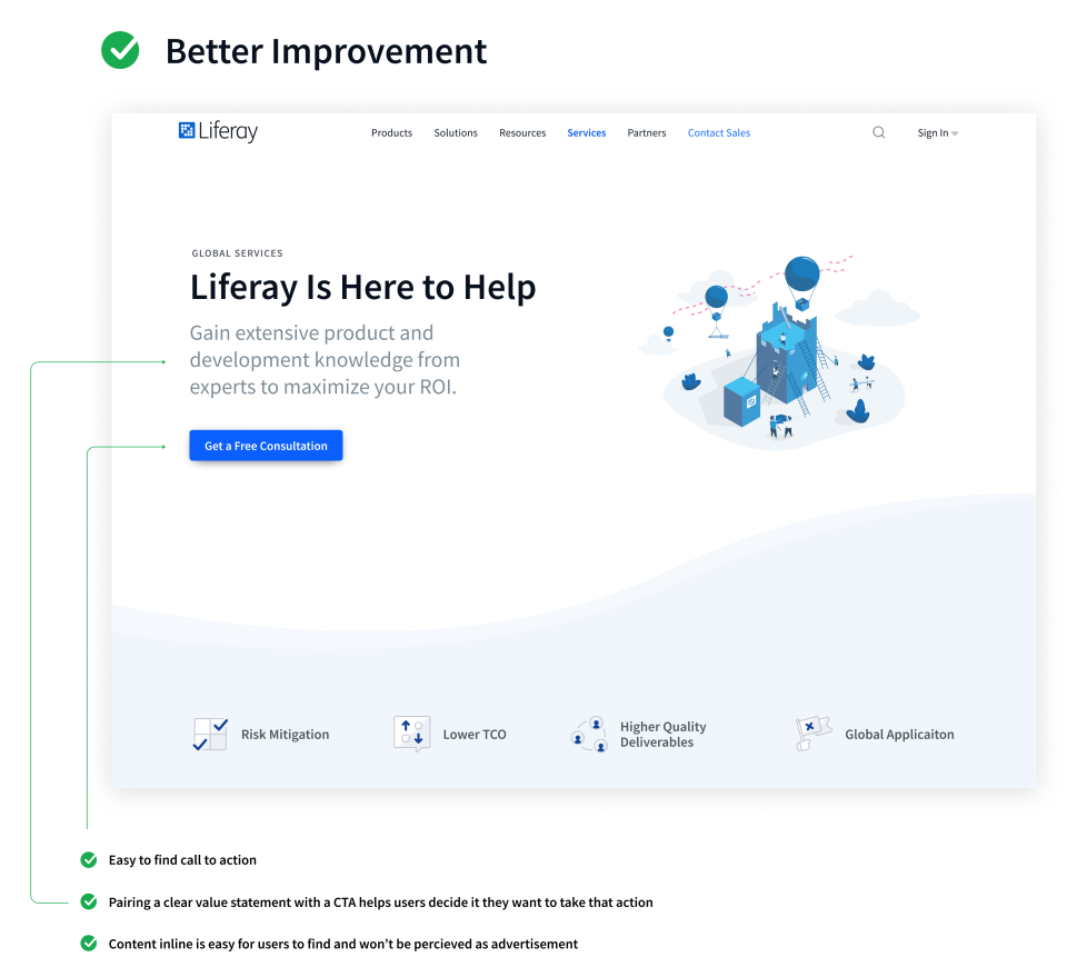
People generally ignore elements on a web page that look like advertisements. Contributing factors are the position of the element on a page, shape (squares and wide rectangles), use of motion, and general styling that does not match the site. Content in the right rail is often ignored by users even when it is not advertising.
Takeaway
Where we place content on a page and how we style it is equally as important as the content itself. In general, the most important content should be on the left half or full width of a page. On marketing pages, we are often offering supplementary (but related) content, similar to an advertisement on a page. Proper visual treatment and placement can significantly affect how often users notice and interact with that content. If you are curious about how effective users are at ignoring content check out the second link.
• Original Eyetracking Study
• Banner Blindness Old and New Findings
• What effect does banner blindness have on online marketing?
