Aesthetic Usability Effect by Abel Hancock on May 20, 2019
1 Min Read

Summary
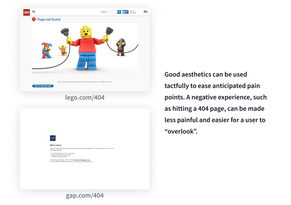
Users perceive products, apps, and sites that are aesthetically pleasing as more useable. This has both positive and negative implications. Users are more forgiving of minor (but only minor) usability issues, they are more patient, and more likely to form positive attitudes toward pleasing designs. This effect is amplified the more aesthetics complement the functionality of a product (it can't just look good for no reason). The downside is that this phenomenon can make usability testing difficult. Test subjects might not report the minor usability issues "masked" by an aesthetic design.

Takeaway
Aesthetic design is not a replacement for good product design, it only complements and improves it. We should never rely on aesthetics to fix usability issues. However, we can (and should) leverage visual design to strengthen a users relationship and positive view of a product. Apple is an obvious example – while they do have well-designed products, their pleasing aesthetic allows a \$\$\$\$ price tag and more tolerable users.
• Laws of UX: Aesthetic Usability Effect
• The Aesthetic-Usability Effect
• The Aesthetic-Usability Effect: Why beautiful-looking products are preferred over usable-but-not-beautiful ones.


