From Chaos to Clarity: Rebuilding Lexicon for Efficiency by Maria Martins on April 19, 2024
4 Min Read
This article was co-written with María Arce.
Have you ever spent more time hunting and customizing UI components than actually designing? That was the struggle facing designers at Liferay. Lexicon’s library, the main piece of Liferay's design system, was due for an overhaul.
The new Lexicon Library project meets these challenges, transforming our designer's experience with a focus on efficiency, clarity, parity with development, and accessibility.
Some Context
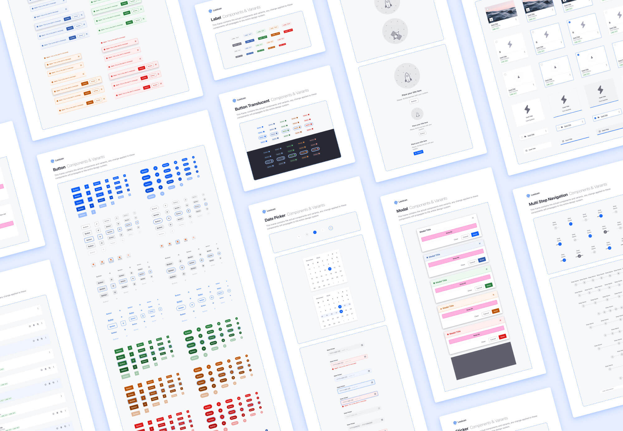
It's no news that our team relies on a Figma Library that is intended to reflect our implemented design system (Clay) to design Liferay products.
The reality is that the current Lexicon library was released and created a few years ago. With the evolution of the times and Figma technology, we have been unable to keep up with the pace of updates. Leading to our library being difficult to update, not using the latest updates supported by Figma, and starting to have several gaps between design and implementation.
Behind the Overhaul
To gain more knowledge and gather feedback on our designer's needs and preferences, we conducted an internal satisfaction survey. It was important for us to understand the several pain points and challenges faced by our designers to consider them during this project. After all, they are our “primary” user.
The findings from this survey were our guide during the revamping process and helped us shape the direction of the new Lexicon Figma Library.
The main topics and findings that guided us during this revamp were:
Usability Improvements
Our Figma library was old and the components were built according to an old architecture, which led to errors when updating the components.
During the survey, some designers highlighted the need for a more intuitive design system and components to streamline their workflow and time spent on repetitive tasks.
Customization & Flexibility
Insufficient flexibility through the library and components was causing frustrations and led designers to detach components for customization. Designers need a more easy way to customize their components to reflect their specific use cases.
Detach numbers & statistics from the survey
Alignment with Development
Another important issue that we wanted to improve and that was also raised during the survey was the difference between Lexicon and Clay on certain components.
This increases complexity when designing and also inconsistency as designers deliver mockups using obsolete components. We should all (designers and developers) speak a unified language and use the same components and their updated variants.
Accessibility
Our product and our company commit to accessibility, so accessibility considerations were a recurring theme in the survey. The designers needed our library and components to reflect the commitment to accessibility that the developed components and system already provide today.
Enhancements to the Library
Lexicon’s new Figma libraries aren't just another design system update. It's a complete revamp, built to empower designers.
Here's how:
1. Find what you need, fast
The new modular structure groups foundations (colors, typography), icons, and components into separate, easily navigable libraries. This slashes the time spent searching for the right element as well as making use of only the elements necessary for each project in the most efficient way.
New Library Organization
- Lexicon Foundations Contains essential design elements such as colors, typography, spacing, corner radius, opacity, and shadows.
- Lexicon Icons Offers diverse graphical symbols to enrich user interfaces and experiences across digital platforms.
- Lexicon Components Provides essential components for interface construction, ensuring consistency and coherence
2. Effortless customization
Properties and slots have been added that allow granular control over components, allowing designers to customize them to their specific needs with little effort. This reduces the need to detach components, streamlining workflow.
Slot Incorporation
3. Components that come to life
Interactive components are now part of the package. This significantly reduces prototyping time, eliminating the need to duplicate screens for hover interactions.
Interactive Components - Hover
4. Accessibility in mind
Lexicon's new library incorporates accessibility features such as focus states, which help our designers create and specify requirements with accessibility in mind from the beginning.
Focus State applied to different components
Beyond the Basics
Lexicon isn't just about efficiency; it's about creating exceptional user experiences and the following objectives have been taken into account for them:
Visual Consistency
In Liferay, we can find Lexicon as the design part of the design system and Clay as the technical and code part of it. Over the years the differences between the two parts of the system were becoming more and more noticeable, making it difficult for both designers and developers who needed to see the 1-1 relationship between them. With the new library, we ensure a unified look and feel across all Liferay products. No more jarring inconsistencies between elements.
A Foundation for Growth
The modular structure allows for easy expansion as the Liferay design language evolves. It also makes it easy to adapt the system to new projects. On the other hand, the new component structure minimizes performance problems and ensures the correct propagation of updates.
Given Liferay’s diverse array of projects and teams, each with unique requirements, there are instances where individual teams maintain custom components and their own component libraries. With the new modular structure, these libraries will be able to inherit foundations and components from Lexicon. This streamlined approach will reduce the need for updates across multiple teams, as any modifications made at the Lexicon level will automatically propagate to other files that use any elements from the “base” file.
Modular Structure
A Look into the Future
Lexicon's plans include publishing the library in the community so that anyone who needs it can make use of it, either for their Liferay or personal projects, as well as have a basis for creating a new design-system library.
In conclusion, the new Lexicon libraries represent a significant step forward in efficiency, clarity, and accessibility. It is a powerful tool that will empower our designers to create beautiful and consistent user experiences more than ever before.
The modular structure and intuitive features of Lexicon make it easy to use and maintain. The library is also highly scalable, making it ideal for large and complex projects.
If you are looking for a design system that can help you improve your design process and create better user experiences, stay tuned to get the library available in the Figma community!