Modernizing Enterprise Web Design by Abel Hancock on March 27, 2020
3 Min Read
In December 2019, as one of our steps toward evolving our modern enterprise website we rolled out an internal landing page building tool which allows our marketing team to build pages on liferay.com with drag & drop elements. Prior to this, our marketing team would use HubSpot landing pages to drive event registrations, and landing pages built by developers on liferay.com for gated content.
The landing page builder marks the first time marketers are able to directly create and publish content on liferay.com. We have seen marketers around the globe adopt the tool to build and publish pages without designer or developer involvement. This has significant, positive implications for how our marketing department is able to utilize liferay.com for quickly responding to market changes and driving conversions.
Rollout Overview
With the rollout, we provided training on how to use the tool, published documentation for users to reference, and then gave marketers full access to create pages as needed. Over the first few months after rollout we have seen adoption by all regions.
Marketing Landing Pages
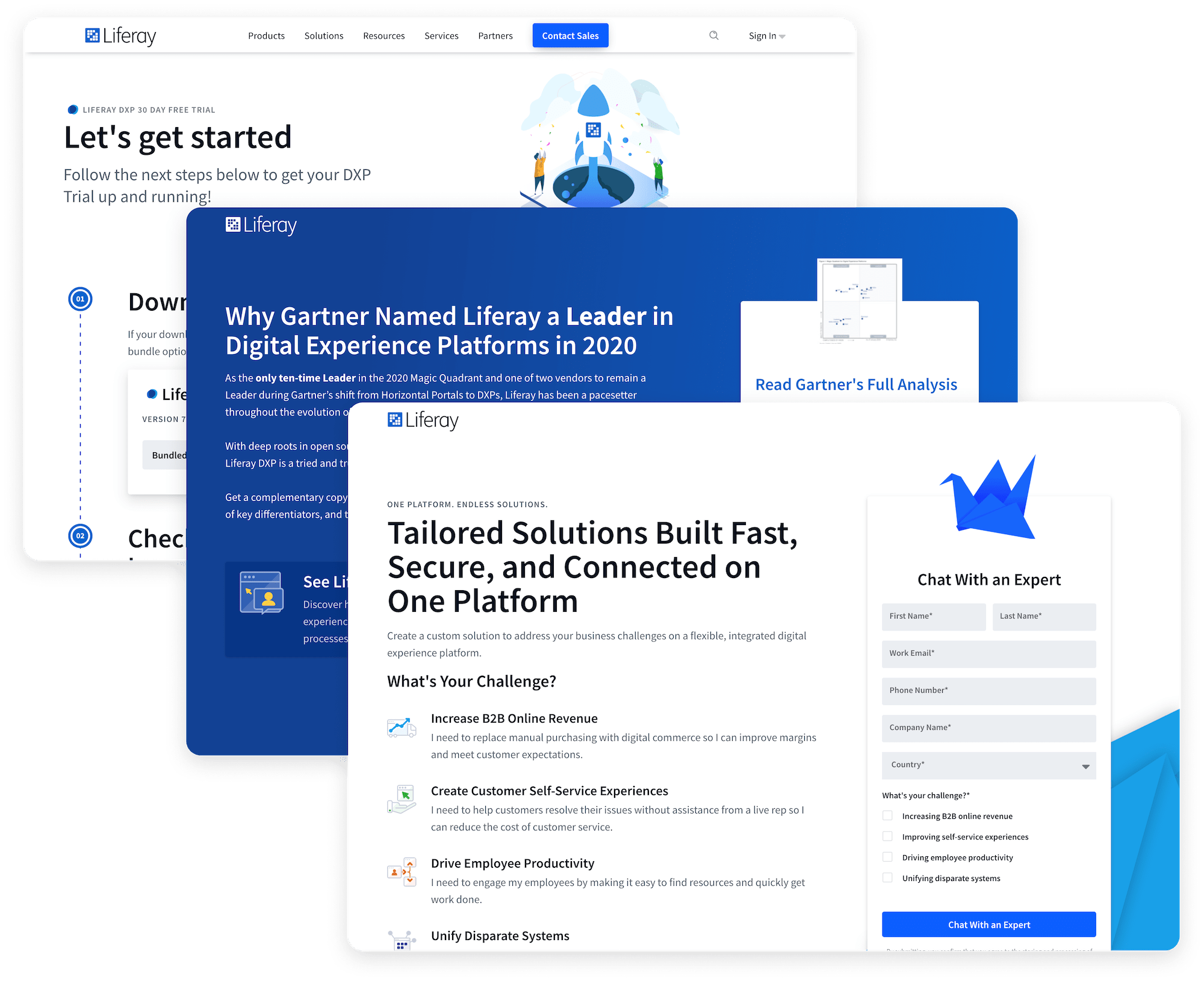
Over 40 landing pages have been created by marketers worldwide. These pages include:
- gated content & demo landing pages
- confirmation pages
- event and webinar registration pages
- mailing list subscription pages
- content hubs
- and many others
Production Content Pages
Aside from marketers building pages for local campaigns and efforts, we have also adopted the tool to build primary pages on liferay.com. To date, we have created well over 16 key pages for the site, including contact sales, developer services, and 30-day trial pages.
Biggest challenge
Using new product features has allowed us to provide new solutions for quickly creating and publishing content that previously wouldn’t have been possible, but as with any new technology it has also surfaced new challenges. Our goal was to deliver an intuitive, useful tool for marketing on a solid infrastructure, but it had to be maintainable and scalable. Being the first real-world use of the site builder we hit many roadblocks, some of which were solved by product teams adding needed functionality to the product and others that required temporary workaround solutions.
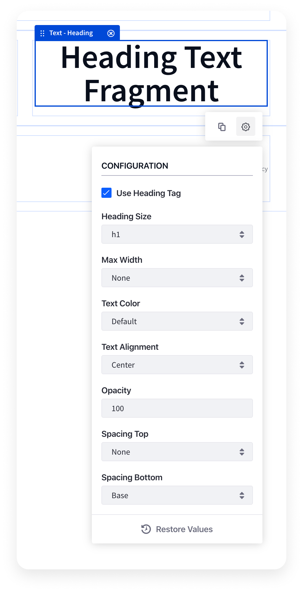
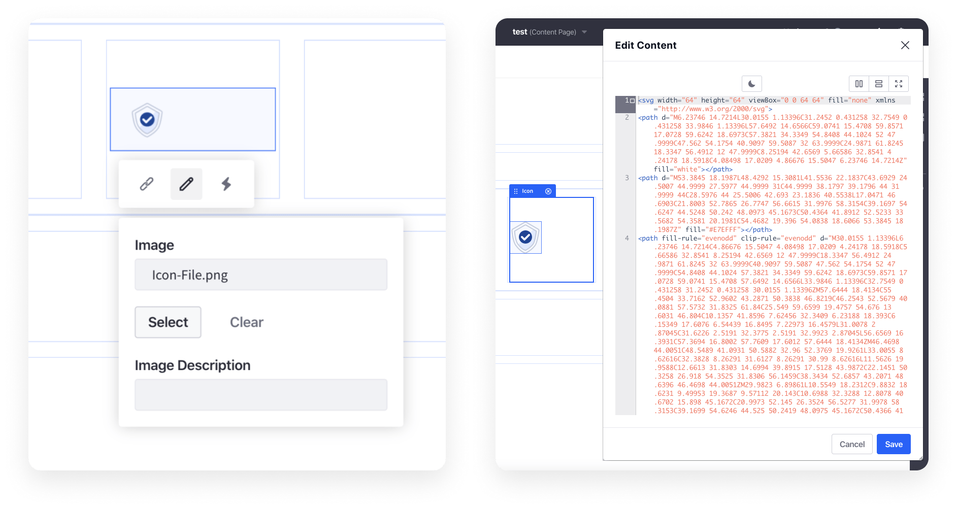
Many limitations introduced with the site builder were solved with some creative thinking. The limitations with out-of-the-box rich text styling options ware bypassed by creating text components that provided options separate from the rich text editor. Svg icons couldn’t be added to a page through the document library & image selector but adding an option for icons that toggles between image upload or embedded code enables embedding svg code directly into the page markup.
The most notable challenge for the web team in the first implementation of the site builder was the lack of ability to embed fragments (components) within other fragments. This made it impossible to create a scalable component infrastructure on the backend, significantly increased redundant code, and restricted our ability to offer fully built out or fully customizable fragments to the user. We hoped to create a component architecture following an atomic model. Thankfully, our ability to work collaboratively with the modern site building product team has been mutually beneficial and helped prioritize functionality such as this for future release.
Biggest success
The initial feedback from across the regions after rollout was overwhelmingly positive. From the perspective of a novice user,
I had never created [a landing page] before (not even in Hubspot) and it was really easy to use it. The drag-and-drop mechanic and the different layouts were the best features.
Our marketers with more experience building pages also found the tool valuable,
There are a few bumps, but the tool is actually really useful and gives us independency as field marketeers to create campaigns faster and more efficiently.
The most significant impact the tool has made is in eliminating involvement from developers to build pages. Recently, we built a page for a new offering our Global Services team is launching. A non-technical user built the page from scratch in under 30 minutes without any help from a developer.
After building the first draft, the Marketing stakeholder was able to quickly make adjustments as the offering details were finalized, and publish to liferay.com without using a single story point.
Next steps
We successfully launched the landing page builder tool and have put it to use on our site but we are looking forward to what comes next. Over the next year, we will continue to:
- gather feedback from the users
- analyze use cases
- make more templates/fragments available
- increase functionality and usability as the core product evolves
Our current focus is to build out additional fragments that will enable us to create any page needed on liferay.com. This is crucial for quickly making changes across the website as we shift to solution-focused messaging.

