Awwwards Conference SF 2019 Recap by David Kim on May 30, 2019
4 Min Read

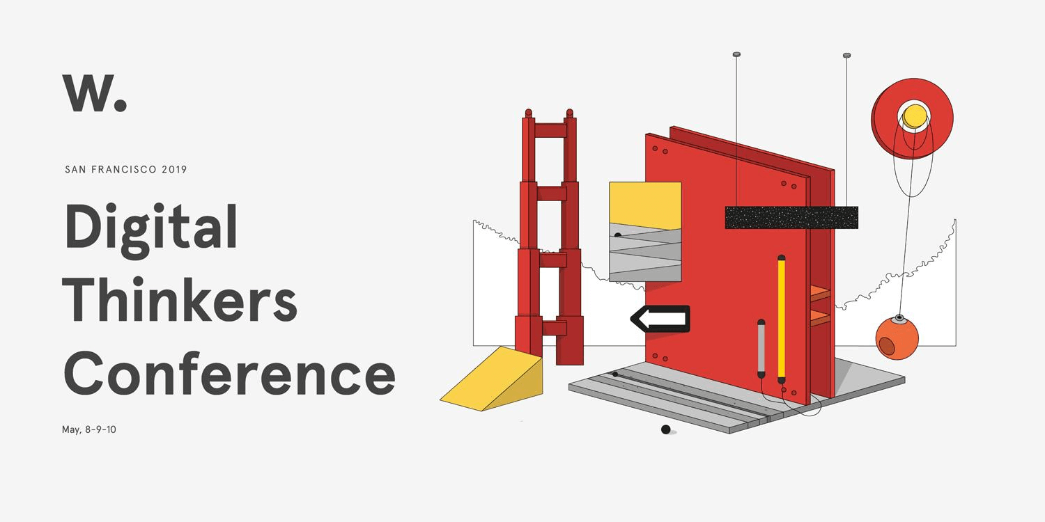
I had a great pleasure attending Awwwards Conference in San Francisco earlier this month. Took a 5am flight from LA and headed straight out to the beautiful Palace of Fine Arts from SFO. Light rain ☔ greeted me as I waited in line to pick up the conference badge and welcome bag. I've always enjoyed connecting with other creative minds and just thought of co-occupying a space with 1000+ other designers was exhilarating.
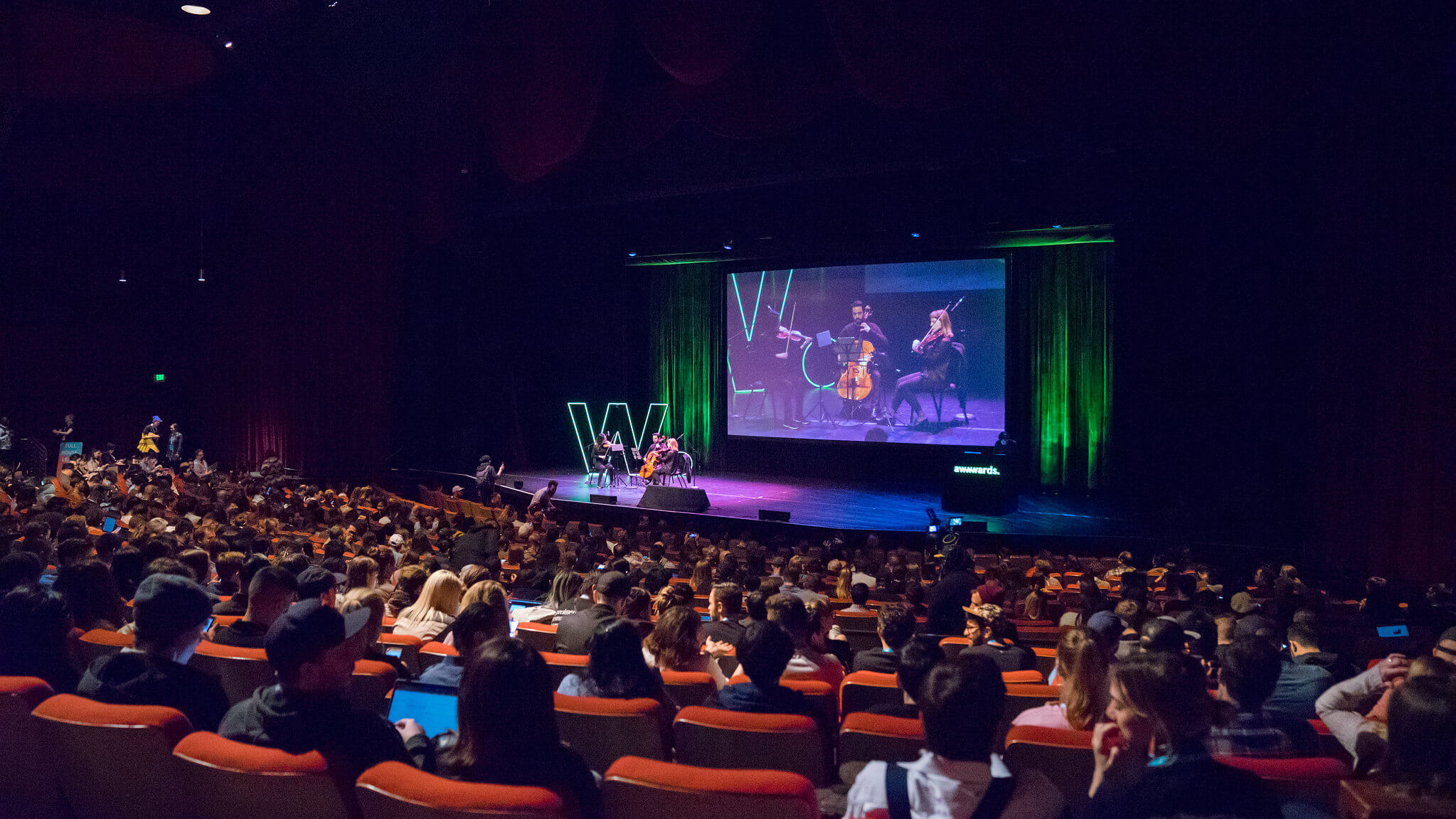 The string trio welcomed the attendees. Loved it.
Listening to 24 speakers talk about 20+ topics in 2 days was both inspirational and exhausting (in a good way, of course 😄) Here's a few memorable insights, quotes, and tweets from the talks. I’ve grouped them into the following 6 themes:
- Design for Future
- Branding and Human Connection
- Accessibility and Creativity
- Empathy and Emotional Intelligence
- Remarkable Storytelling
- Designer’s Responsibility
1. DESIGN FOR FUTURE
Erik Klimczak, Uber
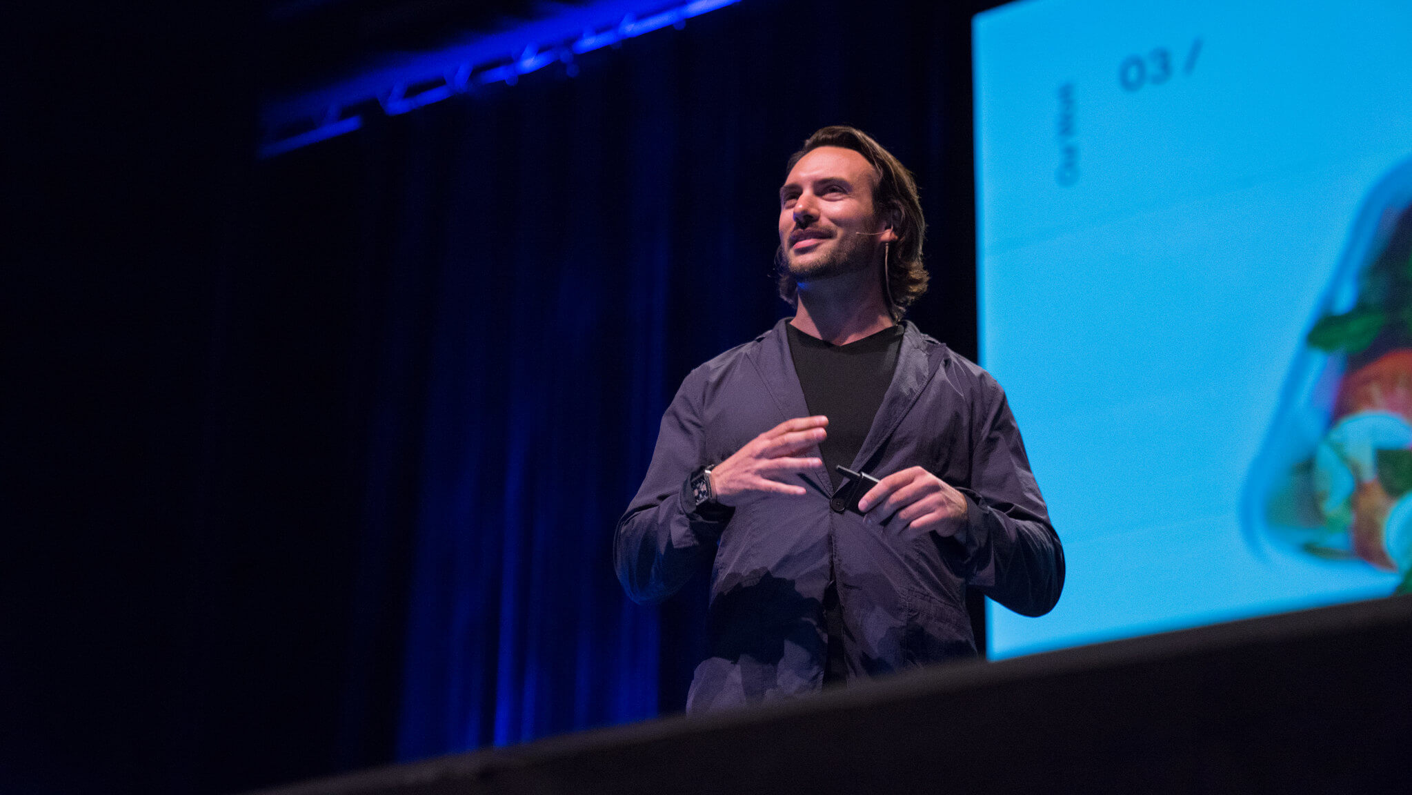
Erik opened the conference with a talk about a methodology to successfully “design for patterns” at multiple scales. He emphasized that every problem is associated with bigger issues and it is important to zoom in and out to discover the patterns to find better solutions.
These are 4 design principles Uber team follows as they design:
Coherent
Good design preserves the integrity of the patterns that contain it.
Simple
Good design is focused. It stops at "just enough.”
Restrained
Good design respects limits. The more far-fetched the solution, the less it should be trusted.
Constructive
Good design solves more than one problem. (And doesn't make new problems.)
Joël van Bodegraven & Pedro Marques, Adyen
"Surrounded by misconceptions and questions regarding its purpose and power, apart from its known ethical and philosophical challenges, AI can be the catalyst for great user experiences"
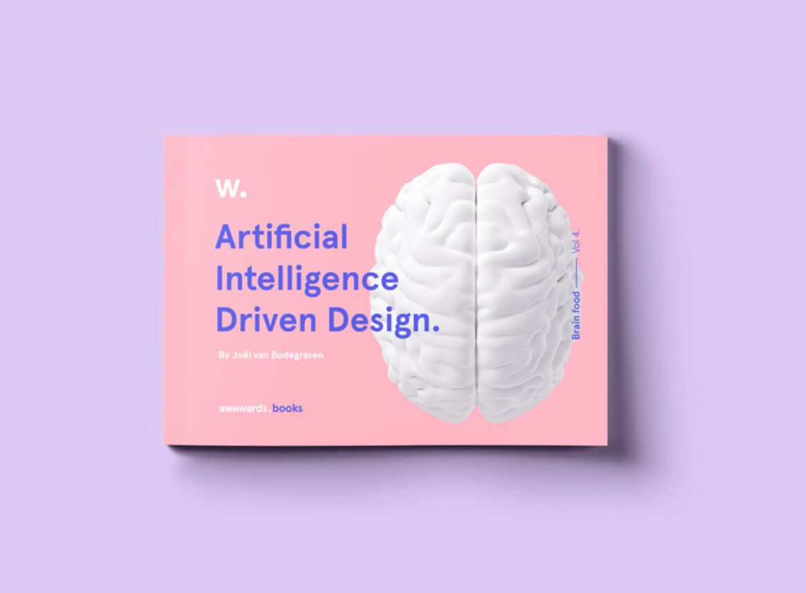 Artificial Intelligence Driven Design Ebook
2. BRANDING AND HUMAN CONNECTION
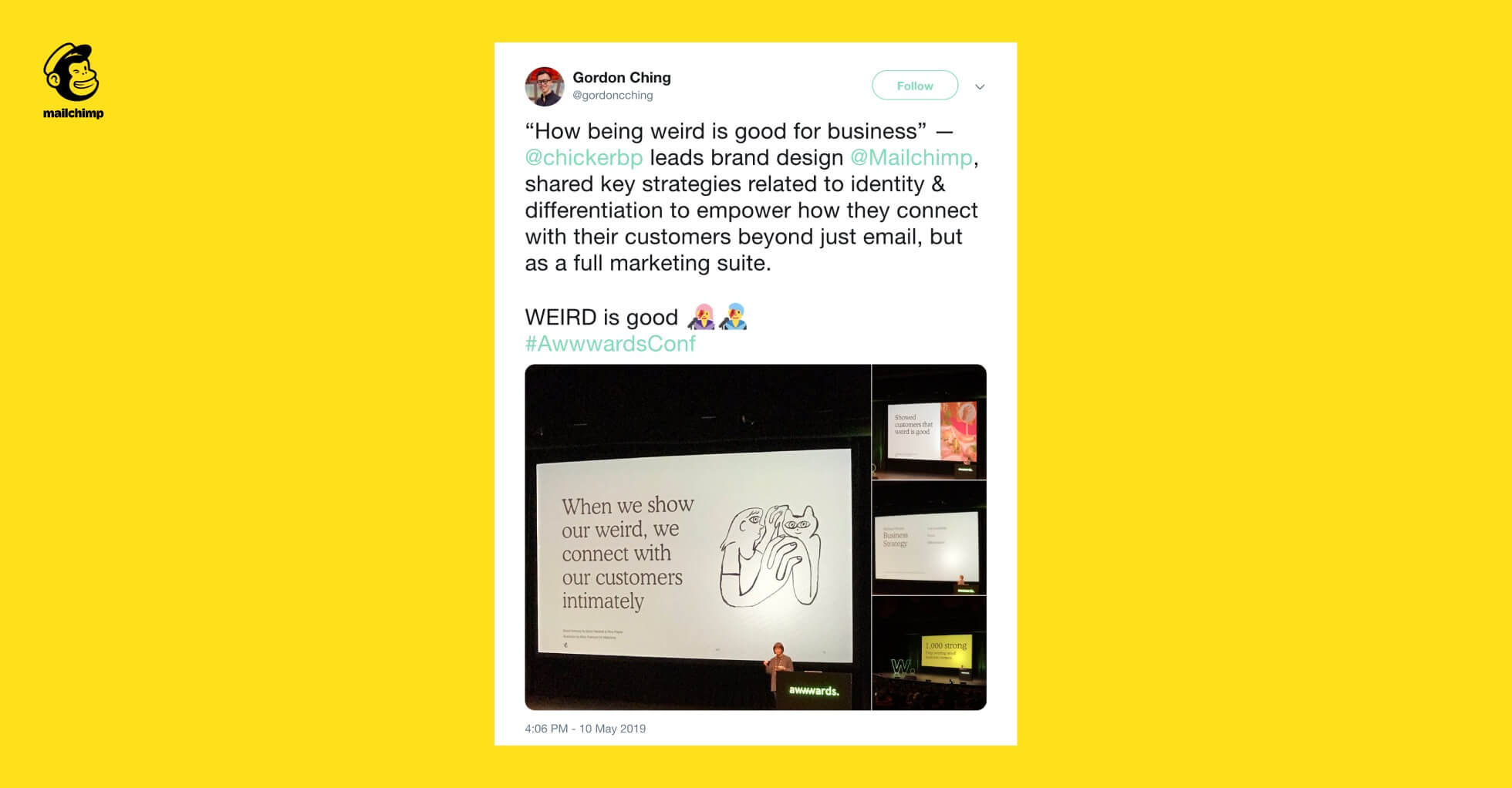
Brandy Porter, Mailchimp
"When we show our weird, we connect with our customers intimately."
Haraldur Thorleifsson, Ueno
"Why branding is important? We're not logical species. We're all controlled by emotions. We rely on emotion, then go backwards and rationalize our decisions."
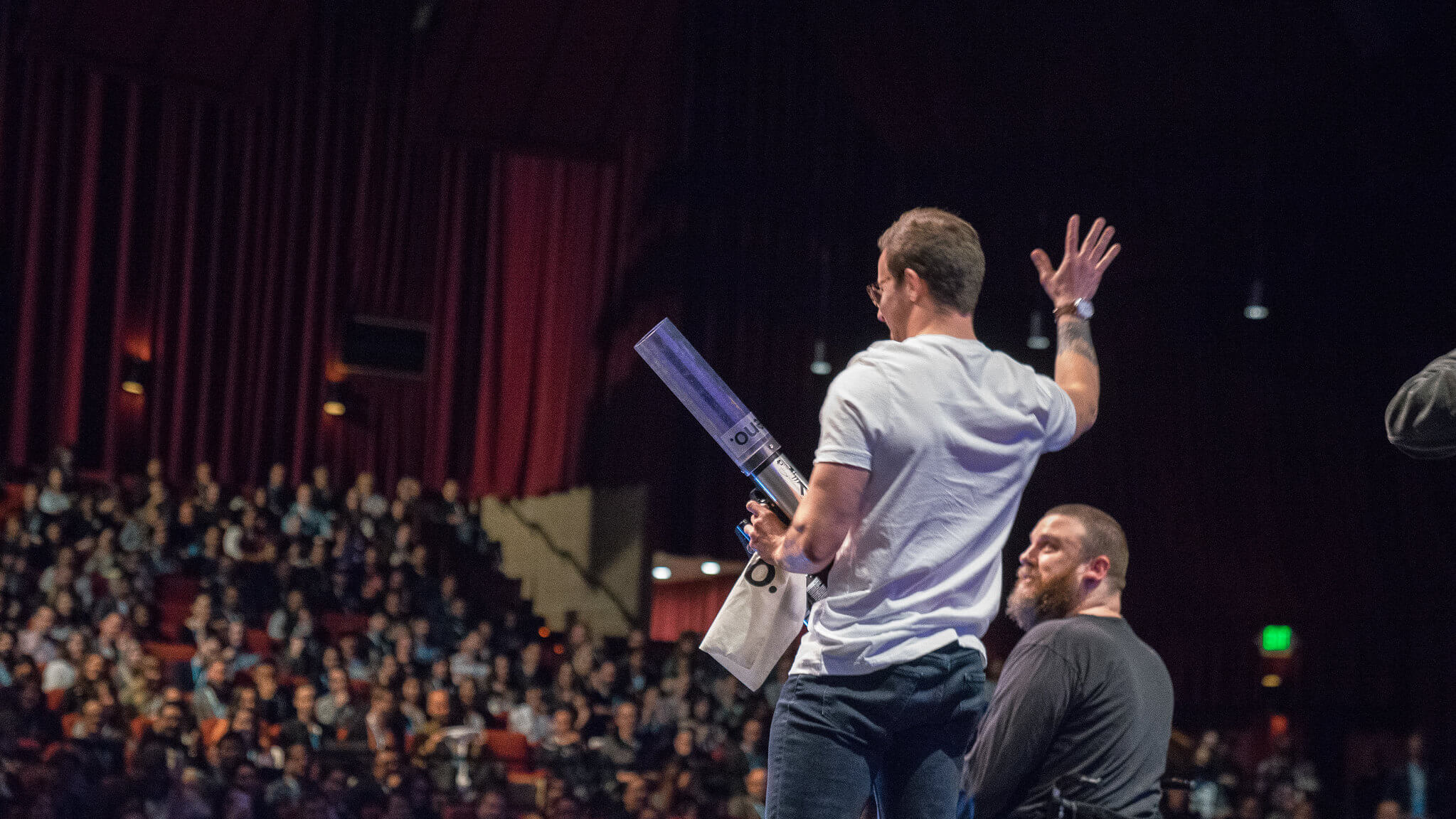 T-shirt Cannon!!! 👕
While Brandy and Haraldur may have had different approaches, I do think they both were essentially talking about the same topic: human connection. Both Mailchimp and Ueno are known for their authentic and unique voice as a company. They connect deeply with their direct customers and a greater audience who care to listen to what they have to say.
3. ACCESSIBILITY AND CREATIVITY
Vlad Magdalin, Webflow
“Accessibility is also the ability to create.”
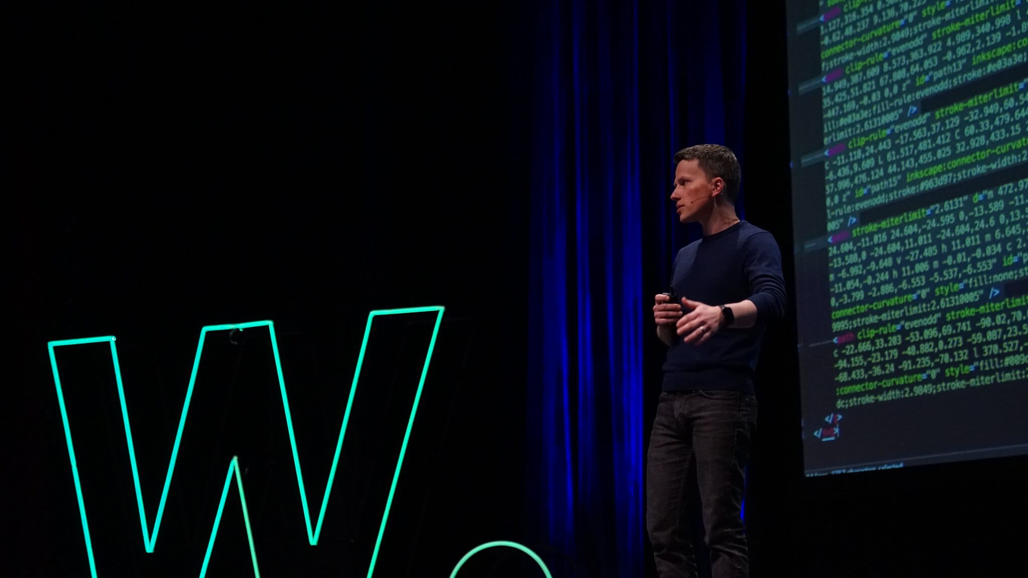 Who will build the next million websites?
Vlad and his Webflow team are on a mission to push the boundaries of "Accessibility." He shared the fact that only 0.25% of people know how to build digital products everyone knows how to use. This number has not changed much for the past 2 decades. He argued how although talent is equally distributed, opportunity is not. He believes that accessibility is not just for users, but also for creators. I absolutely admire his mission and passion to change the status quo.
Claudio Guglieri
“Over 200 million people globally benefit greatly from following accessibility guidelines. Contrast matters.”
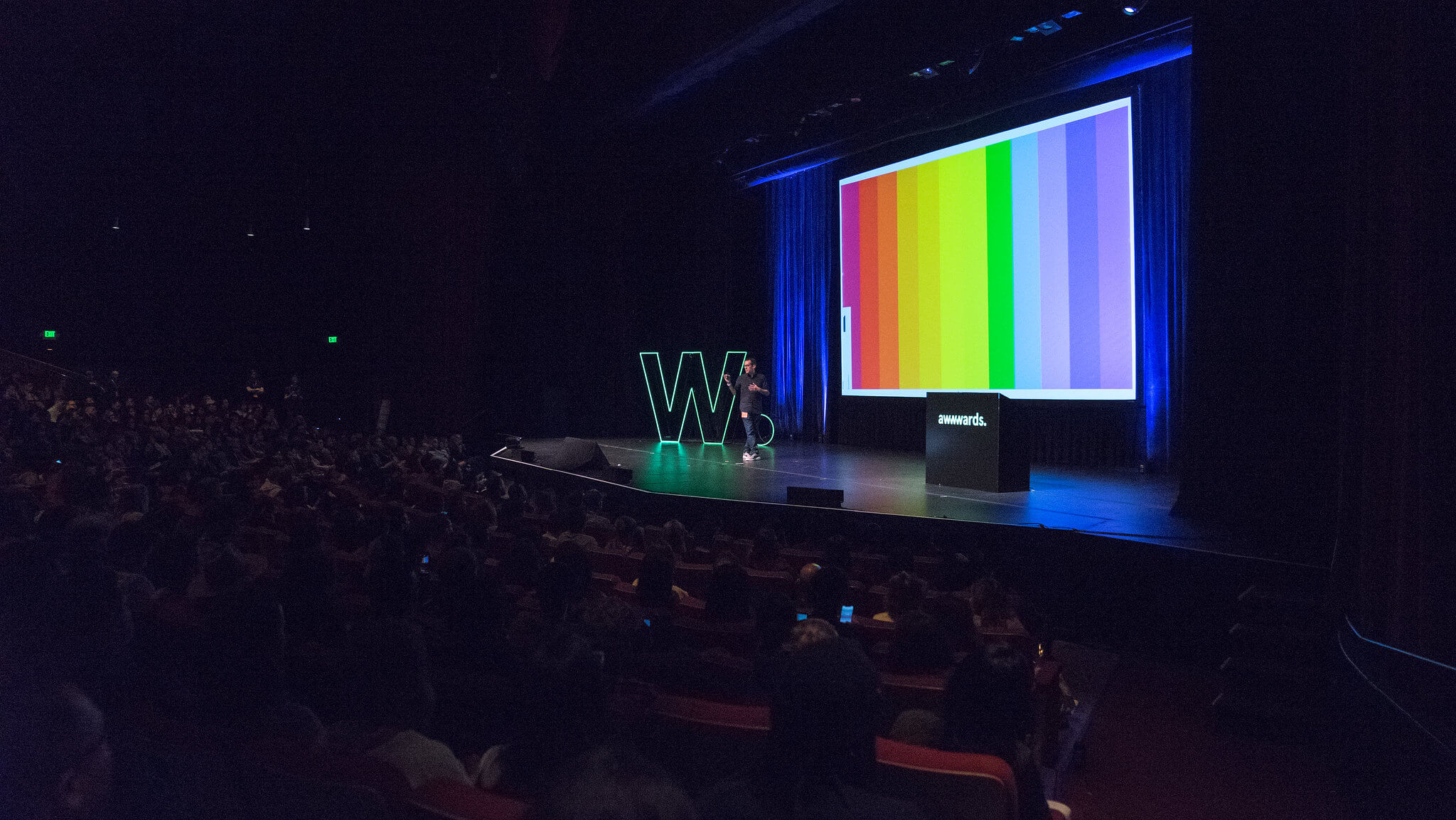 Contrast Matters.
4. EMPATHY AND EMOTIONAL INTELLIGENCE
Benjamin Hersh, Dropbox
"Principles are there to remind us what we owe the people we design for. Be clear, be a friend and be expressive."
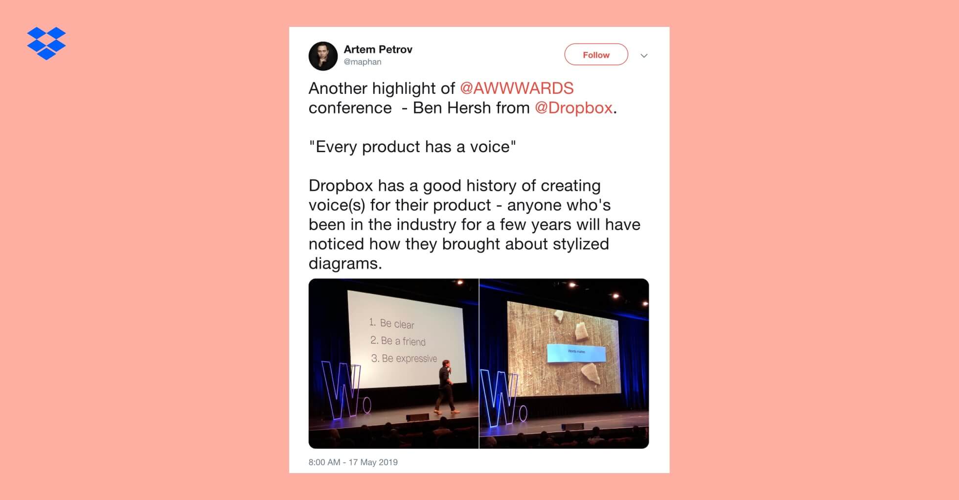
Ben argued that, too often, we run into poorly written messages in many products we use daily. They can be issues with dictation, length, or simply a confusing message. He believes that we, designers, are like imaginary helping buddies. So, be clear, be a friend, and be expressive.
Jennifer Brook, Dropbox
"We navigate the tensions in our working life using strategies. The solutions and strategies are endless. What works for you?"
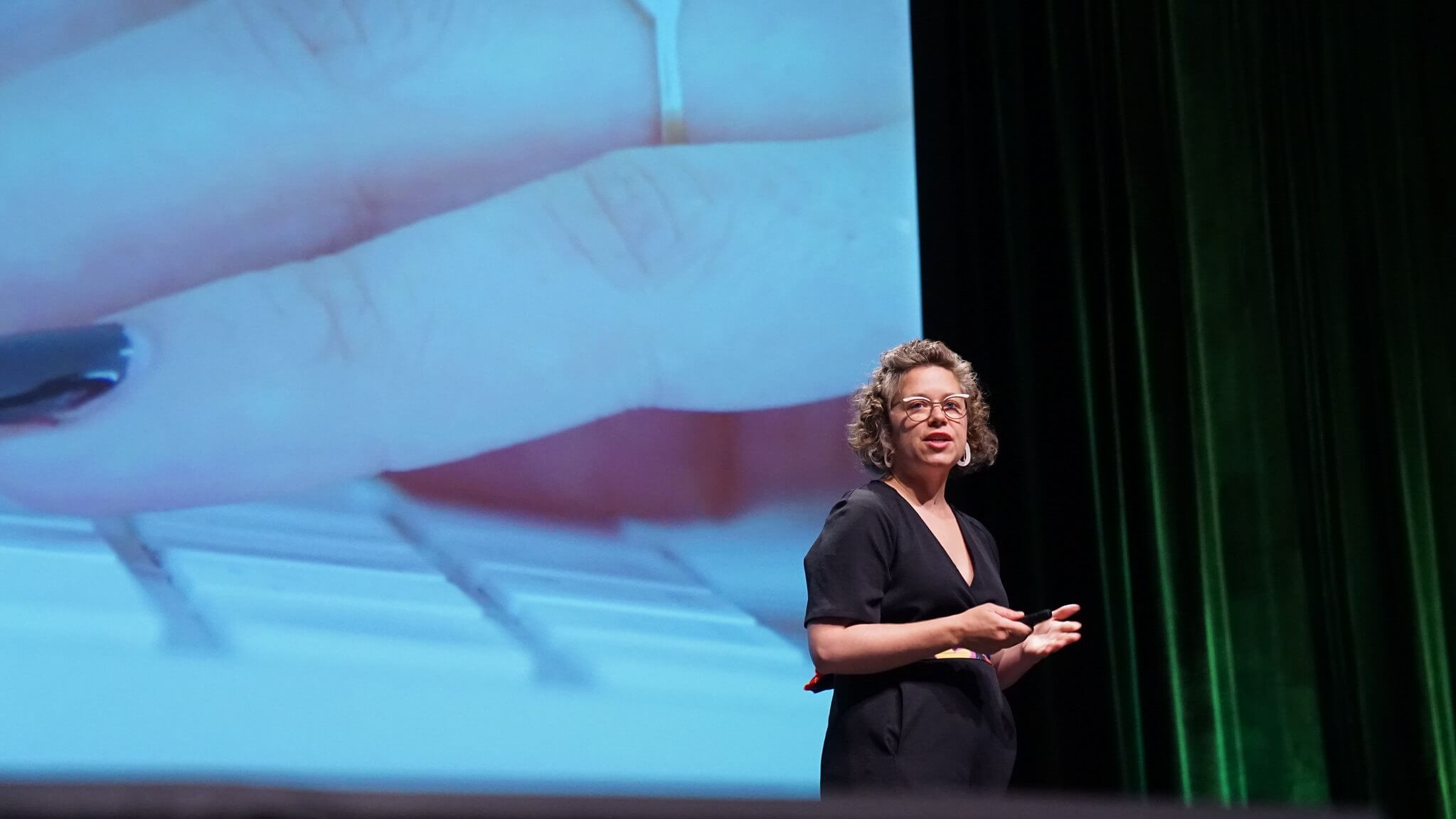
Jennifer shared a few helpful tools we can use to build better team.
Team Values Toolkit
Team Values Cards
Creative Energy Worksheet
Hayley Hughes, Airbnb
"Journey systems can transform the business to invest in human needs instead of product features. They promote collaboration across teams and provide an honest picture of the strategy."
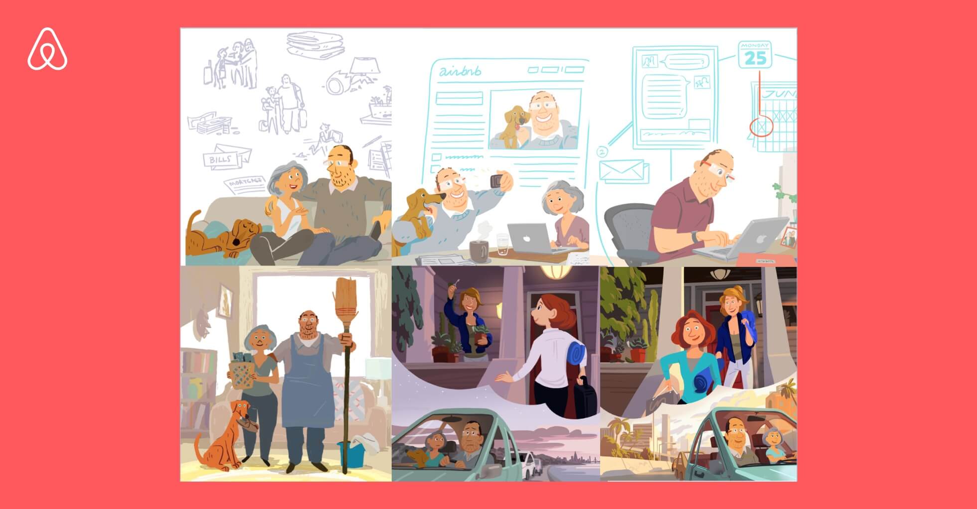 Airbnb and Pixar 👍
Hayley shared about Airbnb's partnership with Pixar to create their Host Journey storyboard to craft narratives and inspire feeling around the experience. This helped Airbnb team to understand their customers better and build their business strategy around human needs instead of focusing on product feature. It was a great reminder that empathy should be at the core of our work as designers.
5. REMARKABLE STORYTELLING
Pablo Stanley, Invision
No summary necessary or possible. Watch his talk.
Alex Cornell, Facebook Live
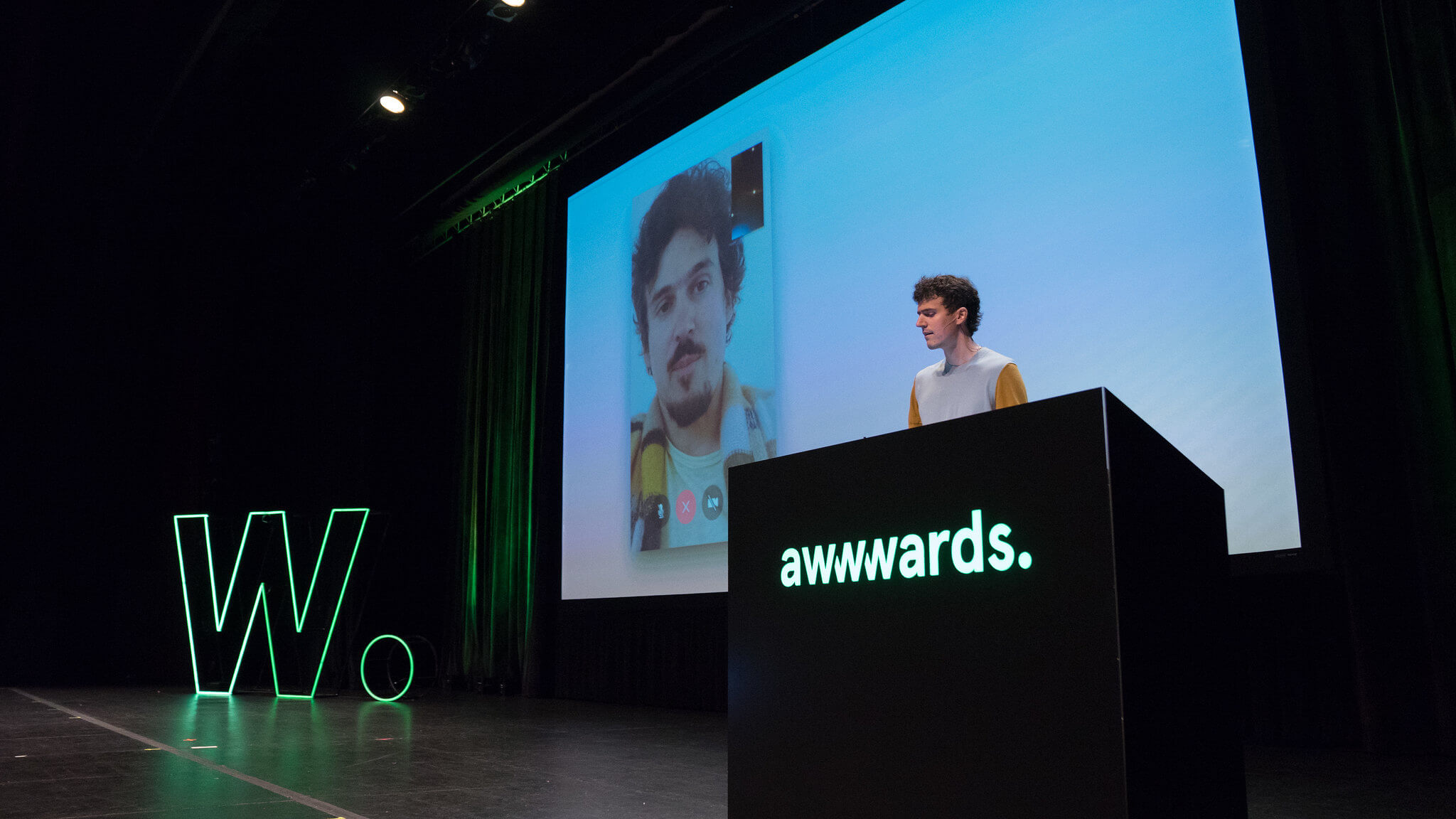 Amazing presentation 👏👏👏
Alex’s talk was the most memorable one during the conference. It was a great reminder that the way we communicate is as important as what we communicate. As designers, we naturally design solutions. But it’s not all. We design how the solution is communicated and delivered. The vessel can be as special as the idea itself.
6. DESIGNER'S RESPONSIBILITY
Kat Fukui, Github
"How could this feature be used to harm someone?"
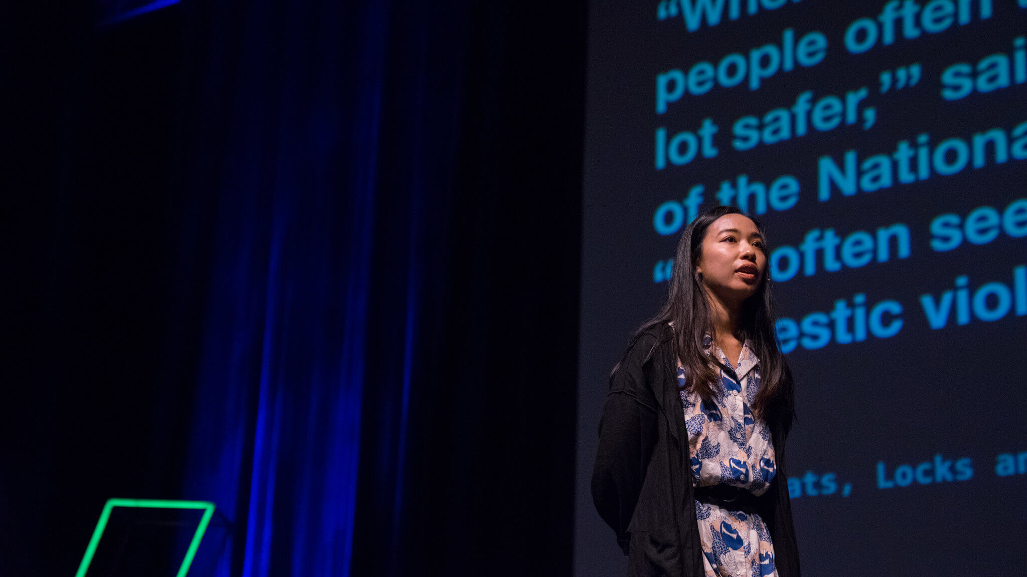
"... nearly one-in-five Americans (18%) have been subjected to particularly severe forms of harassment online, such as physical threats, harassment over a sustained period, sexual harassment or stalking."
Pew Research Center: Online Harassment 2017
Safety is an important issue in an increasingly digital world. Kat Fukui urged us, designers, to take responsibility in shaping technologies that are safe for, not just users, but all people.
Chris Do, The Futur
“To be an interesting person, you must be interested in people.”
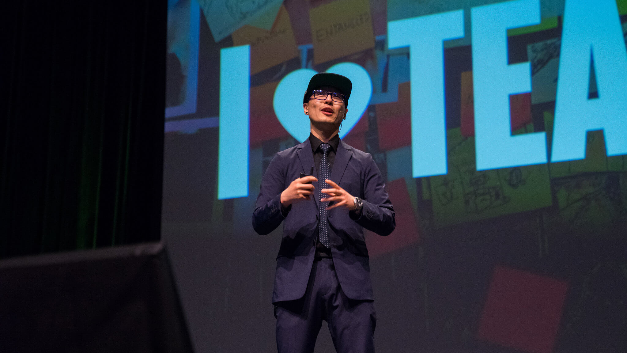
Chris ended the conference with a challenging talk about sharing your knowledge and nurturing your audience. He urged all of us to help others achieve thier dream. Here're 7 key takeaways:
- Help others achieve their goals
- Audience > Customers
- Attractive characters are polarizing
- Out-teach the competition
- Teach while you learn
- Write your cook book
- Seek progress not perfection
THAT'S A WRAP!
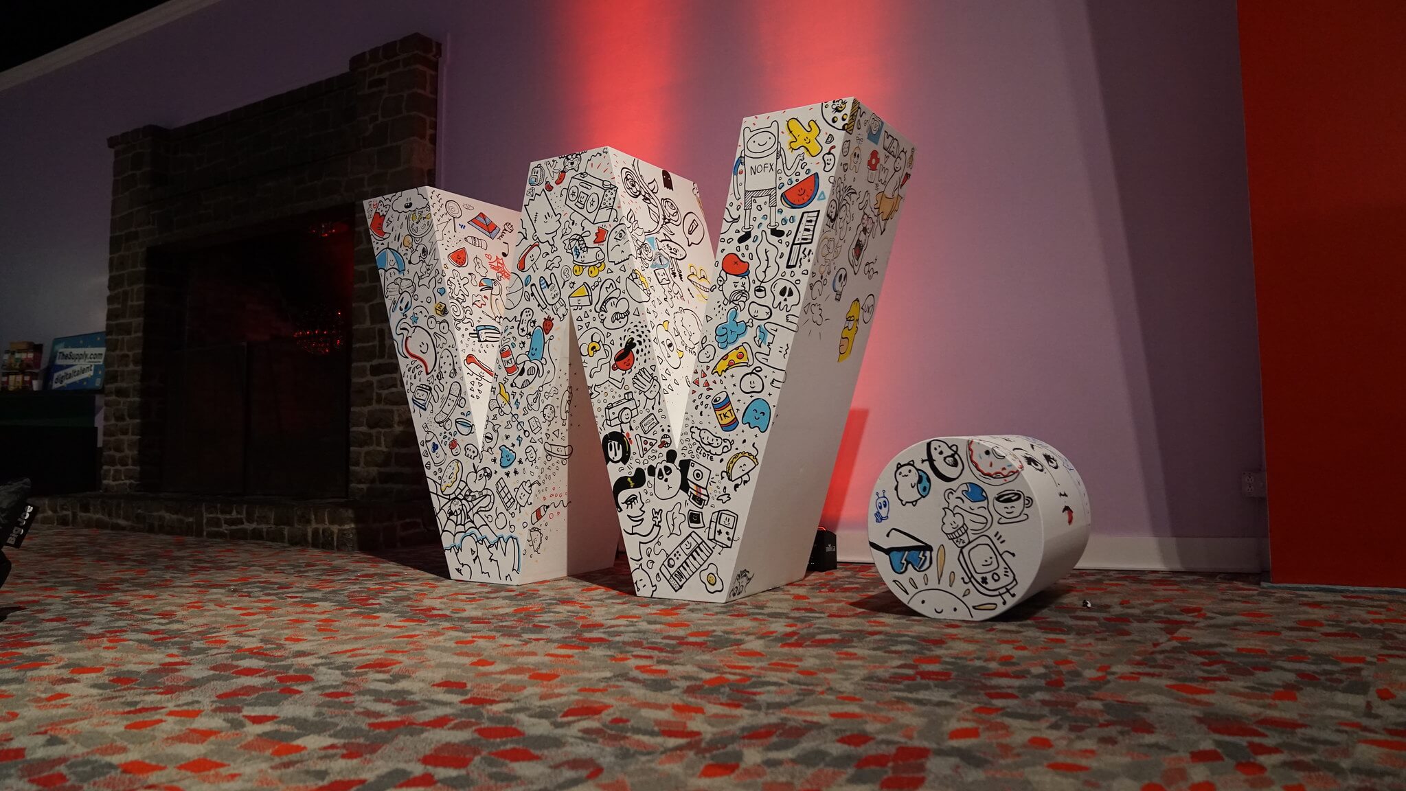
Thanks to Awwwards for an amazing conference! As a designer, I know that inspiration can become cheap, unless it is followed by action. It’s our job to turn this inspiration into something tangible that adds value to people and the world we live in. Let’s do this.
Next conferences will be in NYC and Tokyo. Go attend one.
